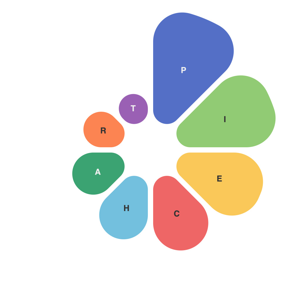
In the vast world of data visualization, the pie chart stands out as one of the oldest and most iconic graphics. Despite its somewhat controversial status in modern analytics, the pie chart remains a vital tool when it comes to depicting proportions and percentages. Crafting the perfect pie chart is akin to a chef crafting the perfect pie—it takes precise measurements, an understanding of flavors, and a desire for perfection. In this article, we delve into the secrets of pie-chart creation, aiming to help you master the art of data visualization through pie.
### Start with a Strong Foundation: Data
Just as with a traditional pie, you must start with a strong foundation—the data. Poorly prepared data will result in a pie chart that doesn’t convey the intended message accurately. Ensure that your data is clean, complete, and accurately represents the story you wish to tell. Pie charts are best suited for depicting data where the full circle is relevant, such as market share or survey results in full categories.
### Selecting the Right Data Story
Not all data should be served in pie chart form. This particular graph is most effective when presenting whole entity versus parts. It’s ideal when there are distinct and clear categories that total to 100%. Choose the right data for a pie chart to avoid confusion: use it to illustrate parts of a whole or a comparison across a broad, singular entity.
### Composition: The Pie Chart Equation
A pie chart is made up of slices of a circle, each representing a percentage or portion of the whole entity. To compose a perfect pie chart:
1. **Total to Whole:** Make certain all the percentages you want to illustrate add up to 100% to represent the whole entity.
2. **Balanced Layout:** Strive to create a visually balanced chart. This means making the largest slice the same size as or slightly larger than the second-largest, and so on. Avoid having too many slices, as too many will lead to a spaghetti-like chart.
3. **Order:** The order in which you place the slices can be powerful. Place the most significant data first, working clockwise or counter-clockwise around the pie chart.
### Design and Color
The aesthetics of a pie chart can also play a critical role in its effectiveness. Design elements can include:
– **Color:** Use colors to differentiate slices clearly. A good palette can enhance readability. Avoid clashing colors and make sure that all the colors used are distinguishable from one another.
– **Labels:** Label each slice clearly, making sure they are placed with consideration to the reader’s understanding and the overall design of the chart.
– **Title and Legends:** Include a title for your chart that succinctly states what the visualization is showing. If using additional categories or information, a legend can be helpful to clarify the colors and what they represent.
### The GUT Principle
In the realm of pie charts, GUT is paramount.
**Grid Overlapping & Touching:** Aesthetically speaking, it’s crucial to avoid grid lines from overlapping and data “touching” one another. This not only enhances the visual appeal but also the effectiveness in reading the chart.
**Users First:** Remember that pie charts are for the audience. Ensure that the usability and readability are front and center.
**Technique:** The technical execution should be seamless, from the initial data set to the final visualization. Choose the right software or coding practices to build your pie chart.
Mastering the pie is a blend of art and science. By starting with a solid foundation, carefully selecting the right data, and focusing on design and usability, you can craft pie charts that inform, illustrate, and most importantly, captivate. Data visualization, when done to perfection, can transform complex information into clear, concise, and compelling stories that resonate with any audience.

