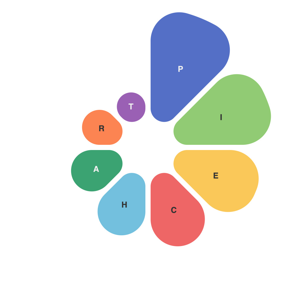
In the realm of visual storytelling, pie charts stand as an unassuming yet powerful tool. They encapsulate complex ideas into digestible slices, making data intelligible at a glance. But to perfect the pie chart art, it requires not just a dash of creativity but also a masterful command of design principles. This guide explores the nuances of crafting the ideal pie chart, ensuring it serves as a beacon of clarity, not confusion.
### Knowing Your Purpose
Crafting a great pie chart begins with understanding its purpose. Are you conveying market share, the breakdown of a project budget, or the constituent parts of a report? The answer to this question will shape the design elements that should be emphasized.
### Selecting the Ideal Pie Size and Shape
A pie chart is most effective when viewers can readily comprehend all the slices without difficulty. The standard pie chart with a circular base is often the go-to, but for certain datasets, an octagon or a pizza-shaped design might communicate the information more effectively. The principle is simple: match the shape to the story you wish to tell.
Keep in mind that a larger chart can accommodate more segments without compromising readability, but it also risks creating a visual that is cumbersome or overwhelming.
### Embracing Color Theory
The color palette is one of the most impactful decisions a designer can make when crafting a pie chart. Use a discernible color scheme that contrasts well and avoids causing dissonance. Ideally, the palette should complement the brand or report in question, as well as the data values. Remember that color blindness is a concern, so if you must use more than four shades, ensure that they are distinguishable against one another.
### Optimal Segments
To maintain the clarity of the pie chart, limit the number of segments. For datasets beyond a few slices, it’s best to break down the pie further into more manageable sub-charts or to find an alternative representation. Six to 10 segments are generally the sweet spot for a pie chart, though this can vary based on the specific context.
### Labels and Legends
Ensure that each segment is clearly labeled within the chart, making it unnecessary for viewers to refer to a separate legend. Position the labels carefully to maintain balance and avoid clumping them all together on a particular blade of the chart. The legend complements the chart, providing supplementary information on the colors used.
### Segmenting the Pie for Accurate Comparison
Pie charts benefit from clear-cut divisions between segments. When slices are adjacent, it can be challenging to pinpoint where one starts and another finishes. This can be rectified by ensuring that each segment has a distinct starting point and that the slices do not intertwine. Use a small line connecting the center of the pie to each slice to facilitate a clearer understanding of the comparisons.
### Use of Highlighting for Emphasis
Whether it’s to draw attention to a key data point or to compare two segments against the whole, highlighting can be a designer’s best friend. Choose wisely and sparingly to maintain the chart’s readability. A contrasting color within a subset can do wonders, particularly when compared to the broader chart color palette.
### Interactive Elements for Enhanced Engagement
With the rise of digital visual content, incorporating interactive elements into pie charts can be captivating for audiences. Hover-over effects, pop-ups with additional data, or clickable sections that drill down into more detailed information can be transformative. However, avoid overcomplicating the design to the point where the chart becomes cluttered or difficult to interpret.
### Considering Cultural Nuances
Remember that the interpretation of color, shape, and design elements can vary across different cultures. When designing pie charts that are intended for a global audience, it is essential to consider these cultural nuances to prevent miscommunication.
### Conclusion
Mastering the art of the pie chart is about distilling complex information into an accessible and engaging form. By thoughtfully considering the purpose, shape, color, labeling, and potential interaction of the chart, the designer can bridge the gap between data and understanding. Through the meticulous application of these guidelines, the pie chart is not just an infographic—it becomes a canvas for clear, compelling storytelling.

