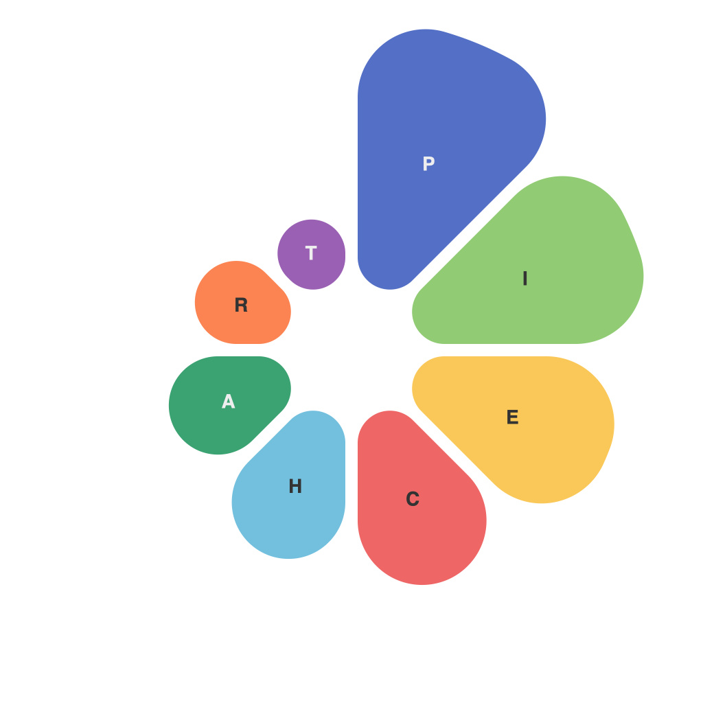
Visual Insights: Decoding Data with Pie Charts – Insights, Challenges, and Best Practices
Data visualization is a crucial tool for data-driven decision-making, and pie charts occupy a significant place within the arsenal of graphic representations. With their unique structure, which allows viewers to quickly identify relationships and proportions among different data segments, pie charts have endured as a popular data visualization method for decades. This article aims to delve into the insights, challenges, and best practices of using pie charts, highlighting the importance of critical interpretation and selecting the right approaches for effective communication of data insights.
Insights
1. **Simplicity and Clarity**: Pie charts are simple and easy to interpret. By dividing a circle into slices proportional to the size of each group being compared, this visualization is immediately accessible, enabling users to grasp the information at a glance.
2. **Representation of Proportions**: One of the primary strengths of pie charts lies in their ability to show the proportional relationships between different segments. This is especially effective when emphasizing the significance of specific groups or categories within a larger set.
3. **Identification of Relationships**: When pie charts are used appropriately, they can reveal patterns and interdependencies, aiding in identifying the most crucial pieces of information within the dataset.
Challenges
1. **Limit to Many Categories**: Pie charts can become cluttered and difficult to interpret when too many categories are included. This can dilute the readability of the chart, leading to misinterpretation of the data.
2. **Visual Misinterpretation**: Due to the two-dimensional nature of pie charts, there’s a risk of misrepresenting the actual magnitude of one segment if the pie is sliced too thinly.
3. **Hard to Compare Individual Slices**: It’s not easy to directly compare the size of one slice with another, especially when small slices are involved. The human brain struggles with perception of angles in two dimensions, which can make these comparisons challenging.
Best Practices
1. **Limit Categories**: Keep pie charts simple by presenting no more than 5-7 categories. When presented with complex datasets, consider using a secondary chart type, such as a bar chart, to offer additional details.
2. **Use Colors Strategically**: Select colors that are appropriate for the data and easy to distinguish. Choose colors with good contrast and avoid using too many hues that may be aesthetically pleasing but contribute to distraction or confusion.
3. **Consider Alternative Graphs**: If there are too many components or when comparing segments is very important, consider other chart types, such as doughnut charts or 100% stacked bar charts, as they can sometimes provide a clearer comparative picture.
4. **Label Clearly**: Use clear and concise labels for each slice to eliminate confusion over what the chart is attempting to represent. Make sure the label is aligned close to the pie slice and large enough to be readily distinguished.
5. **Use 3D Pie Charts Wisely**: While 3D pie charts may seem more dynamic, they often add unnecessary complexity and can distort the perception of size and angles. Stick to 2D pie charts for accuracy and better interpretation.
6. **Contextualize Data**: Always include a legend or annotation that provides a numerical value for the size of each slice so that viewers get a clear understanding of the data presented.
In conclusion, pie charts can be a valuable tool in data visualization, providing insights into proportions and relationships. However, to harness their potential effectively, it is essential to be aware of their limitations and pitfalls. By adhering to best practices and using these charts thoughtfully, visual insights can be decoded in a way that is both informative and compelling.

