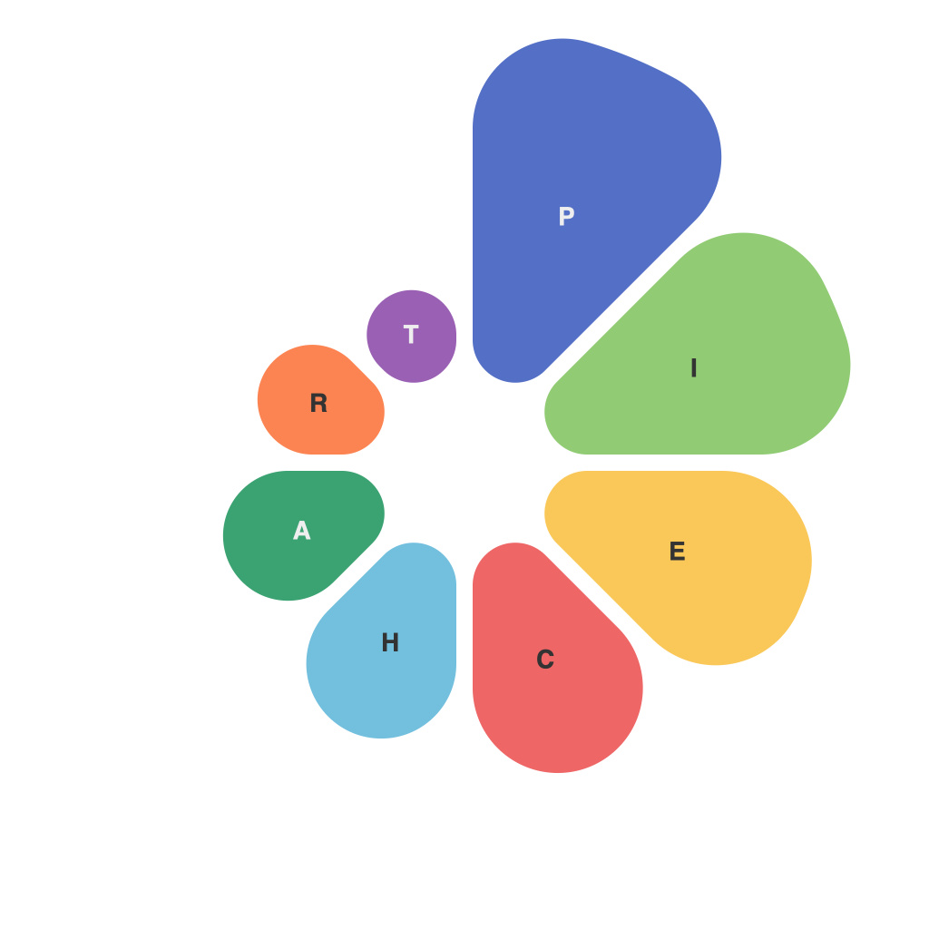
In the realm of data visualization, the pie chart stands as a symbol of simplicity and profound insight. Its circular design subtly commands attention and its categorical slices reveal invaluable information with just a glance. In this master’s guide, we delve into the intricacies of pie charts, exploring the ins and outs that can transform your ability to convey and understand information through this beloved data display.
**Understanding the Basics: What is a Pie Chart?**
At its core, a pie chart is a circular statistical graphic representing data in proportion to the whole. Each slice of the pie corresponds to a category, and the size of the slice reflects the quantity or proportion of the category relative to the total. Historically, pie charts have been used for quick comparisons and to illustrate parts of a whole, particularly where comparisons between different categories are straightforward.
**The Pie Chart Structure and Composition**
A standard pie chart consists of the following elements:
– The Circle: Representing the whole population, the circle is the foundation upon which the pie chart is built.
– Slices: Corresponding to the various categories within the whole, the slices are colored or patterned for differentiation.
– Labels: Text annotations placed on each slice, often in the center, to indicate what the slice represents.
**Best Practices for Design and Layout**
1. **Select Appropriate Data**: Pie charts should only be used when comparing parts of a whole. They are not ideal for displaying trends over time, nor are they effective for data that requires precise numerical comparison.
2. **Limit the Number of Slices**: Too many slices can result in what is often referred to as ‘pizza chart’ — an unwieldy array of slices. Aim for three to six slices to ensure clarity.
3. **Effective Coloring**: Avoid using colors that might be perceived as misleading or that compete with one another. Use a color scheme that provides good contrast and maintains readability.
4. **Label Placement**: Keep labels clear and easy to read. Consider displaying labels on the outside of the pie chart to maintain a clean aesthetic.
**Strategies for Enhancing Insight**
1. **Sector Ordering**: You may want to order sectors to highlight important data for immediate understanding, such as placing the largest slice at the top or the bottom for emphasis.
2. **Data Labels and Values**: Adding labels and values can be beneficial if the chart will be scrutinized for precise figures. This can be done with a small label within the slice or outside.
3. **Using a Donut Chart**: For some datasets, a donut chart (a pie chart with a hollow center) can provide a clearer view and can sometimes help to avoid overlap between the slices.
**Common Pitfalls to Avoid**
1. **Misleadingly Labeling Slices**: Be cautious about how you label the slices; misleading text can skew the perception of the data.
2. **Using Excessive Effects**: Avoid using shadows, 3D effects, or too much animation as these can distort the perception of the pie chart and its slices.
3. **Overcomplicating Design Elements**: Simplicity is the key. Overdesigning can lead to a distracting and misleading chart.
**Conclusion: The Pie Chart as a Data Visualization Tool**
While not without its flaws, especially when used improperly with complex datasets or numerous categories, the pie chart remains a tried-and-tested data visualization technique. The true master lies not in creating a pie chart, but in understanding how to craft it thoughtfully, focusing on clarity and reader interaction. With the strategies and insights outlined in this guide, you are now well-equipped to harness the power of the pie chart and its visual storytelling to convey your data with precision and influence.

