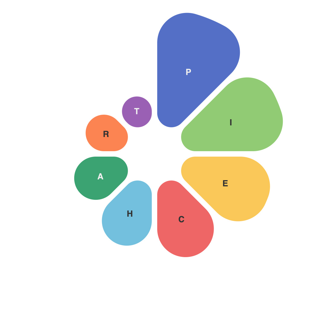
Unlocking Visual Insights: Mastering the Art of Creating Compelling Pie Charts
PIE charts are among the most widely used data visualization tools, commonly found in reports, presentations, and daily data analysis. They are particularly useful when illustrating how a whole is divided into various segments, showcasing proportions and percentages at a glance. However, crafting compelling and effective pie charts often requires a nuanced approach. This article serves as a guide to understanding the ins and outs of pie charts, including best practices, common pitfalls to avoid, and tips to create visual insights that stand out.
## The Importance of Context
Just like any other graphical element, pie charts need context to be meaningful. Clearly indicate what the chart represents: the total, what each slice signifies, and the source of the data. When creating charts, always begin with the objective in mind. Are you highlighting the relative sizes of data categories? Are you aiming to show the distribution of components within a whole? Understanding your objective will guide you in choosing between a pie chart and other types of visual representations.
## Elements to Master
### Data Selection
Select data with care. Pie charts are most effective when showing a small to medium number of categories (ideally not more than 5-7) to maintain clarity and readability. Cluttering a pie chart with too many categories can lead to confusion, making it hard to discern the relative sizes of the slices.
### Design Aesthetics
– **Color Choice**: Use distinct colors for each slice, but avoid overly bright or clashing colors. Colors should aid in differentiation without overwhelming the viewer. Consider using a data visualization color palette to maintain harmony.
– **Label Placement**: Optimize readability with label placement. Position labels either inside or outside the chart, but not too close to the slice edges. A combination of slice labels and data labels showing the percentage and value can enhance understanding.
### Data Accuracy
Ensure that the data plotted correctly reflects the reality. Small slices can be challenging to read, and it’s important to ensure that the data they represent is still accurately discernible. Inaccuracies or approximations can lead to misinterpretation.
### Slices and Hedges
Slices should not overshadow each other, leading to partial or total occlusion. Adjust the size of the chart as necessary to prevent this issue. Additionally, ‘hedges’ or a background color and font on the slices can make the text stand out, enhancing readability.
## Tips for Effective Communication
### Focus on Clarity
Emphasize clarity over complexity. Avoid distractors that do not contribute to conveying your intended message. This includes redundant information and overly complex layouts.
### Consistency is Key
Maintain consistency in colors, labels, and scales across different instances of pie charts within a report. This ensures that insights are easily comparable and understood.
### Engage Your Audience
Your visualizations should capture attention. The use of annotations, comparisons, and strategic animations or interactive elements can help in making the charts more engaging and informative.
### Feedback Loop
Always seek feedback on your visualizations from your intended audience. Insights on how well your charts convey information can help you refine and improve future iterations.
## The Bottom Line
Creating compelling pie charts is about more than just numbers and colors; it’s about effective communication. Paying attention to details such as data selection, design aesthetics, and clear labeling can significantly enhance the effectiveness of your visual insights. With a focus on context, clarity, and the strategic use of design principles, you’ll be equipping yourself with the tools to construct pie charts that unlock visual insights and inspire informed decision-making.

