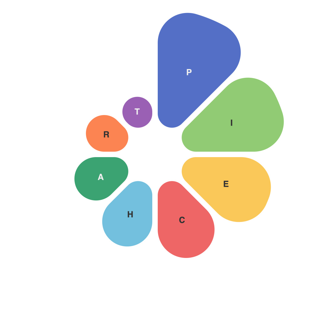
In a world brimming with numbers, data visualization stands as an essential tool for conveying information in a digestible and engaging manner. Of the myriad charts available, the pie chart stands out as perhaps the most universally recognized, a circle sliced into wedges each representing a portion of a whole. Crafting an effective pie chart is not merely an exercise in aesthetic design, but a strategic task that can significantly impact the way data is comprehended and interpreted. This comprehensive guide delves into the nuances of pie chart crafting and analysis, offering insights to those who wish to visualize data in depth.
**Understanding the Pie Chart Basics**
The quintessential pie chart, also sometimes referred to as a circle graph, depicts the relationship between parts and the whole using slices of a circle. The larger the slice, the greater the proportion it represents of the entire data set. Before we begin crafting pie charts, it is crucial to understand that they are most effective when used for categorical data that totals to 100% and when comparing no more than five distinct categories.
**Choosing the Right Data for Pie Charts**
For pie charts to be the right tool for the job, they must fit the data. It works best when trying to display proportions in one variable across different categories within one or two data points. Attempting to show too many categories often leads to a cluttered, readability-challenged image. The choice of data should be driven by the goal of the chart: to highlight the largest segment or to compare multiple segments accurately.
**Elements of an Impactful Pie Chart**
Every well-crafted pie chart is a blend of elements—some for the eye and others for the mind. Here’s a rundown of what makes for a compelling pie chart:
1. **Simple and Clean Design**: The simpler the design, the easier it is to interpret the chart. Avoid too many colors and complex patterns that could distract from the data.
2. **Color Usage**: Choose your colors wisely. Different colors or shading can add dimensionality and make comparing sections easier, especially when there is more than one segment with a similar size.
3. **Labels**: Ensure that each slice is clearly labeled, and a legend is provided if there are a wealth of colors. Labels should be readable by themselves or in conjunction with the legend.
4. **Centerpiece Text**: Adding a key statistic or a central number can draw the audience’s attention immediately. However, only use this if the number is meaningful to the data you are presenting.
5. **Angles and Proportions**: Each slice should visually correspond to its percentage of the whole. It’s important that these proportions are accurate; pie charts can be deceptive when out of proportion.
**Crafting Pie Charts with Proportions in Mind**
Pie charts are particularly useful when comparing several segments of a dataset, but it is important to ensure that the user’s perception of these segments is accurate. This is where visual illusions can come into play. Here are some tips for keeping the ratios and angles true to the data:
– **Avoid Starting with Zero**: When angles of different slices are being measured, starting at zero makes comparing slices that follow seem larger.
– **Use Lines for Individual Slices**: Depending on the size of the pie chart, you might want to use lines connecting the endpoint of a slice to the center to highlight smaller slices.
– **Consider a 3D Effect**: Although it looks flashy, the 3D effect can distort perceptions of the relative sizes of the slices. It’s generally better to stick with a 2D pie chart for accurate proportions.
**Pie Chart Analysis and Misconceptions**
Understanding how to interpret pie charts is as important as crafting them. Here are some insights into common misconceptions when analyzing pie charts:
– **Equal Slices Do Not Equate to Equal Importance**: In a pie chart, equal slices may visually indicate equal values, but equal angles do not necessarily represent equal proportions.
– **Smaller Slices Can Appear Larger**: Smaller slices close to the center can look disproportionately larger than slices closer to the edge.
– **Complex Colors and Patterns Can Be Misleading**: It’s a fine line to walk between making the chart attractive and keeping it accurate. Avoid overly complex designs that could lead to misinterpretation of the data.
**Pie Charts in Multiple Perspectives**
Using more than one pie chart to represent data is a common practice, especially in situations where a single chart cannot convey all the necessary information clearly. Here are some techniques for using multiple pie charts:
– **Stacked and Overlaid**: Complementary charts can be used to represent different aspects of the same dataset. For example, you might have one chart showing product sales and another showing market share.
– **Combining Different Views**: When presenting complex or long-term data, pie charts with trends or seasonal changes can be layered over one another to create a more comprehensive view.
In conclusion, the pie chart is a potent tool in the data visualization arsenal, offering a simple and clear way to convey proportions and relationships between parts and a whole. Crafting a pie chart that is visually effective and informative requires attention to detail in design and layout, accuracy in proportion, and a clear understanding of the audience’s potential misconceptions. With thoughtful crafting and insightful analysis, pie charts can serve as powerful means to deliver data with depth and clarity.

