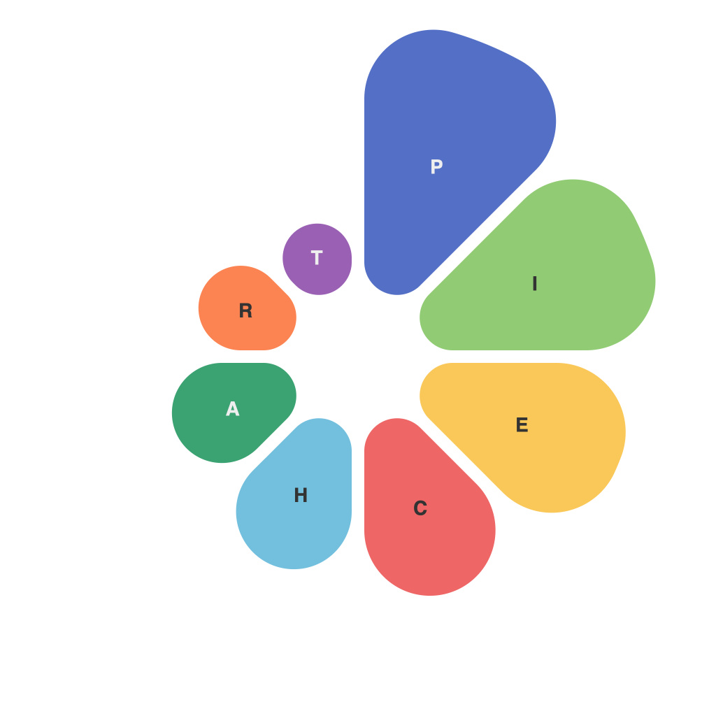
In an era where data is the new oil, harnessing the power of information is crucial for making informed decisions and strategic planning. Visualization has emerged as an indispensable tool to translate complex datasets into intelligible visuals that can be comprehended at a glance. Among the numerous data visualization mediums, the pie chart stands as one of the oldest and most popular methods for conveying a dataset’s composition. In this article, we explore the art of pie chart creation, examining its elements, best practices, and its place in the vast canvas of data representation.
Understanding the Pie Chart: A Quick Overview
A pie chart consists of a circle divided into sectors, each sector representing a proportion of the whole. These sectors are labeled with data points, and the size of each sector is relative to its corresponding data point. The sum total of these proportions equals 100%, and pie charts are often used to show relationships and comparisons between different parts of a whole.
Elements of a Pie Chart
– **Center Point:** The very center of the pie chart represents the aggregate of all the components.
– **Sectors:** These are the colored segments that cut the pie chart, each representing a distinct data category.
– **Labels and Title:** Clear labels are crucial for identification, while a informative title provides the context for the chart.
– ** Legends:** Color coding can make the visualization more engaging; however, a well-placed legend ensures that colors and their corresponding categories are easily understood.
– **Angles:** The angles formed by the sectors are proportional to the data points they represent.
– **Axes or Ranges:** These are important if the pie chart is a 3D version, providing depth and enhancing the visual interest of the chart.
Pie Charts vs. Other Visualizations
Pie charts, while widely used, are not without their critics. Some argue that they are less effective at conveying precise amounts compared to bar charts, line graphs, or other graphical representations. Despite the criticism, pie charts remain beneficial in highlighting parts of the whole and can be particularly effective when:
– The dataset is relatively small and the number of parts is limited.
– The viewer needs a quick and easy-to-understand visualization of simple ratios or proportions.
– Strong visual contrasts are needed to differentiate components.
Mastering the Art
Creating a pie chart that is insightful and usable requires a nuanced understanding of its constituent elements. Here are some best practices to consider:
1. **Limit the Number of Categories:** Avoid including too many sectors as this can make the chart cluttered and difficult to interpret.
2. **Choose the Right Colors:** Use colors that evoke the emotions you want to convey (e.g., red for danger, green for growth) or choose colors that offer strong contrast between different sectors.
3. **Prefer 2D Pie Charts over 3D:** 3D pie charts are often confusing due to perspective effects and can be harder to accurately estimate sector sizes.
4. **Avoid Starting Sectors at the 12 O’Clock Position:** Starting at 12 o’clock is common but not necessary. The orientation of the chart should enhance its clarity, not adhere to tradition.
5. **Consider Using a Donut Chart:** For datasets with a high degree of detail, a donut chart, which is a pie chart with a hole in the center, can reduce the visual clutter and make individual slices easier to see.
Conclusion
The pie chart, with its round simplicity, is a valuable tool in the data visualization arsenal. When deployed effectively, it can communicate insights succinctly and visually, allowing even the most complex data sets to be understood at a glance. Mastering the art of pie chart creation involves a balance of design sensibility and an understanding of the data it represents, ensuring that it becomes more than just a chart but a narrative enhancer—conveying the nuances and insights of data in graphical form.

