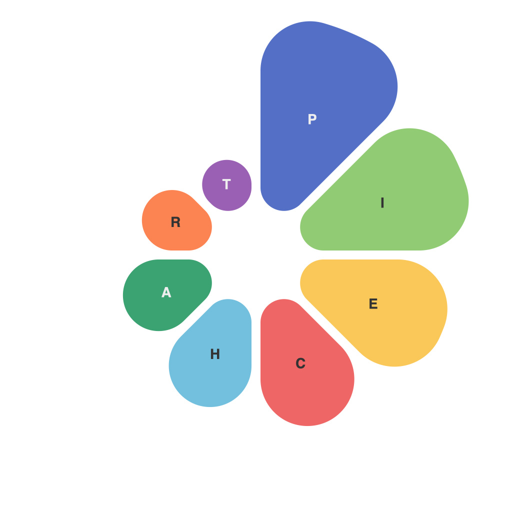
In an age where data visualization is becoming increasingly vital for understanding complex information, pie charts remain a popular choice due to their simplicity and ease of interpretation. Yet, despite their widespread use, pie charts often carry with them a substantial load of misconceptions and myths that can mislead both creators and consumers of data. This article delves into the art and application of the pie chart, debunks common myths, and unveils the best practices for employing these classic visualizations effectively.
### The Myth of Pie Charts as a Universal Data Visualization
One of the most enduring myths surrounding pie charts is that they are a panacea for all forms of data representation. Advocates argue that pie charts are perfect for showing percentage distributions, making it easy to compare parts of a whole. However, opponents frequently highlight that pie charts can be misleading, difficult to read, and not ideal for highlighting trends over time.
**The Reality:**
Pie charts are not universally beneficial. While they excel at indicating simple proportions or when all compared sections are roughly similar in size, their drawbacks can overshadow their benefits. The human brain struggles with interpreting angles accurately, especially when pie charts are not evenly divided or packed closely together.
### Accuracy and Precision: Does Size Really Matter?
Another myth is the idea that pie charts must display every data category as a whole to be accurate. The assumption is that each small slice represents an entire segment when actually, pie charts are more beneficial when the categories are substantial enough to be distinguished from one another and to make meaningful comparisons.
**The Reality:**
It is unnecessary and sometimes misleading to depict every single category as a slice in a pie chart. The small slices can obscure the overall pattern and make the chart difficult to interpret. It’s far more effective to focus on the key categories or data points that are most relevant to the message you wish to convey.
### Pie vs. Bar: A Showdown of Simplicity and Accuracy
Many myths also stem from a direct comparison between pie charts and their close relative, the bar chart. Pie charts are sometimes incorrectly hailed as superior due to their apparent simplicity. However, this is a myth.
**The Reality:**
Pie charts do not inherently offer superior simplicity. Bar charts, while requiring more visual work to read, can provide clearer trends and comparisons, especially with large or complex datasets. The choice between a pie chart and a bar chart should depend on the specific data being represented and the requirements of the audience.
### Rotation and Order: Avoiding Visual Anarchy
An oft-overlooked myth about pie charts is the notion that they should be rotated in a certain way, such as always clockwise, to maintain visual symmetry. However, the direction of rotation is arbitrary and should serve the purpose of the chart, rather than conforming to any traditional standard.
**The Reality:**
Pie charts can be rotated to highlight certain data points or to better fit within a layout. The order of the slices is more important than their orientation and should be arranged systematically, such as by size from largest to smallest to maintain clarity.
### Interactivity Isn’t Just for Charts
There’s a myth that pie charts are inherently static and cannot be made interactive. This could not be further from the truth.
**The Reality:**
With interactive pie charts, viewers can hover over slices to see additional data, click to filter results, or even interact with a chart that adjusts dynamically to user input. Interactive visualizations can offer a deeper understanding of the data within the pie chart than the静态 equivalent.
### Crafting the Perfect Pie Chart
Given these realities, how does one craft the perfect pie chart? The following are some best practices:
1. **Simplicity**: Choose your primary message and focus on the most important sections.
2. **Comparison**: For clearer comparisons, allocate larger sections to more significant data points.
3. **Labeling**: Clearly label each segment to avoid confusion and to enhance readability.
4. **Interactivity**: If the audience is tech-savvy, interactivity can provide deeper insights.
5. **Color Blind-Friendly**: Use color schemes that are friendly to people with color vision deficiencies.
In conclusion, the pie chart may be a time-honored visualization tool, but many of its long-held myths need to be laid to rest. By understanding the true nature of pie charts and the myths that shroud them, practitioners can choose when to use this visualization technique with precision and ensure that their audience receives the intended message.

