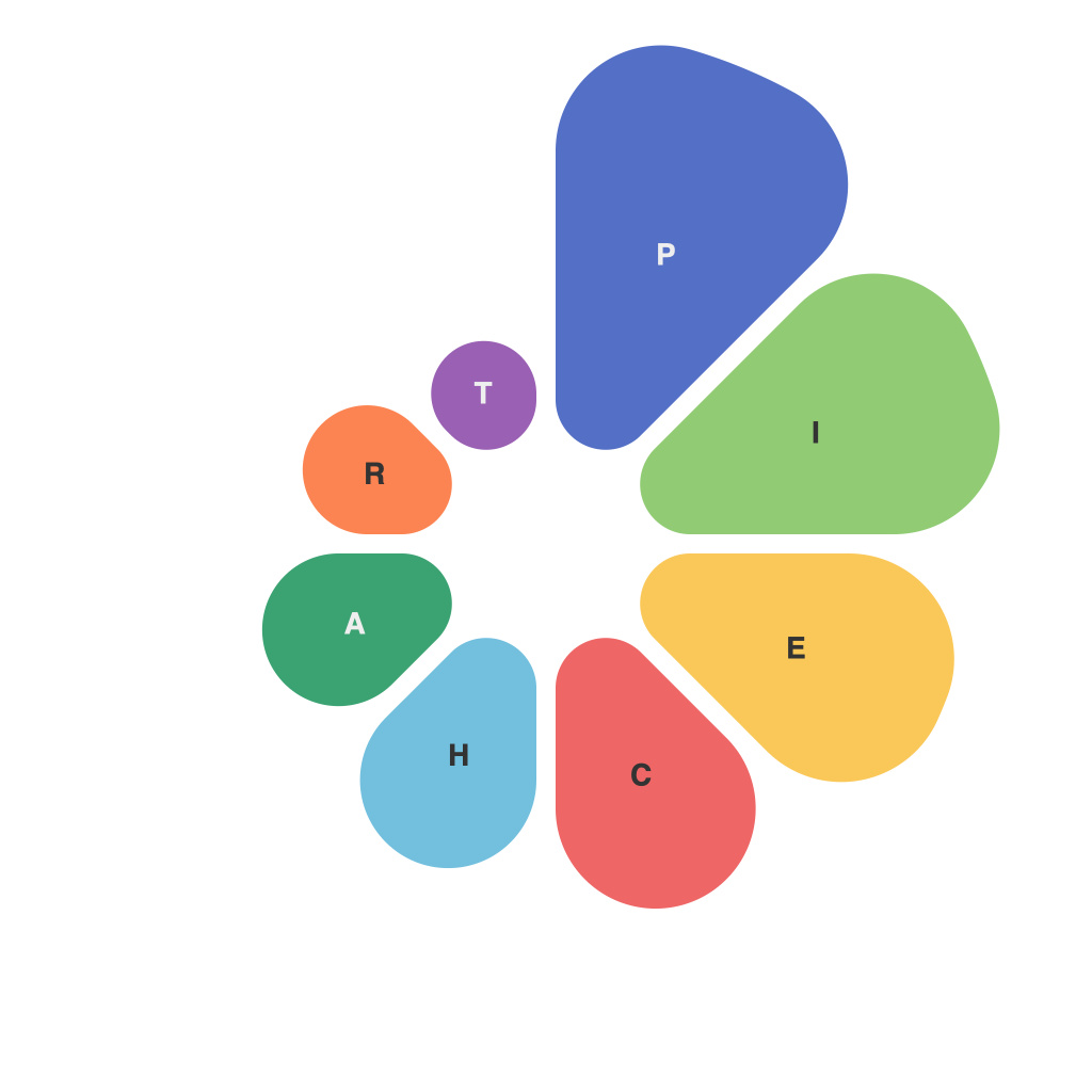
In a world brimming with diverse data points and analytics tools, the ability to distill complex information into easily digestible visuals is a prized skill. Among the myriad of data visualization tools at our disposal, pie charts have maintained their place as both a staple and a polarizing option. While they offer a unique way to break down proportional relationships, their proper implementation is nuanced and challenging. This article is an exploration into the dynamic do’s and don’ts of pie chart design and analysis.
**The Dynamic Do’s**
**1. Know Your Audience**
Understand your audience’s abilities and needs. Pie charts are often straightforward and can be used with people who are less familiar with data visualization or with those who are in a quick hurry. However, if your audience is data-savvy, make sure your pie charts add value and enhance their insights.
**2. Limit Number of Segments**
Resist the temptation to include too many segments in a pie chart. If your data has too many variables or categories, it becomes cluttered and less readable. Aim for around five segments or fewer for maximum clarity.
**3. Use Colors Intelligently**
Color is one of your key tools; use it to highlight important distinctions or to differentiate between segments quickly. Make sure your color scheme is logical and easy to follow, possibly indicating categories with complementary colors.
**4. Label Clearly**
Ensure you provide clear and concise labels within the chart. Pie segments that are too small or placed too closely together can be difficult to read. The most critical data should be labeled directly on the chart or included within a clear legend.
**5. Aim for Consistency**
Maintain consistency in your design, including colors, fonts, and size, so your audience can easily compare across different charts. Consistency also helps in building a stronger brand when presenting data across multiple reports.
**The Dynamic Don’ts**
**1. Avoid Confusion**
Don’t create a pie chart with a central hole, such as a donut chart, unless there is a specific, compelling reason to do so since it can lead to misinterpretation of data.
**2. Skip Central Lines**
Don’t leave the central lines out of the pie chart. Without the central line, pie segments can visually deviate from a straight cut, making it difficult to interpret angles accurately.
**3. Omit a Legend**
Don’t assume that everyone knows what each segment represents. A well-placed legend can save the day and provide essential context to the data being presented.
**4. Overcomplicate the Design**
Simplicity trumps grandeur when designing pie charts. Avoid overly complex designs or patterns in the background that could compete with your data or make the chart hard to read.
**5. Use Pie Charts for Correlation**
Don’t use pie charts to show an increase or decrease in data over time since they only offer static distributions. For temporal data, other charts, such as bar graphs or line charts, can add more value.
In summary, pie charts are a versatile data visualization tool that must be crafted with consideration for audience, clarity, and aesthetic balance. By adhering to the dynamic do’s while avoiding the pitfalls outlined among the don’ts, you can harness the potential of this sometimes maligned chart to create clear and insightful representations of data. Now, with this knowledge in hand, let the data visualization journey continue.

