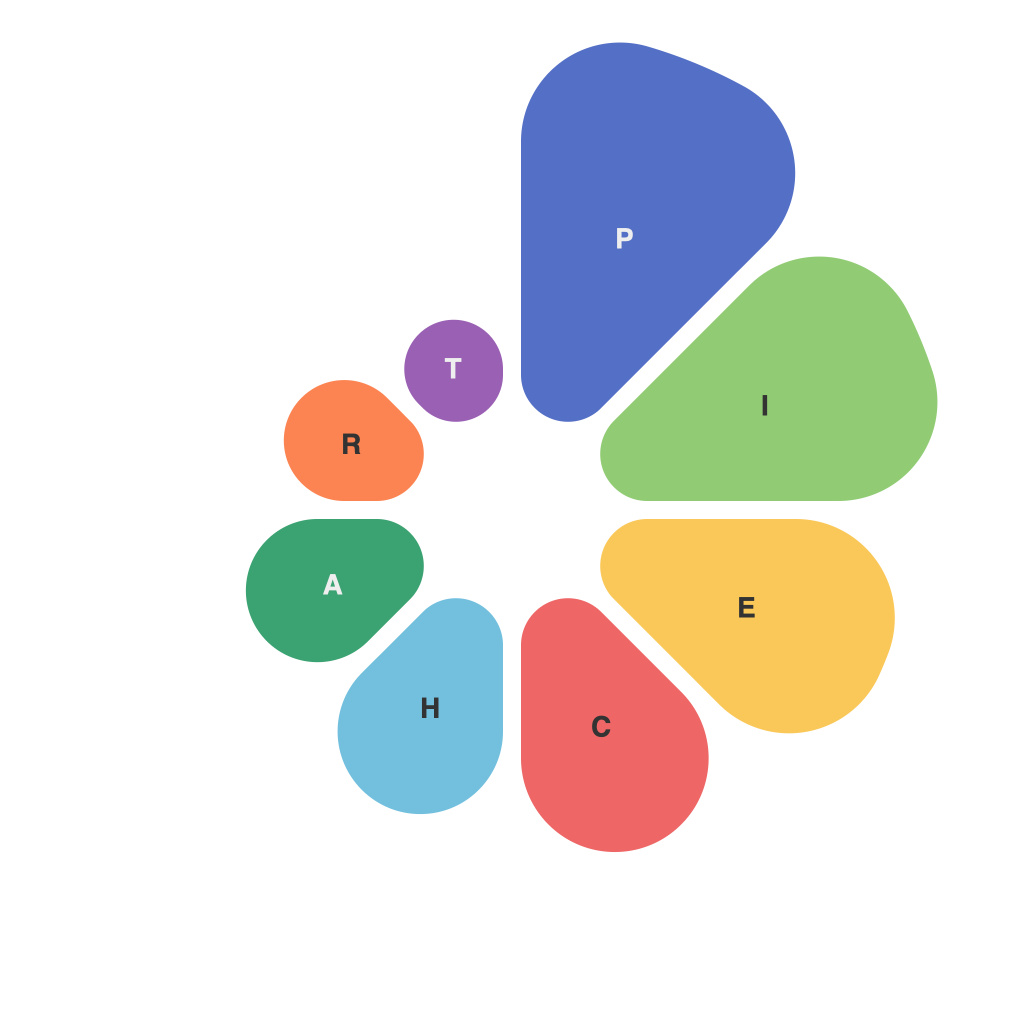
Data visualization plays a pivotal role in the presentation of information, often serving as the linchpin that connects complex concepts to their audience. Among the various graphical tools at our disposal, pie charts are a staple for illustrating proportions and percentages across a dataset. As the adage goes, a picture is worth a thousand words, and in the case of pie charts, the right one can encapsulate the narrative of a whole dataset within a single glance. This article endeavors to decode the art and science of designing irresistible pie charts that not only convey information effectively but also prove to be captivating and memorable.
Understanding the Purpose
The very first step in designing a pie chart lies in understanding its purpose. Pie charts, by their nature, are best employed to convey the composition or proportion of items that make up the whole. It’s critical to decide whether you are attempting to display relationships, compare values, or simply communicate the percentage distribution of data. Misaligning the chart to the wrong purpose can lead to misinterpretation or even confusion among viewers.
Pie Chart Design Best Practices
**1. Simplicity is King:**
Avoid clutter. Each slice of the pie should represent no more than one item of data. Including too many segments can make it difficult for viewers to discern individual slices, rendering the chart difficult to interpret.
**2. Color Palette:**
Use a consistent and logical color palette. Each slice should ideally stand out without overwhelming the viewer. Aim for colors that are either contrasting or complementary, and maintain a palette that reflects the overall theme or branding of your presentation.
**3. Labels:**
Incorporate clear, concise text labels. The labels should be easily readable and convey the exact nature of the data within each slice. Label placement is equally important—it should be easily legible without covering other text or elements.
**4. Legend Entries:**
Be cautious of the number of colors or legends to keep the chart easy to interpret. If there are several different slices, they should all be explained. The legend is often the first place viewers look, so keep it clear and concise.
**5. The Hole Situation:**
Consider cutting out a segment from the center of the pie chart, a technique known as a donut chart. This can help make smaller slices more discernible and can give the chart a modern feel. However, it’s important to keep the hole proportionate to maintain the shape of pie charts that are generally used for comparison purposes.
**6. Rotation:**
Angle or rotate your slices so they are not aligned along the horizontal or vertical axis. This can prevent cognitive biases (like a wedge starting at the 12 o’clock position being perceived as larger) and ensure that the chart is visually balanced.
**7. Data Accuracy:**
Ensure your data is accurate. Misrepresenting the data, even accidentally, can weaken the trust in your presentation.
**8. Avoiding Misconceptions:**
Be wary of using pie charts for data that doesn’t naturally fit the format. For instance, pie charts are not ideal for displaying trends over time, relationships between large and small numbers, or comparisons across diverse datasets.
When to Use a Variation
In certain scenarios, the traditional pie chart may not suffice, and it may be necessary to explore other types of visualizations:
– **Stacked Pie Chart:** Useful for layering data within segments to give a breakdown of subcategories within larger categories.
– **Exploded Pie Chart:** The most common slice can be isolated from the rest, emphasizing its importance.
– **Doughnut Chart:** Similar to a pie chart with a hollow center, useful for highlighting the internal relationships within a category.
Pie Charts in Action
The effective use of pie charts in communication can be exemplified across various fields; from business reports to educational resources. For instance, market researchers use pie charts to illustrate market share by company, health professionals depict the percentage of food groups in a balanced diet, and engineers can showcase the fraction of production that conforms to each quality standard.
In conclusion, the art of designing irresistible pie charts is a delicate balance between technical accuracy and visual appeal. An aesthetically pleasing chart that fails to communicate its message is a missed opportunity, while a technically sound chart that is unpleasant to look at can be equally detrimental. By understanding the purpose, applying design principles, and utilizing variations to suit the dataset, any data presentation can become more engaging and educational for the end-user. Pie charts, when done correctly, can indeed be a powerful tool in the communicators’ arsenal.

