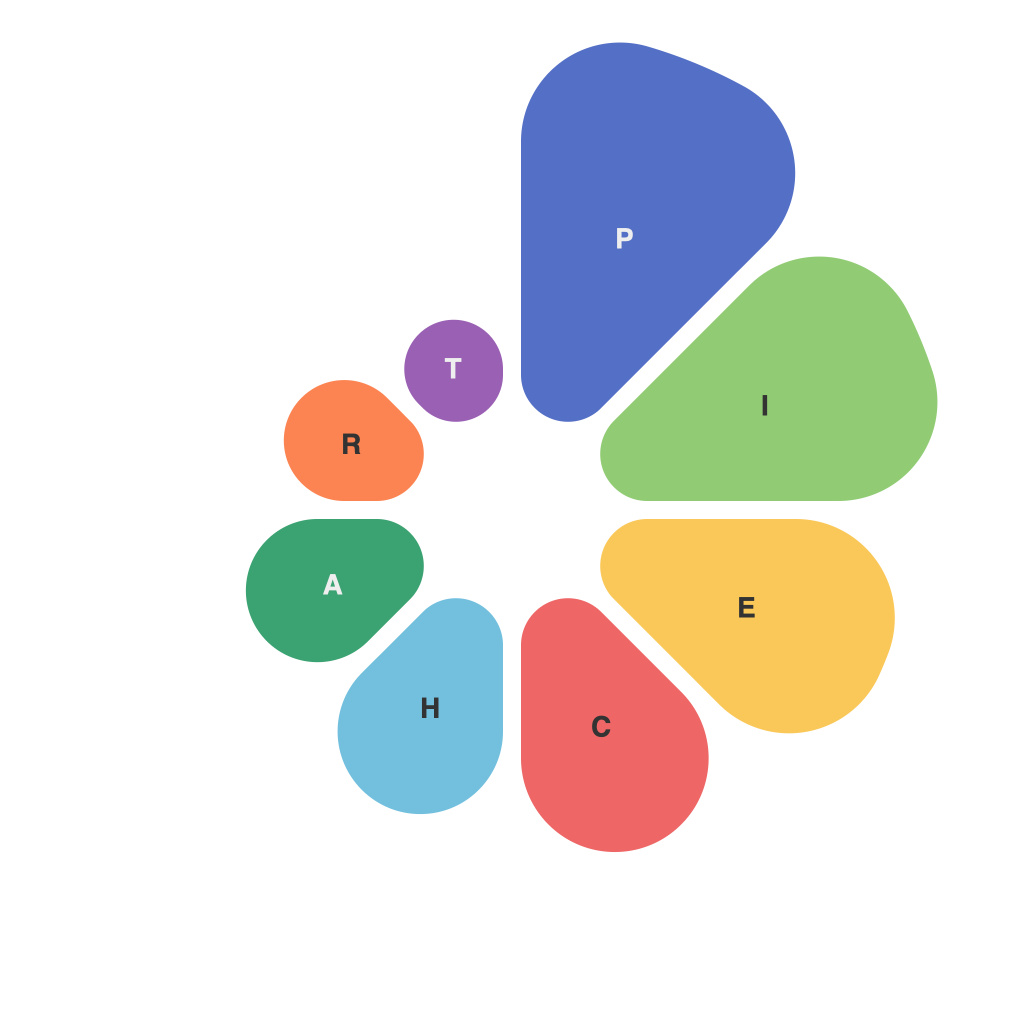
In our data-driven world, visualizing information has become an essential skill for making sense of complex and sometimes overwhelming datasets. Among the many visual tools available to the data analyst, the pie chart stands out for its simplicity and its ability to communicate information through intuitive visual cues. This article delves into how pie charts utilize diameter and color, harnessing the power of basic psychology to not only present data but illuminate trends.
The Diameter Dilemma
The diameter of a pie chart is its bread and butter. It visually represents the relative magnitude of parts within the whole, making it an excellent choice when the data is categorical and you need to compare the sizes of various components. The larger the pie slice, the greater the portion it represents. This means that the diameter directly impacts the viewer’s understanding of the pie chart’s core message.
When constructing a pie chart, certain considerations must be kept in mind to ensure that the diameter does justice to the message:
– **Proper Scaling:** For small datasets, increases in pie slice size are easily perceivable, meaning you can scale diameters with smaller intervals to highlight small differences. In contrast, larger datasets might benefit from wider intervals to avoid a muddled visual.
– **Whole vs. Parts:** The entire pie chart represents 100% of the data, while its slices are the parts. Ensuring a balanced pie—where no single slice is too large or too small—helps keep the visualization clear and not dominated by a single data point.
– **Diameter Distortion:** It’s important to recognize that pie charts can be misleading because of how our eyes interpret size. Rectangles tend to be perceived as larger when side by side than when stacked, which is known as the size illusion. Care should be taken to avoid creating a chart where the visual size of slices does not accurately reflect their actual magnitude.
Color: The Visual Vocabulary
Now, onto the colors that paint the picture. The color palette in a pie chart can significantly affect how viewers interpret the data. As with diameter, certain principles can help make color an asset to pie chart communication:
– **Contrast and Legibility:** The use of contrasting colors ensures that different slices are easily distinguishable. The more vibrant and varied the colors, the more likely it is that the viewer will be able to quickly differentiate between parts of the pie.
– **Color Logic:** Consistency in which colors represent which data points is crucial for clarity. A standard color-coding system can be established, and it’s important to maintain this system throughout any series of pie charts.
– **Color Psychology:** Depending on the aim of the chart, colors with various psychological associations can be chosen. For example, red might represent danger or high importance, while green can denote growth or success.
Pie charts’ color coding can also be made smarter by:
– **Subtlety vs. Saturation:** More subtle shades can help when trying to convey subtle differences between smaller slices, often enhancing the accuracy of data representation.
– **Sequential Coding:** Using a gradient or steps of color can create an intuitive sense of sequence, with viewers understanding the data in a chronological or categorical progression without being overwhelmed.
Introducing Trends: A Visual Journey
Pie charts go beyond just presenting data; they can illustrate trends when used in a series. By displaying multiple pie charts, side by side or as a timeline, trends over time can become clear:
– **Progression of Data Over Time:** By tracking changes in a series of pie charts, viewers can easily follow how data is distributed (or not distributed) over a specific period.
– **Comparative Analysis:** Side-by-side pie charts can quickly show comparisons without the need for numerical calculations or additional visual tools.
The Bottom Line
As a powerful and straightforward visual tool, pie charts are often misunderstood or overlooked in the vast landscape of data visualization. However, by leveraging the visual cues of diameter and color, pie charts can effectively communicate complex data trends in a format that is both informative and intuitive. By balancing these elements with respect to the data at hand and the audience it’s intended for, the pie chart can become more than just a chart; it can illuminate the insights within the data, turning numbers into a compelling visual narrative that resonates with even the most color-blind of viewers. In a world crowded with data, every insight becomes a step closer to understanding the story that it can tell.

