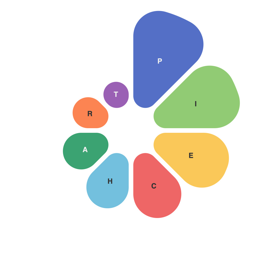
In the realm of data visualization, pie charts have long been a steadfast choice for conveying a single metric or aggregating parts of a whole. However, crafting effective pie charts is not merely about presenting a collection of circles; it’s an art and a science that demands consideration of both visual elegance and communicative clarity. Optimizing data visualization through well-designed pie charts can be transformative, aiding in the communication of complex information with simplicity and impact. Here, we delve into the nuances of designing pie charts that not only captivate the eye but also convey the intended message with precision.
Understanding the Objective
The first step in creating an optimized pie chart is to understand its purpose. Are you comparing various segments, or highlighting an anomaly? Defining this upfront helps to guide the design, keeping the end objective in focus.
Choosing an Appropriate Layout
The layout of your pie chart can either enhance its effectiveness or detract from its message. Simple pie charts often work best for a fewer number of segments, while more complex charts—like donut charts—suit scenarios where the center is an area of interest. Additionally, when dealing with a high number of segments, a pie of pies design could aid clear communication by nesting them into layers.
Segmenting Your Data
A pie chart divides the data into slices that add up to 100%. Deciding on the right number of segments is key. Too many, and the chart becomes hard to interpret; too few, and the chart may lose the granularity that’s necessary for understanding the data. Consider whether to use the sector angle or the percentage of the whole to visualize the segment sizes.
Color and Labeling
Color plays an essential role in differentiating segments effectively. Using a consistent, strategic palette with contrast ensures that the eye can easily discern where each segment starts and ends. Labeling each slice should be clear and to the point, allowing viewers to quickly identify and interpret each segment. Avoid overly complex labeling that may overwhelm the viewer.
Avoiding Pie Chart Pitfalls
Several common pitfalls plague the implementation of pie charts, including:
– Comparing slices that are too small to be accurately perceived.
– Not providing numerical benchmarks or percentages to support the visual cues.
– Using 3D effects that distort the accurate size perception of each slice.
– Inconsistent use of colors that could lead to confusion.
Enhancing Perception and Comprehension
While pie charts should generally be kept simple, there are ways to enhance their usability and appeal:
– Use animated transitions gently to help viewers follow along, but avoid excessively jarring movements.
– Incorporate interactivity to allow users to highlight a segment of interest, revealing more detailed information.
– Integrate legends or callouts to highlight certain segments that might warrant special attention.
Considering the Audience
Ultimately, an optimized pie chart is only as good as its audience’s ability to interpret it. Tailoring the design to the age, background, and familiarity of the audience can make a significant difference in how the information is perceived and understood.
Pie charts, despite being a staple of data visualization, are far from a static convention. Through thoughtful design and an emphasis on clarity, they can be powerful tools for communication. By delving into the intricate details of layout, data segmentation, color, and interactivity, visual communicators can craft pie charts that are not just informative, but also beautiful and impactful, thereby empowering data insights to resonate and motivate action.

