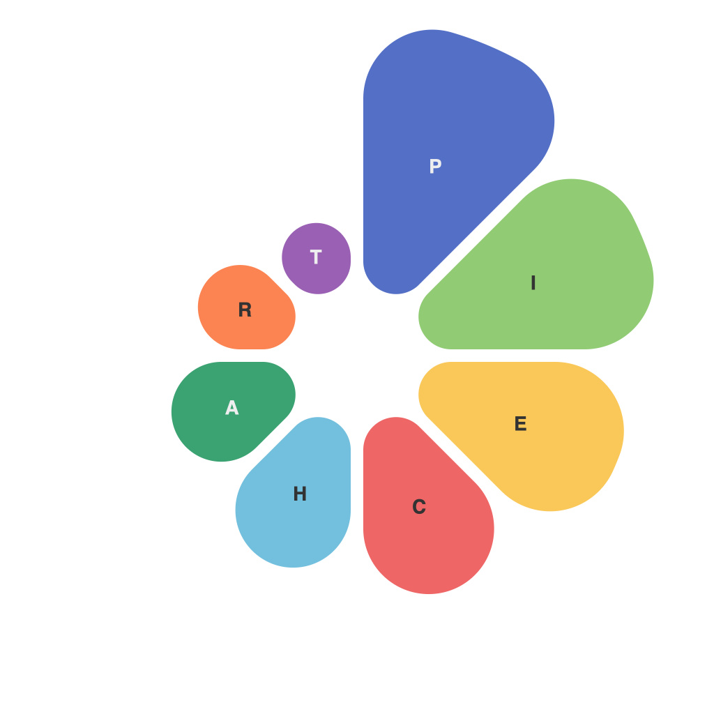
When it comes to data representation, the humble pie chart has been a workhorse for decades. It has become synonymous with breaking down complex information into easily digestible slices that convey at-a-glance meaning to a wide audience. However, what often goes unnoticed is the science behind the art of pie chart creation and understanding the “visual whys” that make them so impactful when it comes to data interpretation.
The Power of Perceived Simplicity
One of the most compelling reasons for pie charts’ popularity lies in their simplicity. The human brain readily comprehends circular forms and is hardwired to read from the center out, making the pie chart a powerful tool for distributing data around a focal point. It’s not merely the format that provides insight; it’s also how we interpret that information.
Color and Categorization
Color is a lingua franca across cultures and a fundamental aspect of pie charts. It’s no surprise that we use color to differentiate pieces of the pie, providing immediate visual cues that make interpretation easier. By choosing distinct colors, we can identify at a glance which categories are larger or smaller in comparison to the whole.
Understanding the “Slice of Life”
Pie charts excel at displaying proportions, and they illustrate percentages as pieces of a whole. Each slice represents a category, often with a name or a label that identifies the respective data. The bigger the slice, the more significant its percentage contribution to the whole. This direct comparison not only simplifies complex data sets but also aids the audience’s understanding of how various data points relate to one another.
The Limitations of Too Many Slices
While the simplicity of the pie chart structure is advantageous, overpopulation is a trap many data visualizers fall into. Too many slices make it difficult to discern individual pieces, reducing the chart’s effectiveness as a means of direct comparison. This common pitfall highlights the importance of data density – keeping the pie manageable with a limited number of slices allows viewers to process the relative values accurately.
Comparison is Key
Pie charts become truly powerful when used for comparisons. By overlaying multiple pie charts side-by-side or transitioning between them, one can see how different data points evolve over time, relate to each other, or behave under varying conditions. Layering data like this can reveal patterns and trends that might not be as evident in tabular or linear formats.
The Role of Size and Shape
Beyond the use of color, the size and shape of each pie slice can also communicate valuable information. For instance, a pie chart can incorporate a 3D effect to make larger pieces look distinct from smaller ones, or even be used to indicate a trend or an area of growth or decrease. By carefully manipulating the elements within the pie chart, one can subtly guide the viewer’s focus to specific data points.
Understanding Context
Pie charts can sometimes be misinterpreted if isolated from their context. To fully appreciate the data within a pie chart, it’s crucial to understand the source of the data and what it represents. Is the dataset complete? Are there any external factors that could influence the interpretation? A nuanced understanding of the context surrounding the data can vastly improve the accuracy of the viewer’s interpretation and decision-making.
Embracing the Visual Whys
In conclusion, the “visual whys” behind pie charts are rooted in the intricate dance of human perception and cognitive biases. They simplify the complex by dividing data into easily manageable pieces, utilize color and comparison to drive interpretation, and need to be approached with mindfulness to avoid falling prey to their limitations. Pie charts are not just about presenting data; they’re about unlocking insights and revealing stories within the numbers. For those who seek to communicate complex ideas effectively, understanding and utilizing the visual whys that make pie charts powerful tools is key.

