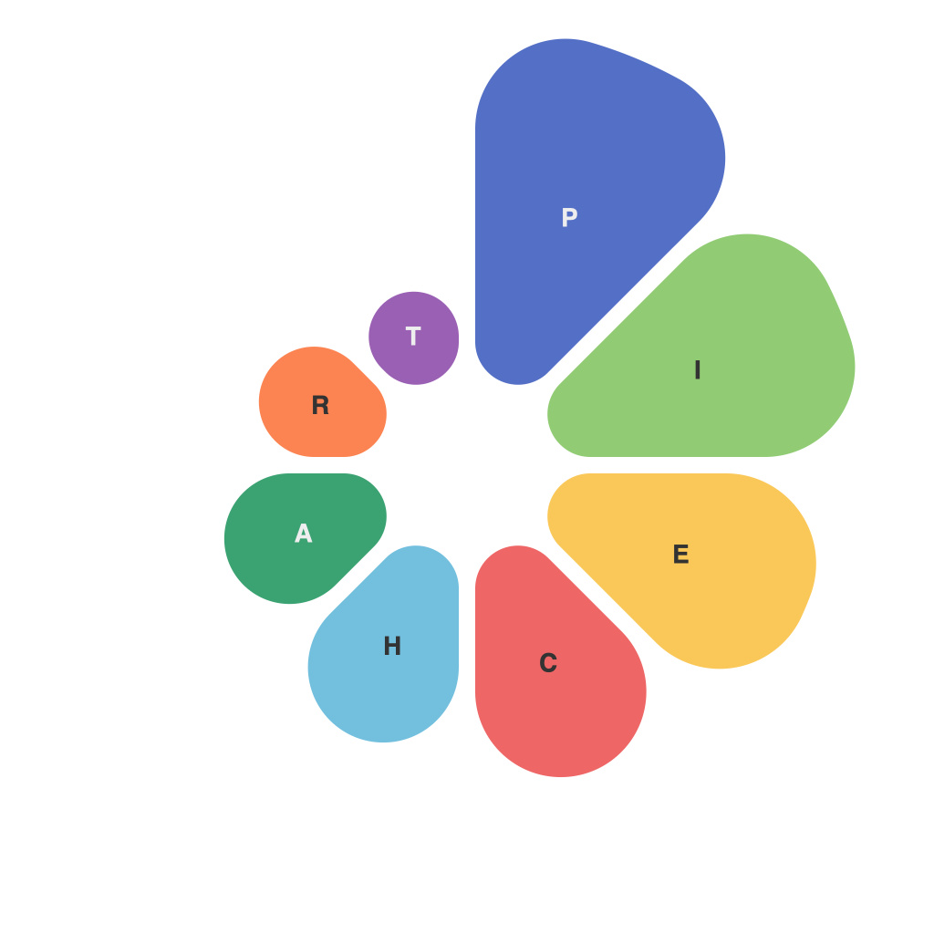
Mastering Data Visualization: A Comprehensive Guide to Creating Effective Pie Charts
Data visualization is the technique for presenting data in a graphical or pictorial form to facilitate better understanding, deeper insights derivation, and easy communication. Among the various data visualization tools, pie charts stand out because of their straightforward nature to interpret, especially for showcasing different parts of a whole. A well-designed pie chart can succinctly depict the proportion of each category compared to the total. However, crafting a pie chart that communicates both detail and clarity demands significant attention to its structure, aesthetics, and the narrative it delivers. This guide aims to demystify the process of creating effective pie charts by addressing essential components, pitfalls to avoid, and practical recommendations.
### Understanding the Data
**Identify the Purpose:**
Before plunging into the design, determine what the pie chart should reveal. Is it meant to compare parts of a whole or to show proportions? Understanding your goal guides the decision to use a pie chart.
**Data Collection and Quality Assurance:**
Gather accurate, meaningful data to represent. Poor data quality leads to misleading visuals and conclusions.
**Choosing Categories:**
Select categories that accurately represent the data’s composition. Pie charts are effective for up to five to seven categories. Beyond that, consider whether a simpler chart type or color-coded segment would be more appropriate.
### Designing the Pie Chart
**Preset Values:**
Always calculate the sizes of each segment to ensure they accurately represent the data. If using a pie chart to show proportions, each sector’s size visually mirrors the actual proportion in the data set.
**Labeling:**
Clearly label each category. Include labels either in the slice (near the center) or below the chart, ensuring readability. Avoid cluttering the pie chart with too many labels.
**Slices and Colours:**
Use distinct colors for each slice to enhance differentiation and reduce confusion. It’s advised to use a diverse color palette to cater to colorblind individuals as well. Consider using neutral colors for smaller segments to keep the chart uncluttered.
**Legends:**
If labels are too crowded or if too many categories are present, use a legend. However, strive for simplicity and clarity in its design.
### Best Practices and Pitfalls to Avoid
**Avoid 3D Effects:**
3D effects can create optical illusions leading to misinterpretation of data sizes. Stick to plane surfaces for accurate comparisons.
**Avoid Pie of Pie or Bar of Pie:**
Combine categories (especially those with smaller proportions) into a separate pie or bar chart to maintain clarity.
**Keep it Simple:**
Minimize the use of elements that don’t add to the chart’s content. This includes borders, shadows, and overly detailed backgrounds.
**Consistency:**
Maintain consistency in chart design across multiple visual aids within the same report to facilitate easier understanding and comparison.
### Conclusion
Mastering pie charts involves balancing visual aesthetics with data clarity and effective communication. By adhering to the principles outlined in this guide, one can create pie charts that not only attract attention but also provide meaningful insights. The key lies in considering the purpose, adhering to design best practices, and avoiding common pitfalls, resulting in impactful and easily interpretable visual representations. Stay mindful of your audience’s needs, and continuously evaluate the effectiveness of your visualizations, refining them for ever-improving clarity and insight.

