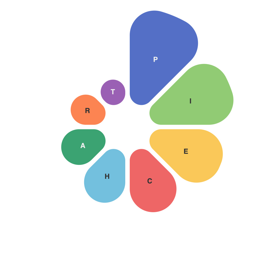
Data visualization has become an integral part of the modern workplace, and one of the most universally recognized methods for presenting data is through the use of pie charts. These circular diagrams, characterized by segments that represent proportions of a whole, are simple yet powerful tools for decoding complex information. In this article, we delve into the intricacies of pie charts, exploring their design principles, best practices, and the narrative potential they offer in visual presentation design.
The Circle of Life: Understanding the Design Core of Pie Charts
Pi charts operate within the framework of geometry, their design inherently based on a circle. This round shape reflects a natural fit for partitioning data into its constituent parts, much like cutting a pie. As visual elements, they are pleasing to the eye and intuitive to understand because every slice is clearly proportional to its share of the whole circle.
Pie Charts: The Mechanics and Elements
Designing a pie chart involves a series of fundamental mechanics and elements that must be meticulously controlled to ensure accurate and engaging data representation.
– **Slice Representation:** Each slice of the pie represents a category or a part of the data, with its size indicative of its proportion to the whole set of data.
– **Angle Measurement:** The angle of each slice corresponds to the numerical value of its data relative to the total sum. For example, if a piece of data accounts for 20% of the total, it will occupy a 20% of the pie’s circumference, meaning it will form a 72-degree slice.
– **Color Coding:** To differentiate data slices, color coding is often employed. It’s essential to choose colors that stand out from each other and won’t be confused with one another, and color schemes must be consistent across all charts presented.
– **Legend:** A well-placed legend will assist viewers in interpreting the color codes and understanding the segments of the pie chart without confusion.
Pie Charts: Design Do’s and Don’ts
While the concept of pie charts is straightforward, the design of a pie chart is an art form in itself. Here are some design best practices and common pitfalls to avoid:
**Do’s**
– **Limit the Number of Segments:** Overcrowding a pie chart with too many slices can make it challenging to perceive individual segments and distort the pie’s visual accuracy.
– **Ensure Readability:** Pay attention to label placement. Long slices require vertically aligned text or a rotated label to maintain readability.
– **Highlight the Most Important Data:** Use the largest slice to draw the viewer’s attention to the most important piece of information.
– **Choose the Right Size:** The size of the pie chart can affect the level of detail it provides. For larger datasets, consider using a 3D pie chart for depth perspective, but use this sparingly to avoid sensory overload.
– **Focus on Comparability:** In cases where direct comparison between slices is the goal, align the slices to a common scale, such as starting at the 12 o’clock position and angling them counterclockwise.
**Don’ts**
– **Avoid 3D Pie Charts:** 3D pie charts can be visually misleading, give too much emphasis to depth, and decrease accuracy.
– **Don’t Use Pie Charts for Large Datasets:** When there are too many slices or when they are significantly different in size, a pie chart can be overwhelming and difficult to interpret.
– **Don’t Clutter with Text:** Keep the design clean and focus on the core data points. Avoid the temptation to add过多 extraneous information such as lines or patterns within the slices.
Narrative Potential: Using Pie Charts as a Storytelling Tool
Pie charts are not just graphic representations of data but also act as storytelling devices. They present a narrative about the data by revealing patterns, relationships, and connections among the different segments.
When designing pie charts for a narrative purpose:
– **Connect with the audience:** Choose a style and colors that resonate with your audience and complement their biases, cultural preferences, or the story you aim to tell.
– **Use annotations or callouts:** To guide the viewer through your narrative, highlight particular slices with annotations or callouts.
– **Set the stage:** If pie charts are part of a larger presentation, make sure they fit in with the story arch of the presentation. The pie chart should complement the flow and enhance understanding, rather than distract from the main storyline.
In conclusion, pie charts, with their simplicity and circular symmetry, have become essential tools for communicating data visualization. By following best practices and avoiding common design pitfalls, pie charts can be beautifully designed, accurate, and above all, narratives in their own right, helping to tell the complex stories inherent in data.

