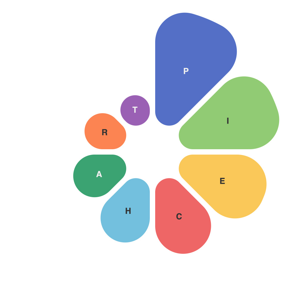
In the era of information overload, where data floods in from every direction and every imaginable source, the ability to present that data effectively is more critical than ever. Among the numerous charts, graphs, and infographics that compete for attention, the pie chart stands out as a simple, yet elegant, way to visually represent proportions and distributions. Whether you’re a seasoned designer or just dipping your toes into data visualization, mastering the pie is a skill worth cultivating. Here we present “The PieChartMaster’s Guide to Crafting Compelling Data Visualizations,” offering tools, tactics, and insights to help you craft stunning pie charts that tell the story of your data with authority.
**Understanding Pie Charts**
Before you start piecing together your own pie chart, it’s important to understand the basics. As a circular chart that slices up data into sections proportional to their value, the pie chart is a powerful tool for illustrating percentages. Understanding how to allocate sections and interpret the whole chart provides a foundation upon which masterful pie charts are built.
**Choose Your Subject Wisely**
Pie charts are best used when you have a finite set of categories and their associated proportions need to be understood at a glance. Avoid pie charts when your data includes more than a few sections—it leads to a complex, hard-to-read visualization. If you have categories that are similar in value, they can dilute the effectiveness of the pie, as well as cause readers to overlook their significance.
**Striking a Visual Balance**
Creating an aesthetically pleasing pie chart begins with the choice of colors and their distribution. The psychology of color plays an important role in perception. You can evoke different emotions and convey meaning with the right palette. The key is symmetry in your color selection, matching colors that are visually pleasing to the eye, and avoiding harsh contrasts that could be challenging to decipher.
**The Power of Labels**
Once you have your foundation of colors laid out, it’s time to label your slices. Ensure that your labels are legible against the background colors of the pie. The larger areas of your pie will likely host larger amounts of text, so make sure these are prominent. The best place for labels? Outside the pie, using an arrow or line to connect the label to its relevant slice. This method keeps labels away from each other’s interference.
**The Art of the Angle**
When dealing with sections that are nearly equal in size, it’s important to adjust their angles within the pie to accommodate the viewer’s eye. Slices should be evenly divided along the perimeter of the pie, ensuring a natural, logical progression for the reader. This requires some careful calculation if you’re planning to divide your data neatly into quarters or multiples of five.
**Avoiding the Aesthetic Pitfalls**
Overcomplicating your pie chart with 3D effects, shadows, or unnecessary decorative elements can detract from the clarity of the data. Keep your chart as clean and simple as possible. Also, steer clear of the “donut” approach unless the center space conveys additional meaningful information.
**Consider Data Interactivity**
In digital formats, the possibilities are vast. Adding interactivity allows users to select and isolate data slices, providing a deeper understanding of the pie’s components. Tools like d3.js and Google Charts can unlock an array of interactive options, making your pie chart more engaging and informative.
**Embrace the Right Tool for the Job**
The tool you select to create your pie chart will largely depend on your skill level and needs. Software like Excel, specialized data visualization tools such as Tableau or Power BI, or coding libraries like Matplotlib for Python are all viable options. Familiarize yourself with at least one and experiment with different features to create the best results.
**The Grand Finale: Composition and Layout**
When you’ve crafted the pie shape, applied your chosen colors, and positioned your labels, final touches can elevate your chart. The pie chart should be placed appropriately in your document or presentation, not overshadowed by other elements, but not lost in redundancy either. The composition should direct the reader’s focus to the data’s narrative without distraction.
Mastering the pie chart involves not just technical proficiency, but an understanding of design, color theory, and storytelling. By learning to craft compelling data visualizations, you’ll be well on your way to conveying complex information in a clear and engaging manner. Remember, a well-executed pie chart doesn’t just present statistics—it tells a story, a journey, and that’s exactly where the magic begins.

