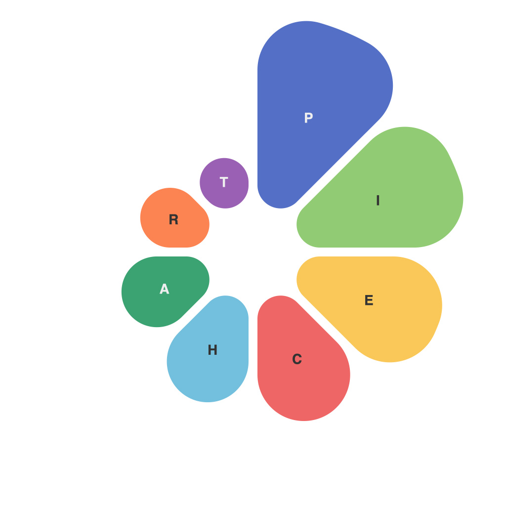
In an era where big data is the linchpin of modern business and decision-making, deciphering the complex mass of information is akin to unlocking ancient scrolls. This, indeed, is the purpose of data visualization – to translate jargon into understandable visuals. One of the most iconic and ubiquitous tools in the visualization arsenal is the pie chart. Despite its simplicity, pie charts hold significant power in conveying information effectively.
**The Art of the Pie Chart**
At first glance, a pie chart seems basic. It is a circular graph, typically divided into slices representing parts of a whole. The larger the slice, the greater the proportion it represents. The artist behind this infographic isn’t just an Illustrator; it is the art form of infusing information with clarity.
The beauty of the pie chart lies in its intuitive nature and the simplicity of its design. Just as a good painting evokes emotions without words, a well-crafted pie chart can resonate on a cognitive level. It allows viewers to immediately grasp proportions at a glance. Colors, labels, and other design elements contribute to the chart’s aesthetic appeal and its ability to convey information efficiently.
**The Science of the Pie Chart**
However, the science of pie charts is a careful balance between form and function. It’s not just about the way the chart looks, but how effectively it communicates information. Here are some of the fundamental principles that govern this artistic medium:
1. **Limit Slice Number**: Like the pieces of a pie, too many slices can overwhelm a pie chart. This concept is known as chartjunk – unnecessary details that do not serve a purpose other than to clutter the chart. The rule of thumb is to keep the number of slices under about 6 or 7, allowing viewers to discern each slice with ease.
2. **Order Matters**: How you position the slices in a pie chart can have a powerful psychological effect. Placing the largest slice first can establish a hierarchy or emphasis, directing viewers’ attention first.
3. **Colors and Patterns**: Contrasting colors help distinguish the slices while too much color can make the chart look garish. Patterns, while they can add interest, should also be used carefully to maintain clarity.
4. **Data Accuracy**: The accuracy of the chart hinges on the precision of the data used. Misrepresenting the information can mislead viewers, diluting the effectiveness of the chart.
5. **Contextual Use**: Not all data is suitable for a pie chart. Bar graphs, for example, are better for comparing discrete data points. But if a visualization’s purpose is to show relationships in proportions, a pie chart is often the go-to.
**Revelations in the Data**
The true power of the pie chart is its ability to tell stories. For instance, a corporate pie chart can reveal revenue distribution across departments, offering immediate insights into which areas are performing well or which need attention. A public health chart could illustrate vaccination rates, giving a clear picture of the epidemiological landscape.
Pie charts have revolutionized how we interpret information. They have not only become the currency of information designers but also the backbone of effective communication. When crafted with intention, they can make complex data comprehensible and inspire action based on that comprehension.
As the data visualization landscape continues to evolve, pie charts remain a time-honored tradition. In an age crowded with complex and overwhelming datasets, they stand as a testament to the power of simplicity. To decode data visualizations is to engage in a rich dialogue between the artist, the scientist, and the audience who finds significance in the revelation brought forth by the pie chart.

