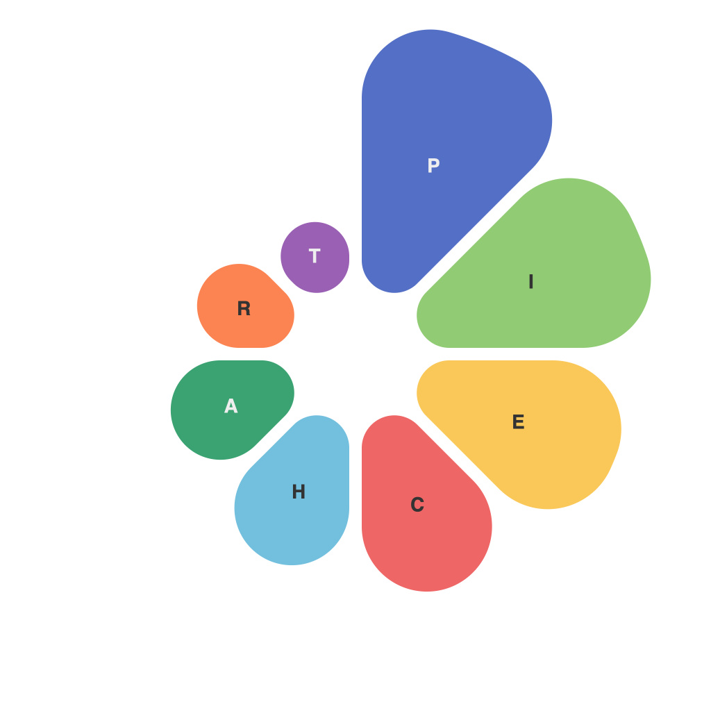
Visualizing data insights is an essential part of the data-driven decision-making process. While a multitude of visualization tools and techniques are available, pie charts stand out as a time-honored and widely used method. These circular graphics convey the proportion of different categories within a whole, providing a quick and accessible way for audiences to grasp complex information. This article delves into the art and utility of pie charts in data communication.
The Art of Pie Charts
Pie charts are often praised for their aesthetic appeal and clarity. The circular design mimics the natural symmetry of many real-world phenomena, making it intuitive to understand the relative proportions of the categories. The color scheme and labels add a layer of artistry that can enhance comprehension and retention.
The concentric circles of a pie chart create a visual hierarchy, with each segment representing a subset of the whole. The simplicity and familiarity of this format speak to the human brain’s propensity for pattern recognition, making it easier for viewers to perceive the relationships between the parts and the whole.
The Utility of Pie Charts
While pie charts are cherished for their aesthetic and psychological benefits, they serve a crucial role in the realm of data communication. Here are some key utilities of pie charts:
1. Quick Comparison: One of the primary strengths of pie charts is the ease with which viewers can compare the proportions of different categories in a dataset. A single glance at the chart can offer immediate insights into the distribution of data.
2. Storytelling: Pie charts are excellent tools for storytelling. By highlighting trends, anomalies, or the most significant segments, data storytellers can draw the audience’s attention to key points and drive the narrative of the data presentation.
3. Clarity in Representation: For datasets with a few categories, pie charts provide a straightforward and clear representation. This clarity is especially valuable in reports or presentations where audiences may be seeking a quick overview of the data.
Conventions in Pie Chart Design
To optimize the art and utility of pie charts, it is essential to follow certain conventions:
1. Minimal Segments: Ensure that the pie chart has no more than five to seven segments to maintain clarity. More segments can lead to overlap and confusion.
2. Color Palette: Use a consistent color palette that contrasts well with the background and with each other. This ensures that the viewer can differentiate between the segments easily.
3. Label Placement: Position labels in such a way that they do not overlap or obscure the data they are intended to describe. Sometimes, including the percentage value alongside the slice label can further enhance clarity.
The Downside of Pie Charts
While pie charts are useful, it is important to acknowledge their limitations:
1. Misinterpretation: Pie charts can be misinterpreted if not presented correctly. The human eye may inaccurately assess angles and proportions, leading to incorrect judgments about the data.
2. Overload: If used excessively, pie charts can lead to visual overload. When multiple pie charts are presented together, viewers may have difficulty comparing the data across the different charts.
Pie charts continue to serve as a vital tool in the realm of data communication, combining artfulness with utility. These circular graphics communicate data insights effectively by highlighting the proportion of categories and facilitating quick comparisons. As with any visualization technique, understanding its limitations and following best practices in design will ensure that pie charts contribute to successful data storytelling.

