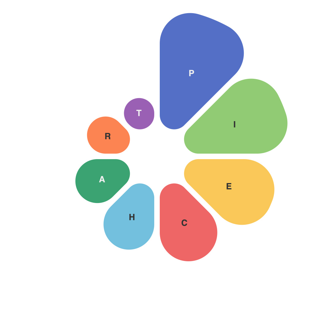
Pie charts have an enduring presence in data visualization, offering a simple and visually appealing way to represent data distribution. However, despite their widespread application, crafting a compelling pie chart requires more than just haphazardly piecing data points together. This guide delves into the intricacies of creating clear and impactful pie charts, providing essential pointers to elevate your data presentation and analytics.
Understanding the Purpose
Pie charts are best used when the goal is to illustrate proportion or percentage. They should be employed when you need a quick overview of components within the whole. However, one should cautiously use pie charts as they can be confused with bar graphs or have elements misinterpreted if the viewer is unfamiliar with the format.
Choosing the Right Data
To create a pie chart worth its salt, the data needs to be selected with precision. Here are a few tips for selecting the right data:
1. **Focus on Proportions:** Choose data with distinct parts to reflect the whole. Avoid overly complex datasets; the key is simplicity.
2. **High Variance:** Use pie charts for data points that are disparate from each other. The diversity aids viewers in understanding each slice separately.
3. **Stay Relevant:** Pie charts should represent data that is meaningful to your audience. Avoid unnecessary visuals that won’t be analyzed or appreciated.
Pie Chart Design Principles
Designing an effective pie chart involves adhering to a set of tried-and-tested principles:
1. **Color Palette:** Use distinct, high-contrast colors to differentiate slices. For those with color vision deficiencies, use patterns or line borders in place of colors to denote separate categories.
2. **Label Placement:** Ensure each slice of the pie has a corresponding label. Consider using a legend to simplify the inclusion of multiple data series.
3. **Labels and Values:** Labeling every slice with both a percentage and whole number enhances clarity. It also allows the audience to comprehend the size of each section relative to the others.
4. **Angle of Slices:** To avoid an overwhelming view, ensure that each slice is large enough to discern. The default is typically an angle of about 12 degrees, but this may vary based on your specific data and audience.
Pie Chart Variants: Donuts vs. Regular Pies
The classic pie chart is often referred to as a “doughnut” when rings or additional layers are introduced to the chart. Both have different strengths and should be chosen based on the goals of your presentation:
1. **Regular Pie Charts:** Best for showing the proportion of parts within the whole. This design is better when there are many distinct components for ease of reading.
2. **Donut Charts:** Suited for emphasizing the center while still showing proportions. They can be particularly useful when some elements contribute very small percentages, reducing the visual overload.
Common Pitfalls and Avoidance Tips
Numerous pitfalls can turn an otherwise effective pie chart into a data chaos or misinterpretation:
1. **Too Many Slices:** A pie chart with more than seven slices is challenging to interpret accurately. Try to condense data or use a different chart type like a bar graph.
2. **Incorrect Data Representation:** Always double-check your data and calculations to avoid misleading the audience.
3. **Inconsistent Slicing:** If using a donut chart, ensure equal slices, as this maintains an aesthetically pleasing and understandable design.
4. **Clashing Design Elements:** Be mindful not to overcomplicate your pie chart with too many design elements, such as texture or excessive shadowing.
Pie charts remain a valuable tool for presenting proportions and percentages. By applying this essential guide, one can ensure that the data is presented with clarity and impact. Consider the purpose, choose the right data, follow the design principles, and be aware of common pitfalls to craft pie charts that are not just visually appealing but also informative and meaningful.

