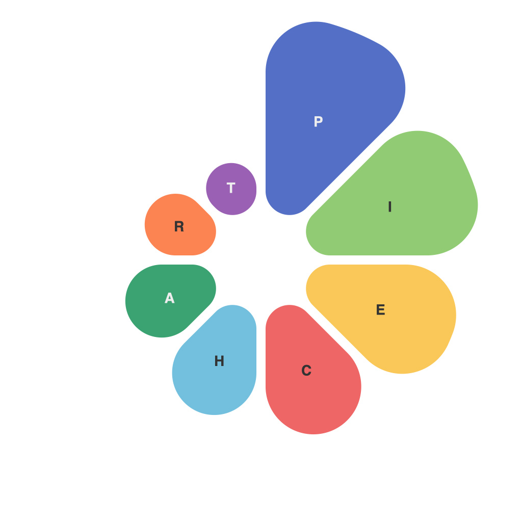
In the realm of data visualization, pie charts have been a staple for communicating complex information at a glance. However, crafting an effective pie chart can be a delicate balance between informativeness and estheticity. This article aims to decode the art of creating clear and appealing pie charts, ensuring that insights are communicated effectively while engaging the audience. We will delve into the fundamental principles behind pie charts, their uses, common pitfalls to avoid, and best practices for designing impactful pie charts that resonate with the intended audience.
**Understanding the Pie Chart’sPurpose**
The core function of a pie chart is to divide a whole into a series of proportional segments, each representing a portion of the total. Effective pie charts should be straightforward to understand, leaving no room for ambiguity. Understanding the precise purpose of each pie chart before beginning the design process is essential. Are you trying to show comparisons between different categories, or are you emphasizing the size of a single segment relative to the whole? This distinction will guide your design choices.
**ChoosingWhen to Use Pie Charts**
Pie charts are particularly useful when:
– Demonstrating proportions of a collection of items.
– Showing a single piece of data that compares multiple categories.
– Providing a bird’s-eye view of complex data.
They are not, however, suitable for:
– Displaying multiple variables on a single chart.
– Comparing values across more than two or three categories.
– When the individual values of each category are important.
– If the audience is more engaged with a linear relationship between the quantities.
**TheGeometry ofEffectivePie Charts**
Pie charts should:
– Be limited to six or fewer slices for better readability.
– Not exceed more than a 10% difference in size between the largest and smallest slice for the human eye to discern easily.
– Include a legend when needed to avoid clutter.
– Have consistent angles and sizes to maintain symmetry; avoid gaps if the data is evenly distributed.
**DesignElements toEnhanceCommunication**
The design of your pie chart plays a pivotal role in facilitating understanding. Consider the following tips:
– **Color Palette:** Use colors that stand out but are not too jarring. Color blindness is a prevalent issue; choose colors with sufficient contrast and ensure they are distinguishable by all viewers.
– **Labels:** Clearly label each piece of the pie with a category, percentage, and if possible, the corresponding raw number.
– **Title:** Provide a title that succinctly reflects the purpose of the pie chart.
– **Annotation:** Highlight specific data points with calls to action or annotations to draw attention to important details.
**Minimizing Clutter andError**
Certain elements can detract from the clarity of your pie chart. Avoid the following:
– **Superimposed Layers:** These may overlap and obscure slices, making information difficult to parse.
– **3D Effects:** Adding depth can distort the perception of sizes, leading to misinterpretation.
– **Gradients:** They can cause the human eye to perceive the sizes incorrectly.
– **TooManyPieCharts:** Be wary of using pie charts excessively, as they can dilute the impact of each.
Pie charts are powerful tools when used correctly. By focusing on the purpose, design elements, and avoiding common pitfalls, you can craft clear and effective pie charts that convey important insights and engage the audience. Whether you are a business professional, a data analyst, or a student, understanding the art of pie chart design can greatly enhance your ability to communicate information in an impactful and accessible manner.

