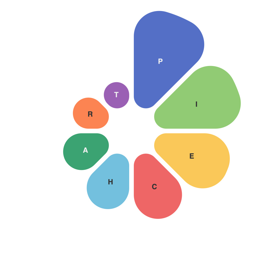
Creating informative and engaging pie charts is a fundamental skill for anyone involved in the fields of data analysis, communication, or visualization. These graphical representations are particularly effective in depicting proportions and components of a whole, making complex data easily comprehensible. This comprehensive guide is designed to equip you with the tools and insights necessary to create compelling pie charts that not only attract attention but also convey data in an accurate and impactful manner.
1. **Understanding Pie Charts**: Pie charts illustrate the relative importance of each part of a whole. They are commonly used when a data set can be broken down into discrete categories. Each slice, or sector, represents a category’s contribution to the total.
2. **Data Preparation**: Before you begin creating a pie chart, ensure your data is clean and organized. Check for missing values and outliers that might skew your results. This preparation is crucial for ensuring the accuracy of your chart.
3. **Choosing the Right Software**: Select a tool that suits your needs. Popular options include Microsoft Excel, Google Sheets, Tableau, and specialized data visualization software like ECharts or Datawrapper. Each tool offers different features, so choose one that caters to your level of expertise and is compatible with your data.
4. **Design Principles**: Design your pie chart considering the 5W approach: Who are your target audience, What data are you portraying, Where will the chart be displayed, When is the chart to be displayed, and Why are you presenting the results. This ensures that the chart resonates with your audience and effectively communicates your intended message.
5. **Color Selection**: Use color responsibly. It should aid in distinguishing different sections but not overwhelm the visual. Avoid using too many colors; typically, no more than five colors should be used per chart. Colors should also be accessible, considering the needs of color blind individuals.
6. **Labeling**: Clear and concise labels—both text and numbers—are essential. Avoid cluttering the chart with too much text; only label slices that convey significant information. Use percentage values in the legends or directly on the slices if space allows.
7. **Using Slicers**: Grouping similar slices together can enhance readability. This is especially useful in charts with many categories or when the categories are logically grouped.
8. **Avoiding Misrepresentation**: Ensure there are no misleading visual effects such as 3D effects that can distort the size perception of the slices. Also, avoid exploding charts where sectors are pushed out, which can also alter the viewer’s perception of proportions.
9. **Comparing with Other Charts**: Consider whether a pie chart is the right choice. For instance, pie charts can struggle with data complexity as they may become confusing with too many categories. Look into alternatives like bar charts, line graphs, or stacked bar charts depending on the nature of your data.
10. **Accessibility and Aesthetics**: Balance aesthetics with accessibility. Ensure that the chart is not only visually pleasing but also accessible to all viewers. This includes using high-contrast color schemes, clear font sizes, and high DPI images for print.
11. **Review and Revise**: Once your pie chart is created, review it for any errors and ensure it is communicating the intended message effectively. Feedback from peers or the intended audience can provide valuable insights to improve the chart further.
By following these guidelines, you can create pie charts that are not only visually appealing but also highly informative and effective in communicating your intended data. Pie charts, when executed correctly, can significantly enhance data analysis, making complex information accessible and understandable to a wide audience.

