**Unlocking the Power of Visualization: Mastering Pie Charts for Effective Data Communication**
In the grand theater of data storytelling, one tool stands out as indispensable: the pie chart. Much like an actor on stage who captures the audience’s attention with just a glance, pie charts bring clarity and impact to the realm of data presentation. As data grows more complex and voluminous, the importance of using visualization tools to convey insights becomes paramount. This guide aims to debunk the mystery of pie charts, equipping you with the knowledge to wield them with expertise, turning data into tales that speak volumes.
### What are Pie Charts?
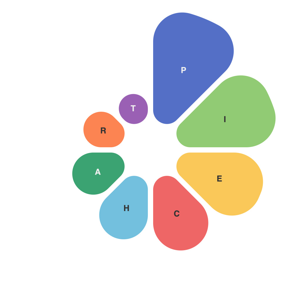
Pie charts are graphical representations of data where the entire figure is divided into sectors or slices. Each slice represents a proportion of the whole, visually demonstrating how the total is divided among various categories. They are quintessential in representing data where the main focus is on showing parts of a whole, making it easier to grasp the relative sizes of each component with a glance.
### When to Use Pie Charts
Pie charts are at their most effective when:
1. **Distinct Categorization is Key**: When the data is divided into distinct parts, like market share across different competitors or budget allocation across categories.
2. **Limited Categories**: They are most legible with 5-7 slices. When there are more than this, they can become cluttered and difficult to interpret. For larger datasets, consider using a bar chart or stacked bar chart instead.
3. **Emphasizing Proportions**: When the emphasis is on showing how each component contributes to the total, like percentage breakdowns in revenue or demographic compositions.
### Techniques for Effective Pie Chart Design
1. **Simplify with Precision**: Limit the number of slices to ensure clarity. More than five categories might require exploration of another chart type.
2. **Label Effectively**: Always label slices, especially those above 25%, and consider the use of legends if pie charts aren’t large enough to accommodate labels.
3. **Consistent Use of Color**: Use color to distinguish slices but avoid overly bright or clashing colors which can distract from the data being presented.
4. **Avoid 3D Effects**: 3D pie charts can distort perceptions and make interpretation more challenging, so stick to a flat design with consistent thickness for all slices.
5. **Highlight Key Data Points**: Use a different color or a larger slice size to draw attention to a particular category, reinforcing its significance in the narrative.
### Common Pitfalls and How to Avoid Them
– **Misleading Comparative Insights**: Pie charts are not ideal for comparing data across multiple charts. For comparisons, consider using bar charts or line graphs instead.
– **Overloading Data**: More is not always better. Too many slices can make your chart hard to read. Simplify by grouping smaller categories into an “other” category.
– **Lack of Zero Baseline**: Without a baseline, it’s unclear how ‘big’ the slices really are, making comparisons across charts difficult. Include the total value or ensure there’s a frame that clearly shows the scale.
### Conclusion
Pie charts, with their charm of simplicity and elegance, hold a unique place in the data visualization toolkit. They are not only beautiful graphics, but also powerful tools for communication. By understanding when to use them, effectively designing them, and mindfully avoiding common pitfalls, you can unlock the full potential of pie charts to enhance your data stories. Embrace the power of visualization to ensure your data’s message is received, understood, and appreciated.

