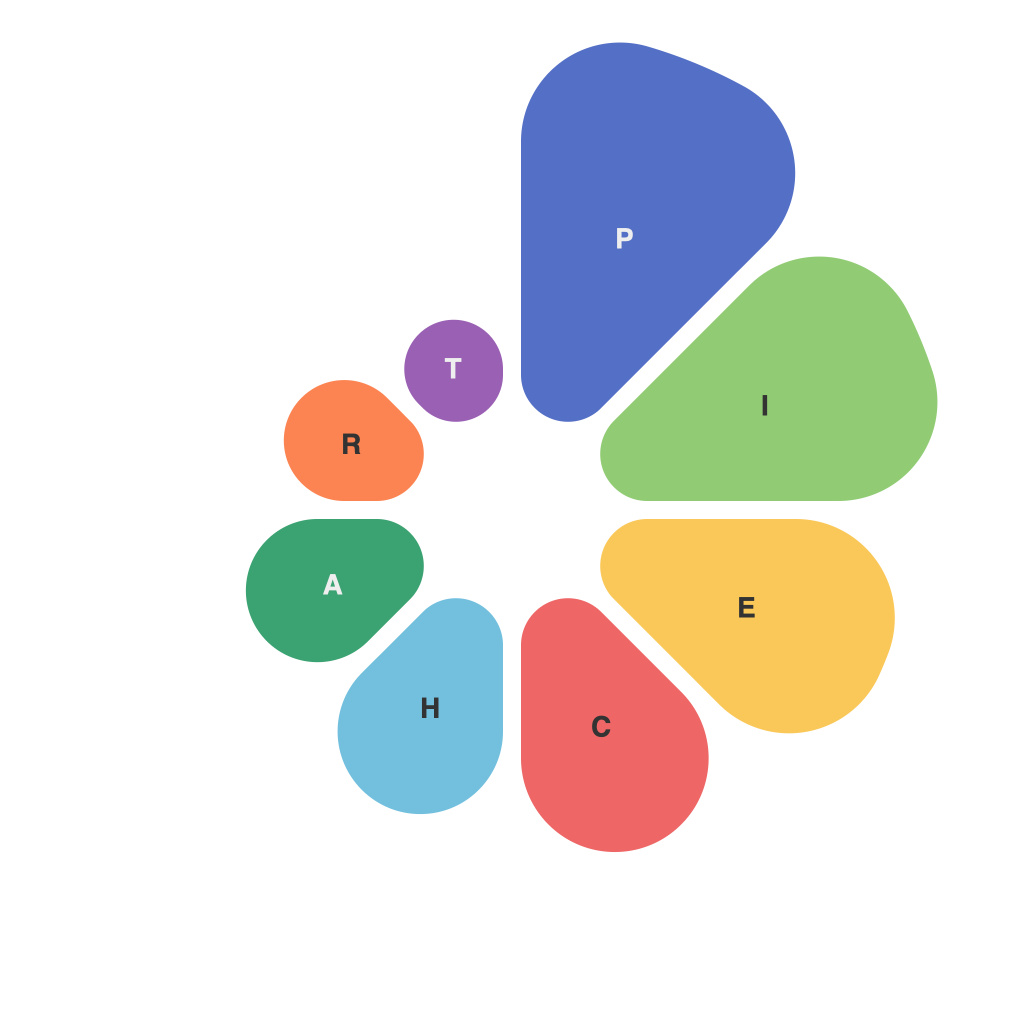
Mastering Your Pie Chart Visualizations: A Comprehensive Guide by PieChartMaster
Pie charts have long been a cornerstone of visual data representation. Initially introduced in Charles Joseph Pohlmann’s Pie Charts (1786), this type of chart has been integral to understanding distributions and proportions in data. From business analysts presenting market shares to social scientists illustrating demographic distributions, pie charts stand as a universally accessible visual tool. As a dedicated enthusiast in the field, I’ve distilled my years of experience into a comprehensive guide to help you grasp the art and science of pie chart visualizations.
### Understanding the Basics
**1. Composition**: A pie chart is divided into segments, each representing a part of the whole. The size of each segment reflects the proportion of the corresponding value in relation to the total data set.
**2. Labels and Slices**: Each slice must be labeled with the corresponding category and, ideally, the percentage it represents of the total. This labeling is key for easy comprehension and accurate interpretation.
**3. Color Coding**: Using distinct colors for each slice can enhance readability, particularly when comparing multiple pie charts. Choose a palette that distinguishes shapes well and is accessible to colorblind viewers.
### Design and Presentation Principles
**1. Limit the Number of Slices**: Typically, pie charts should not exceed five slices; any more and they risk becoming visually overwhelming. If you have more categories, consider grouping them into an “other” category or reformulating the data to use a stacked bar chart.
**2. Avoid 3D and Shadows**: These elements often distort the true proportions and increase complexity without adding value.
**3. Consistency in Data Representation**: Ensure your data is aggregated in a way that directly correlates with the chart’s objective, free of extraneous or contradictory data points.
### Choosing the Right Data Type
Pie charts excel in scenarios where data can be categorized into distinct chunks that represent parts of a whole. They are particularly effective for:
– **Comparing parts of a whole**: Examples include market shares, budget allocations, or demographic compositions.
– **Displaying proportions clearly**: When the relationship between parts and the whole is crucial, and the data can be easily summarized.
### Crafting Engaging Pie Charts
**1. Clearly Identify the Total**: Start by expressing the total value of the data set the pie chart represents. This immediately informs the viewer about the scale they’re dealing with.
**2. Use a Diverse Color Palette**: Employ a spectrum of colors that not only enhances the visual appeal but also increases the chart’s readability and accessibility for colorvision impaired viewers.
**3. Order Slices Logically**: Arrange slices so that those of similar size don’t obscure one another. An order from largest to smallest slice can also help users easily compare and discern between larger and smaller proportions.
**4. Include Legends if Necessary**: While labelings are crucial, a legend can be useful when the chart becomes too intricate or when too many similar looking slices are introduced.
### Interactivity and Animation: Enhancing the Viewer’s Experience
In digital formats, incorporating hover effects that detail the percentage and slice descriptions can deepen engagement. Slow and gentle animation during data transitions can also aid in presenting time series data, making it easier for viewers to comprehend trends over time.
### Summary
Mastering the craft of pie chart visualizations involves a combination of data insight, design acumen, and audience comprehension. Remember, the goal of a pie chart is clarity and accessibility. By adhering to best practices and principles outlined in this guide, you’ll be well on your way to creating compelling, informative pie charts that effectively communicate your data’s story.

