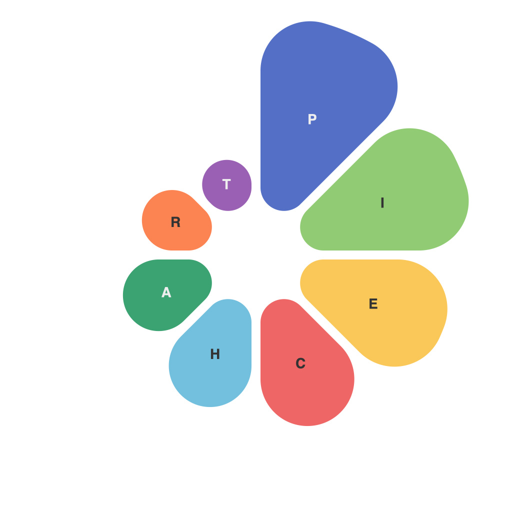
Pie charts have been a staple in the data visualization toolkit for centuries. They’re simple, familiar, and can be quite effective when used properly. However, pie charts can also be misunderstood and misinterpreted, leading to confusing visualizations. In this comprehensive guide, we’ll walk you through the best practices for creating pie charts that communicate your data with clarity. Whether you’re a data visualization novice or a seasoned expert, you won’t want to miss the advice that follows.
**Understanding the Basics of Pie Charts**
Firstly, let’s start with the basics. A pie chart presents data in a circular chart divided into segments, each representing a numerical proportion of a whole. The idea is that a full circle is synonymous with 100%, so each segment’s size reflects the relative value of that particular piece of data.
One of the most significant aspects of a pie chart is its simplicity. It’s usually quite easy to interpret at a glance, especially when you’re comparing two or three pieces of data. Yet, this simplicity is also its greatest challenge. Pie charts can become cluttered and misleading when overused or when you have too many segments. Knowing when and how to use them effectively can significantly improve how you communicate complex information.
**Choosing When to Use a Pie Chart**
You should choose to use a pie chart when:
– The data consists of distinct categories that must be compared as percentages of a whole.
– You aim to make a simple comparison between no more than 6 different pieces of data.
– You want to highlight a specific category for emphasis.
– You want to create an informative visual that is easily understandable at a glance.
However, steer clear of pie charts when:
– You have over 6 segments, as it becomes difficult for viewers to intuit the size of each segment accurately.
– You need to show the composition of a whole, but the individual pieces are not easily differentiated.
– You require viewers to precisely compare data segments or proportions.
– You’re attempting to show a continuation of changes over time, as time-series data is best presented in a line or bar chart.
**Creating a Pie Chart like a PieChartMaster**
Here’s how to create a pie chart that will impress even the most seasoned data visualizers:
1. **Start with the Data**: Begin by getting your data in place. If using Excel or a spreadsheet, the software will typically have a pie chart function that you select and the program will create the chart based on your input.
2. **Use a Clear and Logical Color Scheme**: Give each segment of the pie a distinct color, making sure that the colors are easy to differentiate. Use a consistent color scheme throughout your data visualizations for further clarity.
3. **Lay Down the Labels**: Label each segment clearly to indicate which category it represents. Remember, the goal is to help viewers understand data, not to confuse them. A good strategy is to include a legend outside the pie chart, if necessary, or directly next to each segment.
4. **Optimize the Layout**: It can be a good idea to include the percentage data within each segment for instant reference. Conversely, you can place the percentage label outside the chart, which is preferable when the pie chart features more than a few segments.
5. **Consider the Direction**: The direction in which segments are arranged is usually a matter of preference. However, certain arrangements can make the chart more intuitive for some audiences, such as placing larger segments towards the right of the chart or placing the largest segment at the top corner.
6. **Go Beyond the Baseline**: Get creative with the appearance of your pie chart. You can add subtle visual enhancements like shading or a subtle border to each slice to make them pop, so long as these don’t distract from the overall purpose of the chart.
**Common Pitfalls and How to Avoid Them**
– Avoid starting the legend or labels at 0%. Since pie charts start from the center at 12:00, beginning with zero could suggest 0% at the 12 o’clock position, which isn’t accurate.
– Never place text inside a segment unless it can’t be placed elsewhere due to space constraints. It should be readable at a glance; don’t force your audience to squint.
– Be wary of too many decimal places in segment values. It can clutter the chart and create clutter that’s difficult to interpret.
– It’s best to use a pie chart with discrete numeric data and avoid using them when values are continuous, such as in a time-series context.
By following this comprehensive guide, you’ll be well on your way to mastering the art of pie charts. Remember, when used correctly, they are a powerful tool for conveying information quickly and effectively. Approach your design with knowledge of the principles that make for a good pie chart, and be mindful of your audience’s needs. With a bit of practice, you’ll soon be crafting pie charts like a true PieChartMaster.

