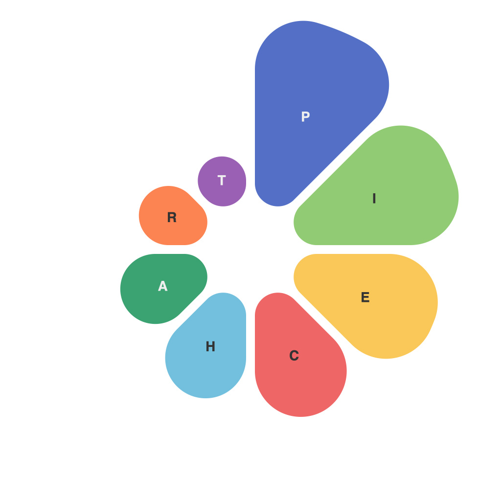
As a data viz enthusiast or an aspiring one, mastering the piechart palette with PiechartMaster can elevate your data storytelling to new heights. Pie charts are a popular tool for representing data, but their effectiveness hinges heavily on the appropriate selection of colors. This guide will equip you with the knowledge and skills needed to conquer the piechart palette with PiechartMaster.
### The Significance of Piechart Palette
Colors are not merely visual adornments; they convey meaning and evoke emotions. In pie charts, the palette choice significantly influences the readability, perceived importance, and the overall message of the data. PiechartMaster is designed to streamline the process of selecting a palette that aligns with your data interpretation goals.
### Understanding PiechartMaster
PiechartMaster is an innovative tool that simplifies the selection and management of color palettes for pie charts. The platform offers a broad array of options, ensuring that you can find a palette that conveys the story behind your data effectively.
### Step-by-Step Guide to Mastering the Piechart Palette with PiechartMaster
#### Step 1: Launching PiechartMaster
– Visit the PiechartMaster website and log in to your account.
– Access the dashboard, which provides a comprehensive overview of the available tools and resources.
#### Step 2: Selecting Your Data
– Upload your data into the system or import from an external source.
– Ensure your dataset is correctly formatted for a pie chart. The data should ideally consist of categories and their corresponding values.
#### Step 3: Choosing a Color Scheme
– Navigate through the color scheme options available in PiechartMaster’s interface.
– Consider the type of story you want to tell and the emotions you wish to evoke.
– If you have domain-specific knowledge, use this to guide your color choice.
#### Step 4: Customizing Your Palette
– Modify your selected palette by adjusting the hue, saturation, and lightness of the individual colors.
– Ensure that your colors are high contrast to enhance visibility and make your pie chart more accessible.
#### Step 5: Visualizing Your Data
– Generate a pie chart using the customized palette.
– Analyze the pie chart’s visual impact, ensuring that it effectively communicates your message.
#### Step 6: Iteration and Refinement
– Make adjustments to the color scheme as needed, either based on feedback or to refine the communication of your data.
– Repeat the visualization process until you are satisfied with the visual representation.
### Best Practices for Choosing a Piechart Palette
– **Complementary Colors**: Select complementary colors for distinct, but harmonious contrast.
– **Neutrality**: Use a palette dominated by neutral tones for a sleek, professional look.
– **Color Psychology**: Consider cultural and contextual elements; for instance, red is often associated with danger but can also signify important data points.
– **Consistency Across Reports**: Maintain a consistent palette throughout your data visualizations to ensure brand recognition and ease of comprehension.
### In Conclusion
Mastering the piechart palette with PiechartMaster is an invaluable skill in the realm of data visualization. By following these steps and adhering to best practices, you can leverage the power of PiechartMaster to tell engaging and impactful data stories that resonate with your audience. With the right palette, your pie charts will no longer be merely representations of data points, but dynamic storytelling tools for all to comprehend and appreciate.

