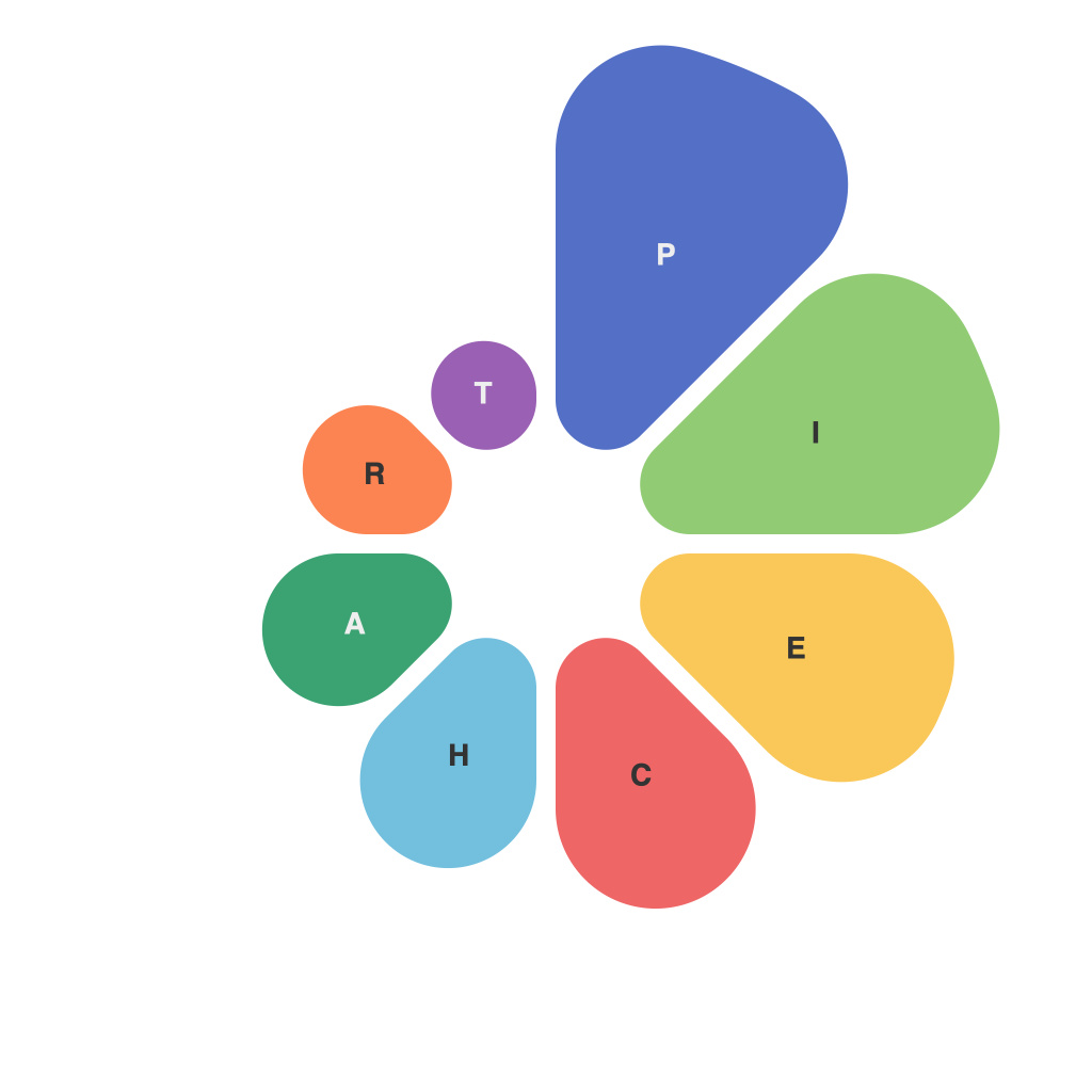
In today’s data-driven world, one of the most crucial skills is the ability to present complex information in an intuitive and visually appealing manner. Pie charts, with their broad appeal and clear format, have long been a favorite among data analysts and communicators. However, the creation of a truly perfect pie chart is not as straightforward as it seems. Enter PieChartMaster, a master of the art, whose meticulously crafted pie charts have become the gold standard of data visualization. This article delves into the secrets behind PieChartMaster’s perfect pie charts, offering you the insights needed to become a connoisseur of your own.
**The Philosophy of PieChartMaster**
PieChartMaster has long held that good design begins with a clear understanding of the purpose behind the pie chart. Each chart is crafted with a specific audience in mind, ensuring that the data speaks to the viewers’ needs and goals. Whether it’s to persuade, inform, or motivate, PieChartMaster meticulously designs each chart to accomplish its goals efficiently.
**Simplicity as the Core Strategy**
At the heart of PieChartMaster’s pie charts is the principle of simplicity. Clutter and distraction are the enemies of clear communication. PieChartMaster’s approach involves showcasing the data in its purest form. This means:
– **Limited Number of Categories**: Only include the most relevant pieces of information within the pie. Any additional pieces dilute the impact and readability of each slice.
– **Clean Edges and Smooth Arcs**: A professional-looking pie chart has evenly cut segments with smooth edges, making it easier for the eye to follow the divisions.
**Color: The Art of Categorization**
In the realm of visual data representation, color is the language that brings meaning and relevance to the data. PieChartMaster’s selection of colors is as strategic as the data itself:
– **High Contrast Colors**: They stand out from each other and from the pie chart itself, ensuring that the viewer can distinguish each category immediately.
– **Thematic Color Pallets**: Depending on the nature of the data, PieChartMaster selects a color scheme that aligns with the data’s thematic context.
**Labeling for Clarity**
Labels are not an afterthought in PieChartMaster’s vision but an integral part of the communication process. Here’s how PieChartMaster ensures label clarity:
– **Readable Fonts**: The chosen fonts should never hinder the readability of the text. Clear fonts like Arial or Calibri work best, although PieChartMaster is open to using bold fonts or italics to enhance information hierarchy.
– **Contextual Labels**: Labels are placed in a way that they make sense within the context of the data. This may involve positioning them within the slices, against the pie’s wall, or along the border. The goal is to make them easily discernible and intuitive.
**Understanding Proportional Sizing**
Pie charts are inherently proportionate, and it’s this inherent property that makes them powerful. However, the importance of ensuring that each piece of the pie is accurately scaled according to its data value cannot be overstated. PieChartMaster maintains the following practices:
– **Consistent Proportions**: Whether the slices are tiny or vast, the consistent size of arcs ensures accurate representation.
– **Minimal Variation**: While there are instances where slight differences in angles can add readability, PieChartMaster seeks to keep these variations to a minimum to avoid misleading representations.
**Engaging the Viewer’s Eyes with Layout**
The arrangement of the pie chart within the frame plays a significant role in the viewer’s engagement. Here’s what PieChartMaster focuses on:
– **Centered Design**: Placing the pie chart in the center allows the viewer’s eye to easily scan and understand the distribution.
– **Balance and Harmony**: Ensuring the pie is well-positioned within the frame, neither overflowing nor being too crowded at the edges, for a balanced composition that enhances visual appeal.
**Incorporating Callouts for Additional Insight**
Pie charts often benefit from additional data points presented outside the pie itself to drive home the key messages:
– **Callouts for High Impact Data**: Use callouts to highlight significant insights or outliers, drawing the viewer’s attention to the most important information.
– **Strategic Placement**: Callouts should be positioned where they do not occlude other data or text, ensuring their value is not lost on the viewer.
**Conclusion**
The pursuit of the perfect pie chart may seem elusive, but with PieChartMaster’s proven strategies, it becomes eminently achievable. From the simplicity of design to the strategic use of color, labeling, and layout, the secrets revealed in this exploration will empower you to create pie charts that not only present information effectively but also engage and inform your audience. By mastering these elements, you too can become a PieChartMaster in your field of data visualization.

