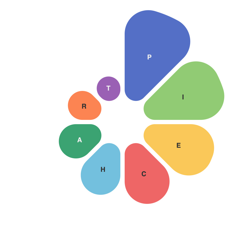
In today’s data-driven world, the ability to decipher mountains of raw information into meaningful insights is a crucial skill. One of the many tools in the graphic designer’s arsenal is the pie chart, a simple yet effective way to represent data visually. Conquering the art of pie chart creation is not just about technical skills; it’s about understanding the nuances of data presentation to communicate complex ideas clearly and persuasively.
**Understanding the Basics**
The essence of a pie chart is straightforward: it visually breaks down a data set into slices that correspond to various parts of a whole. Each slice represents a different category, while the entire pie symbolizes the sum of all categories. In mastering this graphical technique, you not only learn how to craft accurate and appealing charts but also gain insight into the principles of data story-telling.
**Choosing the Right Data for Pie Charts**
The first step in mastering pie charts is understanding when to use them. Because pie charts can become confusing and less informative with large numbers of categories, it’s best to use them for simple data sets with two to seven categories. Additionally, pie charts are more successful when you are trying to show simple proportions and not precise quantities.
**Designing Clear and Balanced Pie Charts**
The design of your pie chart can significantly impact its ability to communicate data effectively. Here are some key considerations when designing pie charts:
1. **Layout**: Arrange your pie chart consistently with respect to the angle of the first slice or data segment and the direction you’re using (e.g., clockwise or counterclockwise). Consistency is key to ensuring comparability.
2. **Colors**: Use a well-thought-out color palette to differentiate between slices. Differentiate colors so even someone color-blind can tell the difference between the segments. Also, avoid clashing colors that may distract the viewer.
3. **Label Placement**: Label each section of the pie chart with clear names. The label should be easily readable without being intrusive on the chart. Avoid too many labels that can clutter or obscure the chart.
4. **Legend**: Use a legend if additional context is necessary, and always make sure it matches the colors and categories of the chart itself.
**Readability and Focusing on the Main Message**
Once the pie chart is laid out, the next step is to ensure it’s readable and communicates the primary message or insights efficiently:
1. **Size and Scale**: Make the pie chart large enough to fit all necessary elements but small enough to fit the context where the chart is presented without overwhelming it.
2. **Proportional Slicing**: Use central angles to represent the size of each category accurately according to the data. Slices should be proportional, keeping in mind the pie’s symmetry for clarity.
3. **Avoid Distractions**: Minimize visual noise to keep the audience focused on the message of the pie chart. This includes a simple background, a clear pie line (if you choose to have one), and no unnecessary gridlines or annotations.
**Data Accuracy and Updates**
A key aspect of pie charts is their reliance on accurate data. Always double-check numbers and make sure they are up-to-date. Keeping the data accurate is not just a matter of correctness; it reflects on your credibility and the reliability of the insights you wish to communicate.
**Conclusion**
Mastering pie charts requires attention to detail, an understanding of the data, and a knack for design. Effective use of pie charts allows you to communicate insights more compellingly, making it an invaluable tool for all levels of data presentation. By following the principles outlined in this guide, you can enhance your communication with clear, insightful, and professional pie chart presentations. Whether you are a business professional, a student, or simply a data enthusiast, embracing the art of pie chart creation is a step towards becoming a confident and skilled data visualizer.

