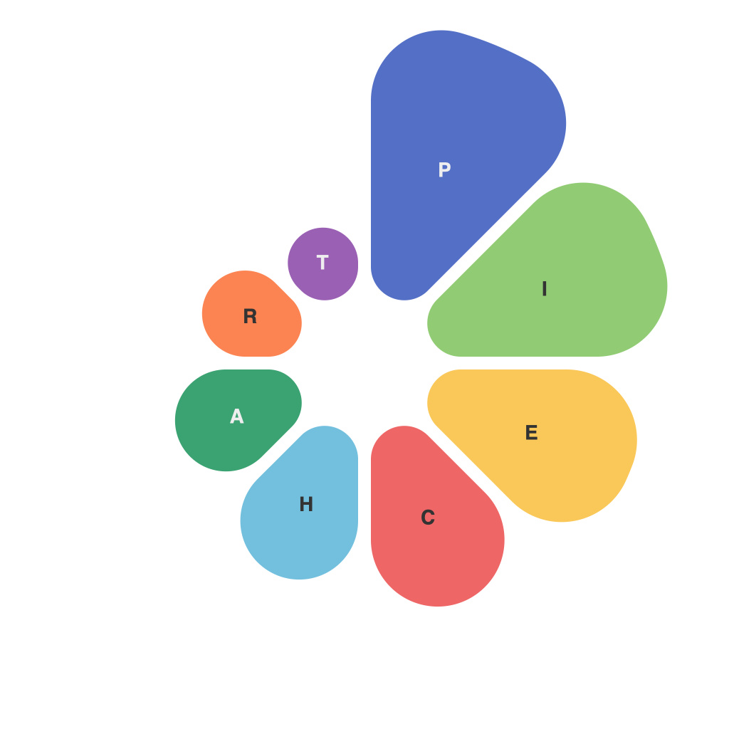
In the data-driven world we live in, pie charts have long been a staple in the realm of information presentation. These circular diagrams are not just popular for their simplicity and eye-catching design; they also serve as powerful tools for presenting complex data in a digestible format. Understanding how to interpret and create pie charts is crucial for anyone seeking to make a compelling case with their data. This article will decode the art of pie chart creation, demystify the visual impact they have, and provide strategies for maximizing their effectiveness in your presentations.
**Pie in the Sky: A Brief History of Pie Charts**
Pie charts have a storied history, their origins tracing back to the early 18th century where they were first used to analyze the distribution of wealth in countries. Over the years, the pie chart has evolved, but its core concept remains: to represent data visually through proportions within a whole.
**The Basic Mechanics: Slicing the Pie**
The quintessential pie chart illustrates data as slices of a full circle, each slice representing a part of the whole. The most straightforward version is a 100% pie chart, which as the name implies, shows the total as 360 degrees, or 100%. The area of each slice is proportional to its share of the total value.
The math behind a pie chart involves simple arithmetic. If you have a total of 100 units and want to represent 40 units as a slice, you would calculate the percentage that 40 units represent of 100 and then apply that percentage as degrees: \[ 40\% = 40 \times 3.6 = 144 \text{ degrees} \]
This method is flexible and allows for accurate comparisons, especially when pie charts are stacked or layered, revealing multiple categories and subcategories.
**Pie or Death: The Challenges and Dangers**
Despite their popularity, pie charts are not without their flaws. The first challenge arises from human perception. As the number of slices increases, the accuracy of the data representation decreases, potentially leading to misinterpretation. Psychologically, the human eye is not well-equipped to judge the angles of multiple slices accurately when they vary by small degrees.
Another common pitfall is the use of 3D pie charts. While they can be visually striking, they distort perceived sizes and areas, making comparisons between slices problematic.
**Pie in Your Face: How to Use It Wisely**
When creating or utilizing pie charts, there are several best practices to consider:
1. **Keep it Simple**: Avoid pie charts with more than seven slices; this prevents cognitive overload and enhances comprehension.
2. **Labels and Titles**: Make each slice clearly labeled and provide a title to your pie chart to help viewers understand its context.
3. **Use Colors Strategically**: Match colors with your brand or with logical associations in your data to improve readability.
4. **Compare with Bar or Line Charts**: Sometimes alternate chart types like bars or lines can offer a more precise comparison.
5. **Position and Alignment**: Position pie charts to contrast with other elements on your page to draw the viewer’s attention.
6. **Contrast Colors:** Contrast the colors between slices to make them distinct from one another.
**The Visual Appeal: Impact and Engagement**
Pie charts are engaging due to their visual simplicity and the immediate story they tell. When used properly, pie charts are effective at highlighting the relative importance of different categories within a dataset. They inspire action and motivate viewers to seek out the details behind the pie.
In conclusion, pie charts are more than just a piece of cake—they are essential components in presenting data. To decode pie chart data effectively and utilize its visual impact in your information presentations, it’s vital to know how to slice it up, what to avoid, and how to use best practices. Remember, when it comes to data, the pie chart is not just food for thought—it is a key ingredient for conveying the message of your dataset.

