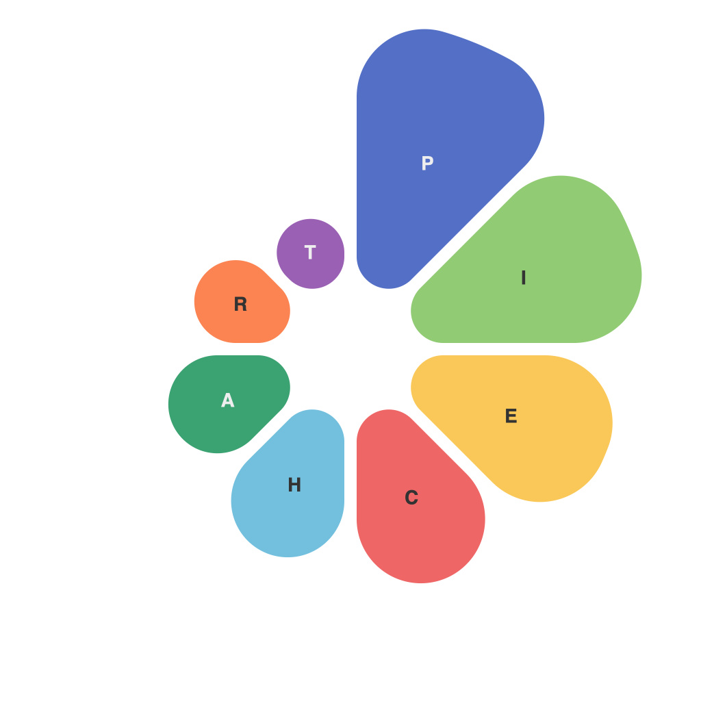
In the sea of data visualization tools, the pie chart stands as a universal staple. However, there’s more to mastering the art of the pie chart than simply throwing together slices of a circle. PieChartMaster, the pseudonym of a seasoned data visualizer, has dedicated their career to refining the craft. From the perfect center to the subtle interplay of colors and legends, this expert has dissected the secrets that make a pie chart not just informative but aesthetically pleasing. Here, PieChartMaster unlocks some of the sacred wisdom behind the seemingly simple pie chart.
**PieChartMaster’s First Commandment: Keep It Simple**
“Avoid the temptation to overcomplicate your pie chart,” PieChartMaster preaches. “Your audience should be able to take in the entire chart at a glance.” PieChartMaster insists that the most effective pie charts are those that are free from unnecessary embellishments and overly complex designs.
**Choosing the Right Size**
According toPieChartMaster, the size of your pie chart should match the amount of data you intend to represent. “A pie chart should never be so large that it loses clarity or so small that it becomes unreadable,” PieChartMaster asserts. PieChartMaster advocates for a 500-pixel width as a universal guideline, ensuring that the chart maintains legibility without requiring excessive zooming.
**A Harmonious Palette**
The colors chosen play a crucial role in the success of a pie chart. PieChartMaster suggests using a palette that not only stands out against the background but also reflects the brand identity or the data’s thematic context. “Contrasting the pie chart with the background is a no-brainer, but using hues that complement each other can create a more polished look,” PieChartMaster advises.
**Balancing the Segments**
Ideally, each slice in the pie chart should be at least 8-10 degrees wide. This guideline ensures that all pieces are easily discernible and contributes to the overall readability. PieChartMaster warns against creating a pie with multiple slices that are 2 degrees wide as they can lead to confusion.
**The Importance of Labels and Titles**
“Clear labeling is the backbone of a strong pie chart,” says PieChartMaster. “Each segment should be labeled with its piece’s name and appropriate value. This eliminates any room for ambiguity.” PieChartMaster adds that the inclusion of a short, descriptive title and a legend is often necessary for the chart to be understood outside of its immediate context.
**Leveraging Interaction and Animation**
PieChartMaster believes in the power of interactivity and animation to bring pie charts to life. “Interactive elements can allow users to drill down into smaller segments and understand more granular data. Animation, when done right, can enhance the storytelling aspect of your pie chart,” PieChartMaster advises. However, interaction must be used sparingly and only when it will significantly benefit the user, as too much animation can detract from the chart’s purpose.
**Understanding Context and Audience**
Before diving into the design, PieChartMaster recommends taking stock of the context. “Who will be looking at this chart, and what are they trying to understand?” PieChartMaster asks. “Tailoring the pie chart to the needs and backgrounds of your audience will ensure that it resonates with them and provides valuable insights.”
**Conclusion: The PieChartMaster’s Pledge**
In conclusion, PieChartMaster leaves us with a timeless promise: “Cracking the pie, whether it’s a visualization tool or an actual pie, comes down to the basics. Understanding the principles, considering the audience, and using the right tools to achieve clarity are all elements that combine to create a perfect pie chart. With these secrets in hand, any data presenter can transform a mountain of data into a delicious slice of insight.”

