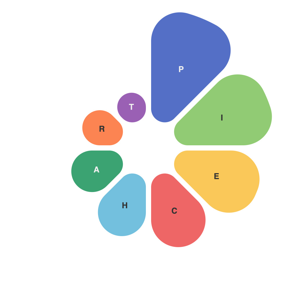
In today’s data-driven world, where information is generated and consumed at an unprecedented rate, data visualization has become crucial to understanding and communicating complex data. Among a myriad of chart types, pie charts stand out as some of the most iconic and universally recognizable. This article delves into the visual insights of pie charts, highlighting their triumphs and the challenges they present in the art of data visualization.
### The Magic of Pie Charts
At first glance, pie charts seem simple: a circular representation split into sections, each section’s size corresponding to the proportion of a particular category in the entire dataset. It’s this simplicity that has made the pie chart a staple in business graphics, corporate annual reports, and even educational materials.
#### Key Visual Insights of Pie Charts
– **Immediate Comparison**: One of the primary advantages of pie charts is their ability to offer immediate, at-a-glance comparisons. Users can quickly identify which category is larger or smaller than others, especially when they aren’t more than seven or eight slices.
– **Overall Awareness**: Pie charts can provide a quick awareness of what is being represented without the need for extensive data analysis.
– **Contextually Clear**: When properly designed, pie charts can communicate the context in a way no other chart type can.
### Navigating the Challenges
While beneficial in many ways, pie charts are not without their flaws. Many pitfalls await those who wish to leverage this visual tool effectively. Here are some of the key challenges in using pie charts:
#### Misleading Proportions
The very nature of pie charts can sometimes be misleading. Visual angles in a circle are harder to compare accurately than absolute sizes on a bar chart. This misjudgment can lead to skewed interpretations of the data. To counteract this, some pie charts include a legend or key that denotes the actual values alongside the visual representation.
#### Too Many Slices
There is a temptation to include every single category into the pie chart. However, when more than seven slices are present, the pie chart can become overcrowded and difficult to interpret. Good design practice suggests that a pie chart is not the best choice when more than seven categories are involved.
#### Clarity of Numbers
Without numerical labels, it can be challenging to determine the exact figures represented. Thus, it’s advisable to include both percentages and actual numbers within the chart (or at least a numerical key) to provide more detailed insights.
### Evolving Best Practices
Despite their limitations, pie charts can be quite effective when used appropriately:
– **Limitation Awareness**: Users and designers should be aware of the potential pitfalls and should apply best practices, such as minimizing the number of slices and adding numerical context.
– **Design Finesse**: Utilizing color coding wisely, with contrast between slices enhances readability. The color palette should be chosen to avoid distracting from the data or leading the viewer to incorrect conclusions.
– **Contextual Use**: Pie charts are best used to show a simple part-to-whole relationship when the data isn’t too complex.
### Conclusion
Pie charts, like all tools, have their strengths and weaknesses. By understanding their visual properties and common pitfalls, you can use them to effectively communicate complex data. They offer a visual way to comprehend and discuss the make-up of a dataset without being overwhelming or overly technical. With thoughtful design and clear context, pie charts can be a valuable asset in your data visualization arsenal.

