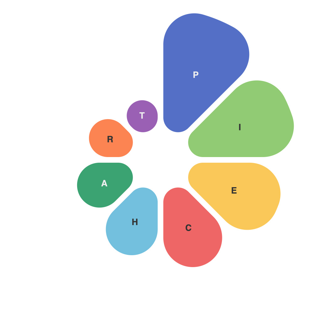
Visual storytelling has become a crucial aspect of conveying complex data effectively to a wide range of audiences. In the digital age, where information is abundant and often overwhelming, the way data is presented can significantly impact the communication of a message. One tool that is particularly well-suited to this task is the pi chart. Often overlooked in favor of more intricate graphics, the pi chart, also known as a pie chart, is a circular infographic that slices information into proportional sections to illustrate data points. This article aims to decipher the art and science of creating compelling narratives with the help of pi charts.
**Understanding Pi Charts: More Than Just Slices**
A traditional pie chart consists of a circle divided into sectors, with each sector representing a portion of the whole. These slices can be shaded, colored, or patterned to differentiate them. Although it may seem simple on the surface, the design, layout, and context behind a pi chart can have profound implications for how data is understood.
**The Power of Proportions**
At the heart of the pi chart is its ability to communicate proportionality. By visually linking the size of each slice to the actual value it represents, the audience can quickly perceive the relative importance of different data points. This is particularly useful in scenarios where the comparison between various categories is the focal point, such as market shares, survey results, or demographic breakdowns.
**Choices and Challenges in Design**
The design of a pi chart involves a variety of subjective choices. The first and most fundamental decision lies in the selection of the right data. Not all data is well-suited for presentation in a pi chart; it’s a tool best used when comparing parts to a whole. In cases where the data set is too large or the individual categories are too numerous, the pie chart can become cluttered and difficult to interpret.
Another aspect to consider is how colors and shades are used to differentiate between slices. Color choice can evoke emotional responses in viewers and, when used carefully, can enhance understanding. However, it is essential to ensure that color use does not introduce bias or confuse the viewer with too many hues.
**Lies, Damn Lies, and Pie Charts**
Despite their simplicity, pi charts are not without criticism. A popular adage, “lies, damned lies, and statistics,” often targets the pi chart as a potential tool for misrepresentation. One of the most notorious tricks is the use of different-sized pies. Comparing two pie charts with different radiuses can trick the audience into misjudging size perceptions. Another critique is the difficulty in gauging precise numerical values; it is challenging to visually estimate the exact percentage of a slice.
**Visual Storytelling Through Artful Execution**
When creating a pi chart, it’s essential to minimize these pitfalls. Start with a clear understanding of the audience and the objective; avoid overly complex data sets. Emphasize the primary message and design the chart in a way that is as intuitive and straightforward as possible. If including numerical values within the chart, ensure that they are rounded and clearly legible. Incorporate data labels or annotations carefully to enhance comprehension without overwhelming the layout.
**Conclusion: The Pi Chart as a Narrative Device**
In the realm of data visualization, the pi chart may seem passé or oversimplified, but it remains a potent narrative device when used correctly. Its circular nature and innate sense of proportionality make it a powerful means for storytelling through graphics. Whether used to communicate market trends, survey data, or demographic statistics, the proper use of a pi chart can turn complex figures into coherent narratives that resonate with audiences, fostering a deeper understanding of the data story being told.

