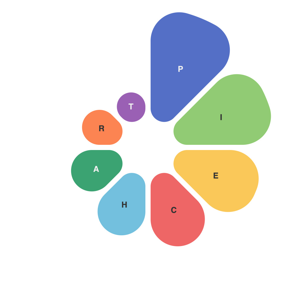
In the ever-evolving landscape of data visualization, pie charts remain a staple. Despite their simplicity, these circular representations of data can be both powerfully effective and surprisingly complex. As statisticians, designers, and communicators seek to decode the data dynamics inherent in pie charts, they uncover an art and science that requires careful consideration and precise execution. We delve into the intricacies of pie charts, exploring their creation, best practices, and how they can be effectively utilized.
**Understanding Pie Charts: More Than Just a Circle**
A pie chart is a circular statistical graphic, which divides data into sections of a circle to illustrate numerical proportion. Each piece of the pie, or slice, corresponds to a value within the dataset, and the size of each slice is proportional to its share of the total.
However, pie charts aren’t merely an artistic endeavor using colors and angles; they serve a practical purpose: to make it easy to understand parts of a whole. Despite the appeal of their simplicity, pie charts require a nuanced understanding of design principles and data analysis.
**Choosing the Right Data for Pie Charts**
Before crafting a pie chart, one must consider the nature of the data and whether it’s an appropriate tool to use. Typically, pie charts work best with a small number of categories, generally no more than 6 to 10 slices. This ensures that the chart can be easily comprehended and not overwhelmed by too much information.
The data itself should be categorical; that is, discrete elements or distinct sections of data that cannot be divided. Continuous numerical data doesn’t translate well into a pie chart, where precise fractions and comparisons of smaller segments are difficult to discern.
**The Role of Color in Pie Charts**
Color usage in pie charts is not arbitrary; it plays a crucial role in enhancing readability and comprehension. A consistent palette that contrasts well with the background should be chosen to distinguish among slices. However, care must be taken that the color choices aren’t influenced by personal biases, as some colors can have powerful emotional responses.
**Creating Balance and Order in Pie Charts**
To make pie charts more readable and visually compelling, designers employ a few tricks. Ensuring that no slice is anemic or over-sized helps maintain balance. Arranging categories with progressively larger pieces in counter-clockwise order is a common practice; starting with the largest piece makes it a focal point and the following slices less overwhelming.
**Navigating the Angular Conundrum: The Angle of Slices**
There’s a delicate interplay with the angle of individual slices. The standard is to have the largest angle at 12 o’clock; this not only ensures balance but also allows viewers to mentally orient themselves with the pie center. Avoiding overlapping slices and using distinct shapes for distinct data can also clarify information at a glance.
**Legends, Labels, and Lines: The Pie’s Accessories**
Accompanying a pie chart with a clear legend is essential. Even though pie charts aim to communicate the amount of each pie slice at a glance, not all viewers may immediately understand the reference to the entire pie. Including key labels within or outside the slices can be particularly helpful when a dataset doesn’t fit neatly into the pie (e.g., it requires a label to be split into halves).
**Pie Charts in Motion:Interactive vs. Static**
In recent years, interactive pie charts have become viable. Such charts can be manipulated on a computer screen to highlight slices and adjust perspective. Inversely, static pie charts maintain a single point of view, which can minimize the potential for confusion in audiences.
**Pie Charts in Misery: Common Errors to Avoid**
Despite all the strategies and techniques discussed, designers and analysts often fall into the traps of pie charts’ pitfalls. Misinterpreting the viewer’s understanding can lead to common errors. Some of these include:
– Using too many slices which leads to crowded charts difficult to comprehend.
– Failing to label all slices clearly.
– Starting the chart axis from zero, which skews perceptions of proportion.
– Relying heavily on color alone to differentiate between slices when labels are missing or insufficiently informative.
In conclusion, the art and science of creating effective pie charts demand careful consideration of the data, aesthetics, and viewer convenience. As data visualization tools evolve, pie charts will continue to play a significant role in distilling complex data into a visual language that can be easily understood. Designers and consumers of data alike must remain vigilant in interpreting these circular representations correctly to ensure the story told aligns with the reality of the dataset.

