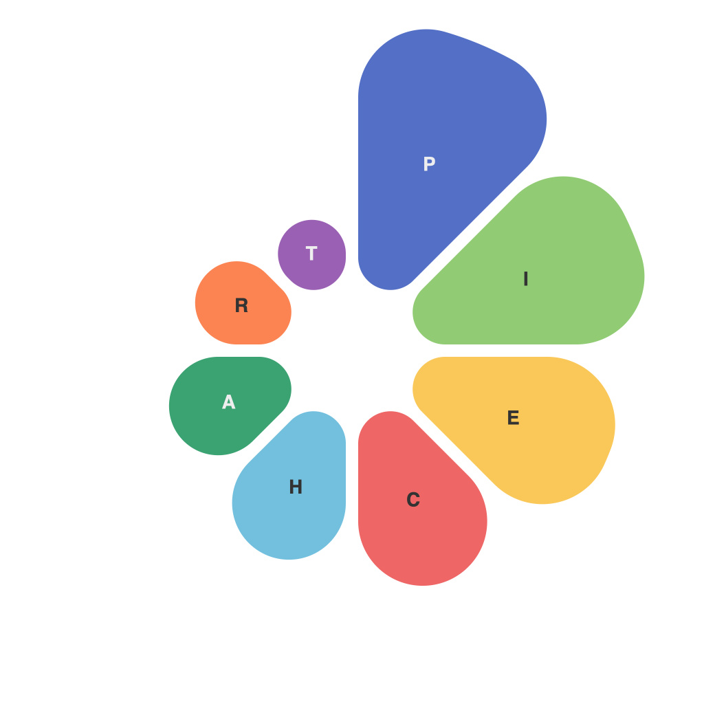
In the grand tapestry of data representation, the humble pie chart has often been overlooked as the less glamorous sibling in the family of statistical visualizations. Yet, hidden within its circular simplicity lies a world of possibilities where colors, proportions, and arrangements coalesce to tell a story, making the sometimes impenetrable language of data accessible. This article aims to decode the data dynamics at play in the artistry of master pie chart designers, shining a light on the subtle techniques that transform data into a digestible feast for the eyes and mind.
The beauty of a pie chart lies in its simplicity. A round slice represents a category or piece of information, making it easy to visualize how parts relate to the whole. Designers must navigate a careful balance of aesthetics and functionality, ensuring that the chart communicates data accurately and is aesthetically pleasing.
**Honing the Proportions**
At the heart of master pie chart design is the art of proportion—deciding how many slices will be cut and what their sizes will be. The most effective pie charts typically feature a minimal number of slices, say four or five, to prevent it from becoming a crowded and convoluted maze. The larger the slice, the more important the category it represents, both in terms of visibility and interpretation.
However, large slices can result in text overlap if the font size isn’t adjusted accordingly. Designing for both web and print, master pie chart designers understand the limitations of their medium; a pie chart on a smartphone screen will look different when magnified on a large poster. Scaling proportions appropriately to the intended audience and context is a key skill in this design craft.
**Color as a Palette for Storytelling**
Color is the lifeblood of a pie chart. It can amplify the visual impact, highlight critical data points, or even convey emotions and cultural nuances. Designers navigate the color spectrum with discernment, choosing hues that reflect the mood of the data without overwhelming the composition.
The rule of thumb is to avoid overcomplicating the color scheme. Too many colors can muddy the message, especially in charts that are part of a larger suite of visual data representations. A designer must carefully select a palette that can communicate distinct sections succinctly. In some cases, using patterns or shadings can provide the necessary differentiation without overwhelming the viewer.
**Labeling with Precision**
Labels are crucial in pie chart design, acting as both signposts and markers of categorical identity. They should be placed outside the chart to avoid cluttering and should contrast sufficiently with the color of their respective slice. Labels often require careful placement to ensure that they are readable while being out of the way of other slices.
Master designers know when to forgo labels entirely, relying on a well-thought-out color scheme and a logical categorical order to allow the pie chart to tell its story. In these instances, arranging slices according to a consistent and meaningful sequence helps the viewer process the data more effectively.
**Typography as the Narrator**
Typography completes the pie chart’s design narrative. A designer must choose fonts that are legible at all scales, ensuring that the chart maintains clarity from a mobile device to a printed display. The font should complement the pie chart—neat and modern for corporate documents, perhaps with playful fonts for educational tools or public engagement.
Furthermore, the use of bold or italicized labels can draw the eye to significant data points or highlight outliers, a technique that master designers skillfully utilize to draw attention to data that might otherwise be overlooked.
**Balancing Art and Information**
Pie charts, at their best, are a fusion of art and information. Master pie chart designers honor this balance, crafting a visual that informs while providing the user with the aesthetic satisfaction that beauty can bring. They recognize that the journey is more than just decoding data; it’s a journey of crafting an experience that encourages viewers to engage with the information, question it, and draw their own conclusions.
In the quest to bring clarity to complex data, master pie chart designers have honed their craft, turning data into a form of artistry accessible to all. Their dedication to precision, color harmony, and legibility makes them the silent architects of data storytelling across a multitude of mediums and contexts.

