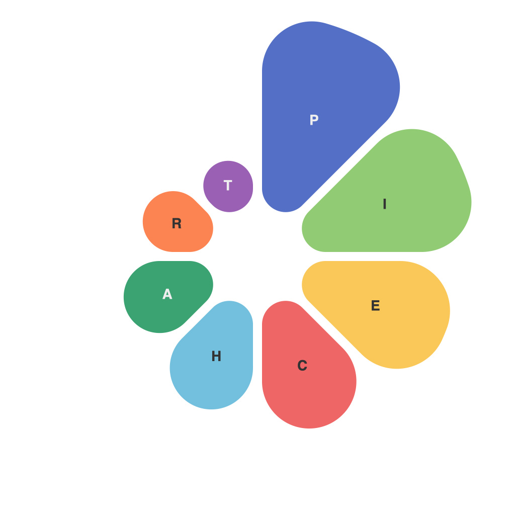
In an era where data reigns supreme, the challenge of making complex information comprehensible and actionable is paramount. One of the most effective ways to do this is through the judicious use of pie charts. Pie charts offer a unique visual approach to breaking down data into digestible pieces—a true art form when handled with precision. This article delves into the essence of pie charts, examining their benefits, best practices, and the delicate balance that separates a mundane diagram from a masterpiece of data presentation.
At first glance, the pie chart seems like a fundamental tool of data communication.圆形的分割区块,代表整体数据的不同部分,总和中每一部分的比例直观易懂。However, the simplicity belies the profound design considerations behind each perfectly placed slice.
The Art of Pie Charts in Data Visualization
**Pie Chart Basics**
Pie charts are circular graphs divided into sectors, each representing a portion of the whole. The degree of each sector’s size reflects the percentage of the whole that section accounts for, allowing for an immediate assessment of proportions. This simplicity makes the pie chart a quick and intuitive visual tool for conveying information, be it sales figures, population statistics, or product distribution.
**Pie Chart Benefits**
The advantages of pie charts are multifaceted, making them invaluable tools for data visualization:
1. **Immediate Recognition**: With their geometric purity and stark segmentation, pie charts are immediately recognizable, making complex data more palatable for audiences.
2. **Visual Clarity**: Pie charts provide a clear, at-a-glance summary that avoids the cognitive overload that can occur with more complex visualizations.
3. **Comparison**: When designed well, pie charts allow for a quick comparison of different data segments.
**Best Practices**
Pie charts are not always the first choice for presenting data due to certain limitations. However, by following these best practices, they can be an effective visual aid:
1. **Limit the Number of Slices**: Keep the number of slices to a minimum to ensure legibility. Too many sectors can make the pie chart cluttered and confusing to interpret.
2. **Avoid 3D Pie Charts**: The use of 3D depth can exaggerate differences in size and distort the visualization, so it’s best to stick with flat, two-dimensional pie charts.
3. **Label Wisely**: Clearly label each slice to avoid ambiguity. Ensure the label is directly connected to the pie section for ease of understanding.
4. **Choose Appropriate Colors**: Use a palette of colors that can be easily differentiated from one another. Avoid using color to encode additional information unless the pie chart contains few slices.
**Balancing the Pie**
Pie charts are like the delicate balance of a tightrope walker—they require precision and skill to perform their magic. The key is to keep the chart simple without oversimplifying the data:
– **Focus on Value**: The message should be about value and proportion, not the individual pieces.
– **Consider an Alternative**: For data that requires detailed comparison, pie charts may not be the best choice. Consider other types of visualizations, such as bar graphs or scatter plots.
– **Ensure Audience Relevance**: Tailor the pie chart to your audience. If they are more comfortable with numbers, provide numbers in addition to the visual representation.
**Pie Charts: A Dynamic Tool**
Pie charts are a classic, and for good reason—they capture data in a clean and elegant form. Yet, as with all data visualization tools, pie charts are not always the right choice. Understanding when to use them effectively and when to consider an alternative depends on the context, the audience, and the story you wish to tell. When used correctly, pie charts unlock the art of data simplicity, revealing the insights hidden within your numbers with beautiful clarity.

