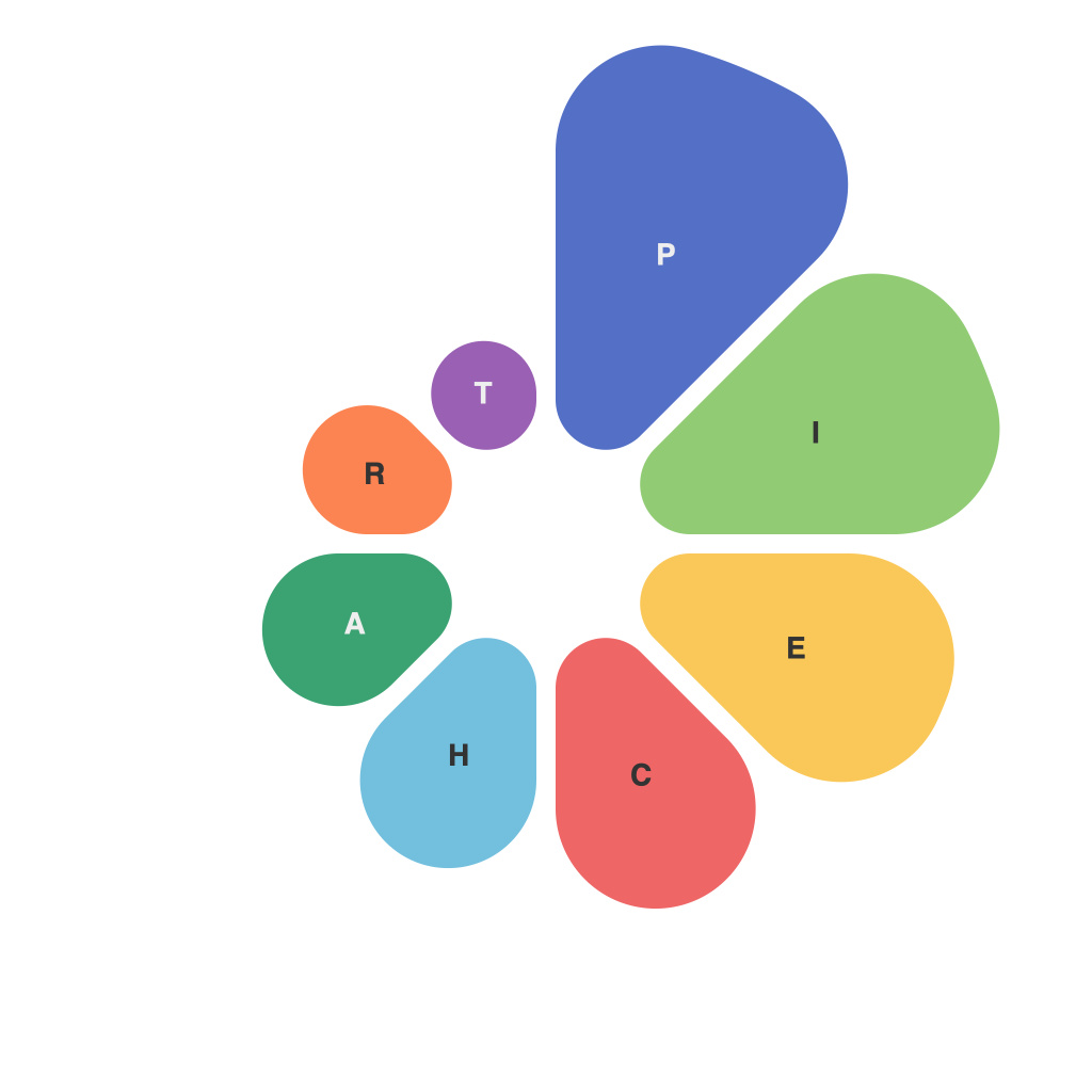
In the realm of data visualization, pie charts are a staple; they serve a dual purpose. Not only do they decode reams of complex data into digestible pieces, but they also possess a certain artistry in their formation. Their power lies in their ability to communicate information swiftly and clearly, making them invaluable tools in a world increasingly reliant on data-driven decision-making. Let’s delve into the art and power of pie charts in visual communication.
### Deciphering Data with Precision
Pie charts embody a deceptively simple concept. They break down data into fractional slices, with each segment representing a proportion of the whole. This segmented display format is highly effective as it offers a rapid assimilation of information. For instance, in a market research study, pie charts can succinctly illustrate the market share of different companies or the distribution of demographics. It is this precision that makes pie charts so valuable: they facilitate quick comprehension and prompt deeper analysis.
### Artistry in Pie Charts
The artistic side of pie charts comes from the nuances of design that ensure a coherent and visually appealing presentation. Effective use of colors, symmetry, and labelling can transform a pie chart from a mere statistic to a visually engaging piece. Artistic pie charts not only convey information but also aesthetic pleasure. The subtleties of design can include the choice of palette, the way slices are divided, and the positioning of the chart itself. All these factors contribute to the overall storytelling potential of pie charts.
**Color Palette:** Colors can evoke associations and feelings, making them a powerful element in pie chart design. For example, blue can represent calmness and stability, suitable for finance data, while green is often used symbolizing growth, a good choice for depicting market trends.
**Symmetry:** Symmetry gives the pie chart a balanced and harmonious look. When every segment is a uniform size, the chart is perceived as cleaner and more trustworthy. By contrast, an asymmetrical chart can be difficult to interpret at a glance.
**Labelling:** Clear and concise labelling is crucial. Label names should be concise to avoid cluttering and confusion. Placing labels inside or outside the chart can affect readability, which is a design decision that must be made thoughtfully.
### The Power of Pie Charts
Pie charts have immense power across various domains due to several unique strengths:
**Clarity:** They impart clear information in a matter of seconds, making them perfect for both formal reports and everyday decision-making.
**Comparability:** They allow for easy comparison between items, especially when the data has high contrast between the proportions being visualized.
**Communication:** Visual communication is superior to numerical descriptions as people often process visual information more readily. Pie charts exploit this advantage, making them an effective medium for conveying ideas and concepts.
**Non-Distraction:** They keep the presentation of data straightforward, without the complexity of multi-dimensional graphics that can sometimes be overwhelming or misleading.
In the modern world, where data is king, pie charts are invaluable. They are the bridge between abstract statistics and meaningful insights. As both art and science, they enable us to perceive the world through a different lens—an informed, visually enhanced lens.
However, with power comes responsibility. While pie charts have their own set of advantages, they are not universally applicable. The data they represent must fit the format well. Misuse can lead to misinterpretation of the data. Despite their art and power, it is essential to use pie charts judiciously and with context to maintain and enhance their effectiveness in the realm of visual communication.

