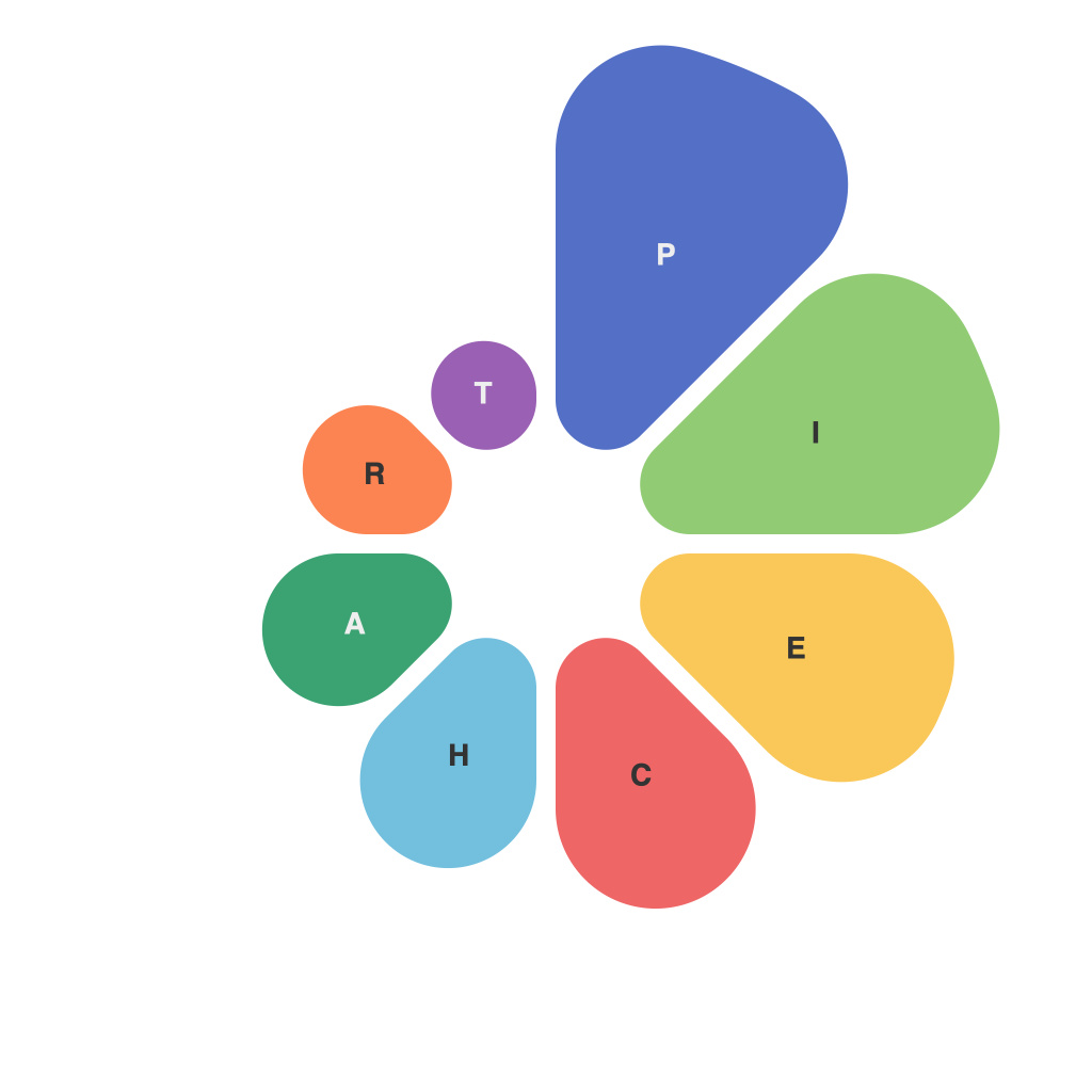
Pie charts are a staple in the world of data visualization. These circular graphs break down proportions and percentages into slices that collectively make up the whole. Decoding data through the art and science of crafting effective pie charts requires a nuanced understanding of both the principles of data presentation and the aesthetic aspects that engage the viewer. This article will take a deep dive into the intricacies behind creating pie charts for maximum clarity, understanding, and impact.
### The Foundation of Pie Charts
At their core, pie charts represent data in a circle, with each segment representing a proportional part of the whole. They are straightforward in concept but can quickly become cumbersome, especially when trying to convey complex data sets or large numbers of variables within a single chart.
### Choosing the Right Use Case
A pie chart excels when the data is categorical and the number of categories is relatively small. It can be an excellent choice for:
– Comparing parts to a whole
– Displaying proportions in a simple, straightforward manner
– Illustrating relationships within a single set of data
However, when the number of data points is high, pie charts can become confusing. It is crucial to select your use case thoughtfully to ensure that the information is effectively communicated.
### Design Principles for Effective Pie Charts
The aesthetic appeal of a pie chart is just as crucial as its accuracy in communicating data. Here are some key principles to follow:
**1. Layout and Orientation**
Pie charts should be oriented parallel to the horizontal, not vertical. This arrangement facilitates a more natural reading pattern and reduces the complexity of the chart.
**2. Color Usage**
Color should be used wisely to enhance readability. It is a powerful tool to differentiate slices but can also mislead if overused. Use a distinct palette, avoiding too many colors, and make sure they are distinguishable from one another.
**3. Segmentation**
Avoid splitting a large slice into multiple smaller ones unless you have a specific reason. If a slice is small, you may remove it entirely or represent it through a secondary method, like a donut chart or a bar chart.
### Techniques for Improved Readability
**1. Labels and Legends**
Include clear and concise labels for each slice and use a legend if there are more colors than the eye can easily differentiate. Labels should be placed outside the pie, near the corresponding segment, to avoid confusion.
**2. Data Labels**
When space permits, include a label with the number or percentage of the segment in the chart itself. This allows for quick reference and comparison between slices.
**3. Data Annotation**
Adding a percentage symbol (e.g., %) can aid in readability by indicating that the value is indeed a proportion and not an absolute count.
### Decoding Data Through Interactivity
Interactive pie charts can revolutionize the way data is analyzed. By allowing users to hover over different segments to reveal more detailed information, you facilitate a deeper engagement with the data. However, overdone interactivity can have the opposite effect; keep it simple and focused on enhancing the user experience without overwhelming the chart.
### Final Thoughts
The art and science of crafting effective pie charts blend the analytical with the creative. To succeed, it’s essential to understand the data you are presenting and your audience. Pie charts, when executed well, can be a powerful tool for data communication, succinctly summarizing complex information in a graspable visual format. Through careful consideration of layout, color, readability, and interactivity, you can decode data with pie charts that resonate visually and provide insights that endure.

