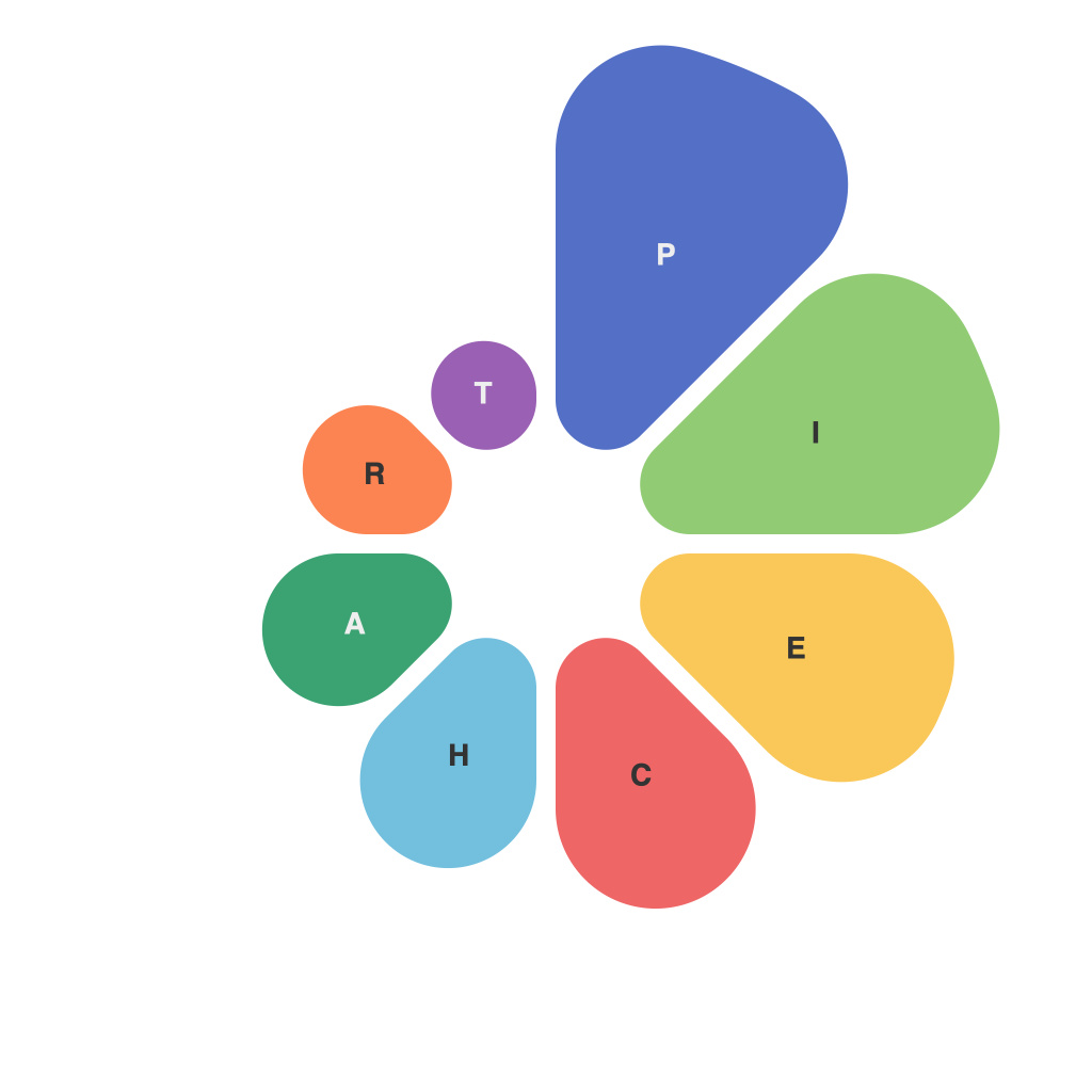
In the vast world of data representation, the humble pie chart stands out as an enduring staple. A true hybrid of art and science, pie charts have become a universal language for conveying information in a visually appealing and meaningful way. Crafting the perfect pie chart is an art form, one that combines not only an understanding of design principles but also an in-depth knowledge of statistics and visualization techniques. This article delves into the intricacies behind this graphical icon and offers insights into creating pie charts that are both informative and aesthetically pleasing.
**Nuts and Bolts of Pie Charts**
A pie chart is, at its core, a circle divided into segments (slices), each of which represents a portion of a whole. The size of each slice correlates with the proportion it represents in the overall group being visualized. It’s an elegant method, as the whole circle equals 100%, making it simple for audiences to immediately understand the distribution of the different segments.
But pie charts are not without their challenges. The primary drawback is their limited ability to represent complex data sets or provide precise values. The eye is not as adept at making precise numerical comparisons as it is with bar graphs or line graphs. Despite this limitation, pie charts have endearing qualities that make them irresistible to data visualization enthusiasts.
**Choosing the Right Data**
The cornerstone of an effective pie chart lies in selecting the right data and structuring it appropriately. Start by gathering relevant data points that you aim to communicate. Then, make sure the information is quantitative and absolute. Each data point should represent a piece of the total and fit neatly into the circle.
**The Art of Slicing**
Once the data is decided upon, it’s time to divide the circle into slices that accurately represent the figures. This requires careful calculation, ensuring each slice’s angle or size conforms exactly to the portion it represents. Precision here is crucial; misrepresenting even a small slice can throw off the visualization’s overall message.
**Color Theory and Palette**
Selecting a color palette is as much an art as it is a science. The right colors can enhance the pie chart’s readability and memorability. Too many colors can be overwhelming, resulting in “mismatched socks” syndrome. A good color palette includes hues that contrast well while remaining consistent with the overall design aesthetics. Think about your audience and the emotional weight of the data when making you choices.
**Design Principles and Layout**
Just as with any visual medium, pie charts benefit from adhering to basic design principles. The layout should be simple and intuitive. This often means avoiding overlapping slices and ensuring that the angles and sizes of slices don’t create visual clutter.
Furthermore, the placement of labels is an underappreciated aspect that can dramatically impact the pie chart’s effectiveness. Labels should be readable against the background of their respective slices and positioned so they do not overlap other elements or clutter the chart.
**Interactivity and Animation**
In the digital age, pie charts can come to life with interactive elements. This can be as simple as hover-over effects or as complex as interactive infographics that allow users to click on different slices to see the corresponding data in further detail. The key is to keep the interactive elements intuitive and not to distract from the underlying data.
**Balancing Text with Data**
Text is often left in a pie chart to add titles or labels, but excessive text can detract from the simplicity and readability of the chart. Choose fonts and sizes that work in harmony with the pie chart, making text succinct and only using it where it adds clarity or context.
**Educating the Audience**
A great pie chart not only presents data clearly but also educates. Take the time to explain any peculiarities about the pie chart you’re presenting. This could include providing explanations for unexpected results or discussing any biases in the data that affected the chart.
**Pie vs. Donut, and More**
Some choose to display their data as pie charts or as donut charts, which are essentially pie charts with a hollow center. While this might give the chart more space for other text or visual elements, it can also dilute the message that the data itself should be the center of attention. There are many other types of charts and graphs that might be more suitable for certain types of data, so the choice between these options should not be taken lightly.
Crafting the perfect pie chart is a complex endeavor that demands a delicate balance of art and science. It requires an intimate understanding of the data, a keen sense of visual design, and knowledge of the tools and techniques used in data visualization. Whether you’re creating a chart for a business presentation, a marketing campaign, or an academic paper, the art of pie chart crafting can go a long way in making your data sing. By paying attention to the nuances of data selection, presentation, and audience engagement, you can turn the humble pie chart into a powerful tool for data storytelling.

