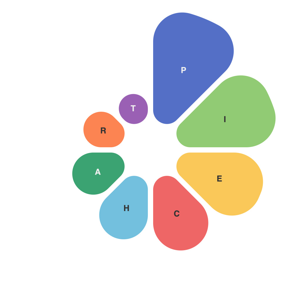
In the visually rich and data-packed world of information presentation, pie charts stand as iconic figures, representing the intersection of art and science. These circular diagrams provide a visual shortcut to complex data, breaking down percentages into intuitive slices. Deciphering the art and science of creating compelling pie charts, we delve into the nuances of pie chart creation, from the choice of elements to the aesthetic balance that completes the story these graphs tell.
**The Science: Foundation of Data Accuracy**
To begin with, it’s paramount to recognize the foundational role accuracy plays in pie chart science. Precision in data is the cornerstone upon which your chart is built, and as such, it should be the starting point for all pie chart compositions. High-quality data is your guidebook; it not only ensures relevance but also bolsters the credibility of your information presentation.
Considerations such as sampling methods and representation of the population or phenomena you are analyzing must be meticulously handled to prevent misinterpretation. Data that has not been sanitized or properly vetted can give misleading pies, and no one wants to be the bearer of incorrect information.
**The Art: Visual Design Principles in Motion**
Pie charts, while rooted in straightforward mathematical concepts, benefit greatly from the application of artistic design principles.
1. **Color Theory:** Utilizing the right colors can elevate a pie chart from functional to beautiful. However, it is essential to stick to a color palette that’s both engaging and communicates the data well. It’s a delicate balance between aesthetics and communication, using color to highlight anomalies or significant segments without overwhelming the viewer.
2. **Legibility and Clarity:** Even with the best colors and design, if your chart isn’t clear, it’s all for naught. To this end, always use a pie chart when the data can be broken down into clearly defined slices, with clear percentages. A chart cluttered with too many shades and slices can leave the onlooker bewildered.
3. **Proportional Slicing:** The size of the pie’s slices should accurately reflect their proportions. This doesn’t mean making large, central slices more prominent just because they look impressive – focus on representing the data as it truly is.
4. **Labels and Annotations:** Proper labeling enhances the readability of the chart. Avoid making the user reach for extra information to make sense of a chart. Include not just numerical values but also annotations that might provide additional insights or trends.
5. **Consistency:** Maintain your charts’ aesthetics, so they have a uniform look across a set of related graphs. This uniformity helps in cross-comparison and builds trust with the data you present.
**Balancing the Pie**
Creating an aesthetically pleasing and scientifically sound pie chart is a process of balancing various elements:
– **Segmentation:** Not every dataset makes sense as a pie chart. Be judicious about choosing pie charts when the data can be more than two or three slices; more can lead to the so-called “Salad-Dressing Problem” – where the chart resembles more a salad plate than a pie.
– **Comparative Pie Charts:** When comparing pies, ensure consistency in color schemes and segmenting. It should be clear what each piece of pie represents across the charts.
– **Interactive Versus Static:** In today’s digital age, interactive pie charts allow for easier exploration. If a static chart is preferred, ensure that viewers can isolate and interact with slices manually if necessary.
Creating a compelling pie chart requires both an understanding of the data you’re presenting and the design elements that keep your audience engaged. By mastering the art and science behind pie charts, you can communicate your data story effectively, connecting with your viewers and conveying the message of your data in a clear, captivating, and scientifically accurate manner.

