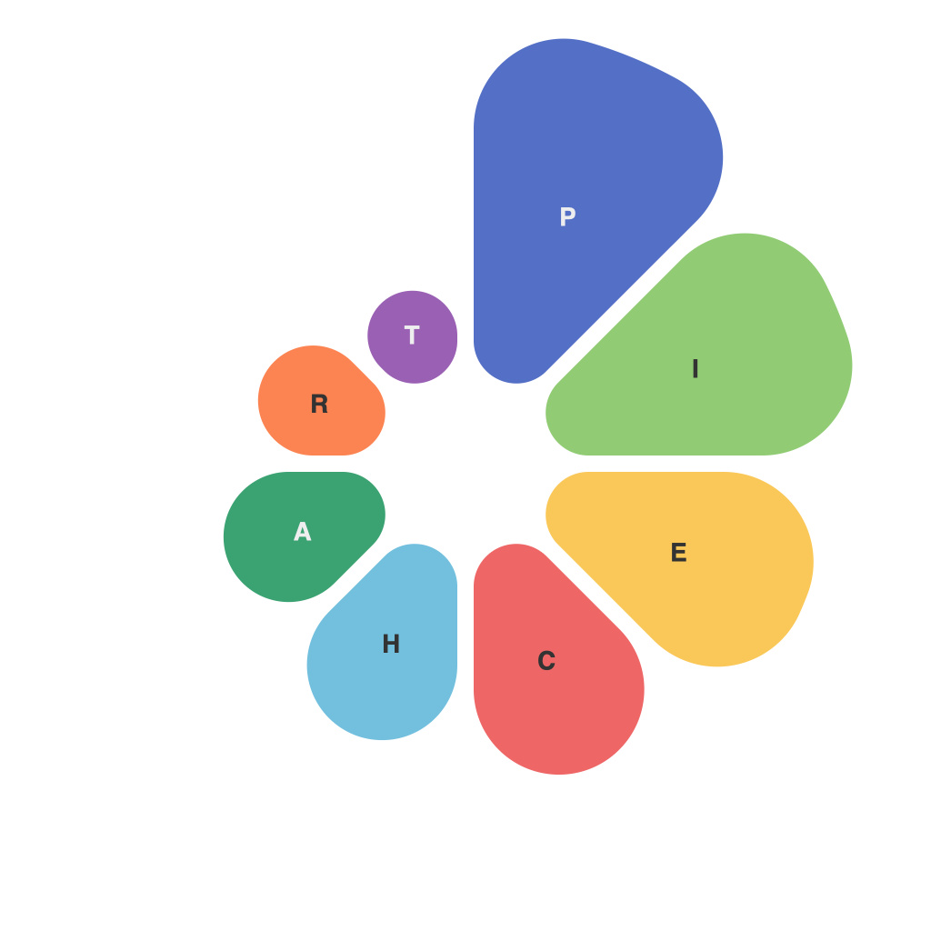
In the vast sea of digitized information that we navigate daily, data visualization becomes a beacon that illuminates insights. One of the most intuitive and enduring tools in this arsenal is the pie chart.Pie charts, with their simple divisions and 100% whole, make complex data digestible and accessible. Decoding data through pie charts doesn’t only convert numbers into visuals but also serves as a visual guide to information.
**The Art of Pie**
A pie chart is essentially a circle divided into sections, each typically representing a proportion of a total. These slices can range from straightforward representations of sales by region or product lines, to more intricate distributions of market sentiment or traffic sources. While pie charts may appear deceptively simple, their effectiveness relies on careful construction. Proportionality is key, as it ensures the viewer can easily understand the significance of each segment.
**Pie Chart Anatomy**
1. **Labels**: Clear labeling is crucial. Each slice should be accompanied by a succinct label that indicates what it represents.
2. **Colors**: Effective color use can enhance comprehension. Choose colors that have a clear contrast and that resonate with the context of the data.
3. **Size of Pie**: The circle itself can sometimes be misleading. Adjusting the chart size can help ensure that segments are legible, especially when dealing with a large number of categories or when some segments are particularly small or large.
4. **Legend**: For complex pie charts with numerous segments, a legend is a must. It provides an easy reference for the color or name of each slice.
**Pie Charts in Action**
**Deciding When to Use a Pie Chart**
1. **Proportion Comparison**: When you need to compare parts of a whole, pie charts excel. For instance, pie charts are perfect for illustrating the geographic distribution of sales.
2. **Limiting Categories**: If the data has a relatively small number of categories, pie charts are an excellent choice. Too many slices can make the chart hard to read.
3. **Limited Detail**: A pie chart is not great for showing precise quantification. It is more about the general shape and size of the pieces, not the exact size or order.
**Best Practices in Design**
1. **Avoid 3D Effect**: This can distort perceptions of the size of the pieces.
2. **Use a Single Color Scheme**: Too many colors or clashing colors can make the chart hard to read.
3. **Consider Data Values**: When the data values are too small, pie charts might not be the best choice; bar charts or dot plots may be more suitable.
4. **Labeling Slices**: When possible, try to position the data values close to the slice they represent for ease of reference.
**Beyond the Basics**
Recent advancements in data visualization have expanded the capabilities of pie charts. Interactive pie charts, for example, allow users to hover or click on slices for more information, dynamically segmenting further to reveal granular data at a single click. Similarly, some tools enable 3D pie charts with a slanted angle for greater depth, but it remains a controversy whether these enhance clarity or simply add unnecessary complexity.
**Pie Charts in the Digital Age**
In a world where data is the lifeblood of informed decision-making, pie charts have never been more vital. As technology evolves, so too does the art of pie chart creation, with advancements in tools and methodologies that enable greater interaction and customization of these traditional charts. Whether analyzing market data, conducting user research, or reporting on corporate performance, the pie chart remains a versatile and invaluable tool that allows us to decode our data in a quick and easily digestible format. Embracing all the nuances and best practices of pie chart design enables the audience to quickly grasp complex information, leading to a better-informed understanding of the subject at hand.

