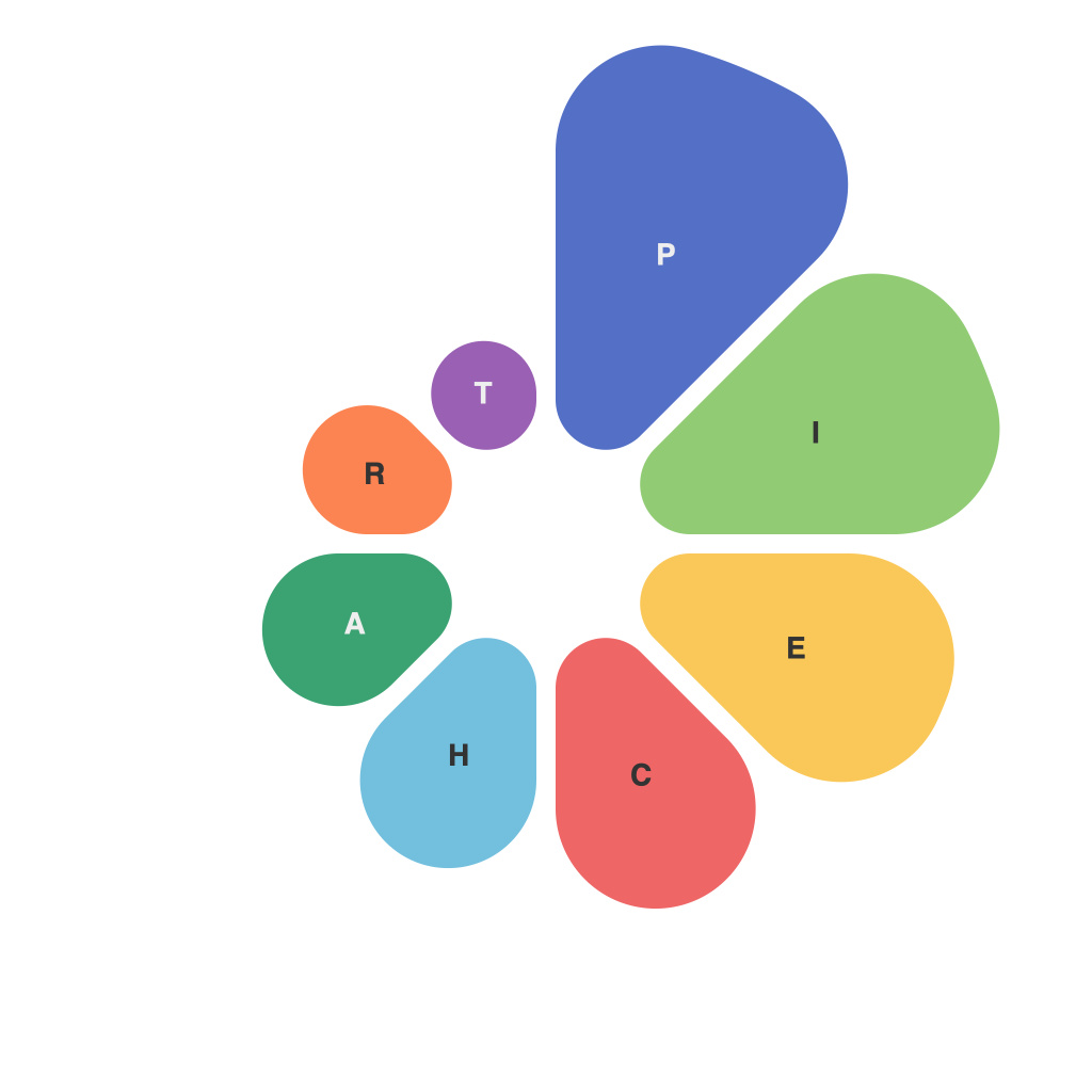
In a world that increasingly relies on data to guide decisions, both big and small, the presentation of that data is paramount. Pie charts have emerged as a popular visual tool for representing fractional insight, offering a simple, intuitive way to compare parts to the whole. As such, pie charts represent more than a segment of the past—they stand at the intersection of data analysis and human perception, fostering a visual journey through the fractional insights within data sets.
Understanding Pie Charts: The Basics
At the core of the pie chart’s functionality lies its simplicity—a circle split into sectors, each representing a portion of the whole. The total area of the circle corresponds to the entire data set, with each sectors’ size proportionally representing the size of its associated part. The beauty of the pie chart is not just its visual elegance, but also its immediate impact in the mind of the viewer.
Deciphering the Segments
Let’s cut to the chase. The primary goal of a pie chart is to parse a complex concept, such as percentages or amounts, into easy-to-understand visual blocks. By studying the size and color of each sector, one can quickly grasp a wealth of information without being overwhelmed by sheer numbers.
For example, imagine you are analyzing the results of a political poll, where one segment is colored blue to represent Republican voters, another red for Democrats, and a third green for Independents. At a glance, pie charts reveal that a party is leading by a considerable margin or that the election outcome is potentially very close. This kind of information is invaluable to a policy maker or a campaigns strategists, who need rapid insights to direct their actions.
Pie Chart Design Do’s and Don’ts
While pie charts are effective, their design is critical. Badly designed pie charts can mislead by distorting perceptions or confusing the viewer.
Do: Use consistent color coding. It’s important to make the chart easily readable and comprehensible.
Do: Label each segment clearly. Knowing what each segment represents is as crucial as the size of the segment itself.
Do: Limit the number of segments. Too many slices can detract from the pie chart’s primary value of clarity.
Don’t: Use 3D effects or shadowing. These add unnecessary complexity and can distort viewer perception.
Don’t: Use a multitude of colors. Stick to a range of two to three colors to ensure the chart remains simple and uncluttered.
Pie Charts in Action
Pie charts aren’t just for polls or market share data. Organizations use them for budget allocation, performance tracking, customer demographics, and more. By using a pie chart, you can quickly understand where resources are being applied or what demographics are consuming the most of a product.
The Power of Perception
A well-designed pie chart isn’t just a snapshot of data; it’s a lens through which we view the world fractions. The power of visualization cannot be overstated. It cuts through ambiguity, enabling us to absorb vast amounts of information in mere seconds.
When pie charts go right, they help unlock the story behind the numbers. They guide us not just to understand a snapshot of data, but to visualize trends, uncover potential stories, and ultimately, to guide action.
In the data-driven age we inhabit, the journey through pie charts is not just about analyzing fractions but about interpreting and communicating the message of these fractions in a way that is not only accessible but also compelling. It is a path paved with the clear, concise, and compelling visuals that data presentation should aspire to every day.

