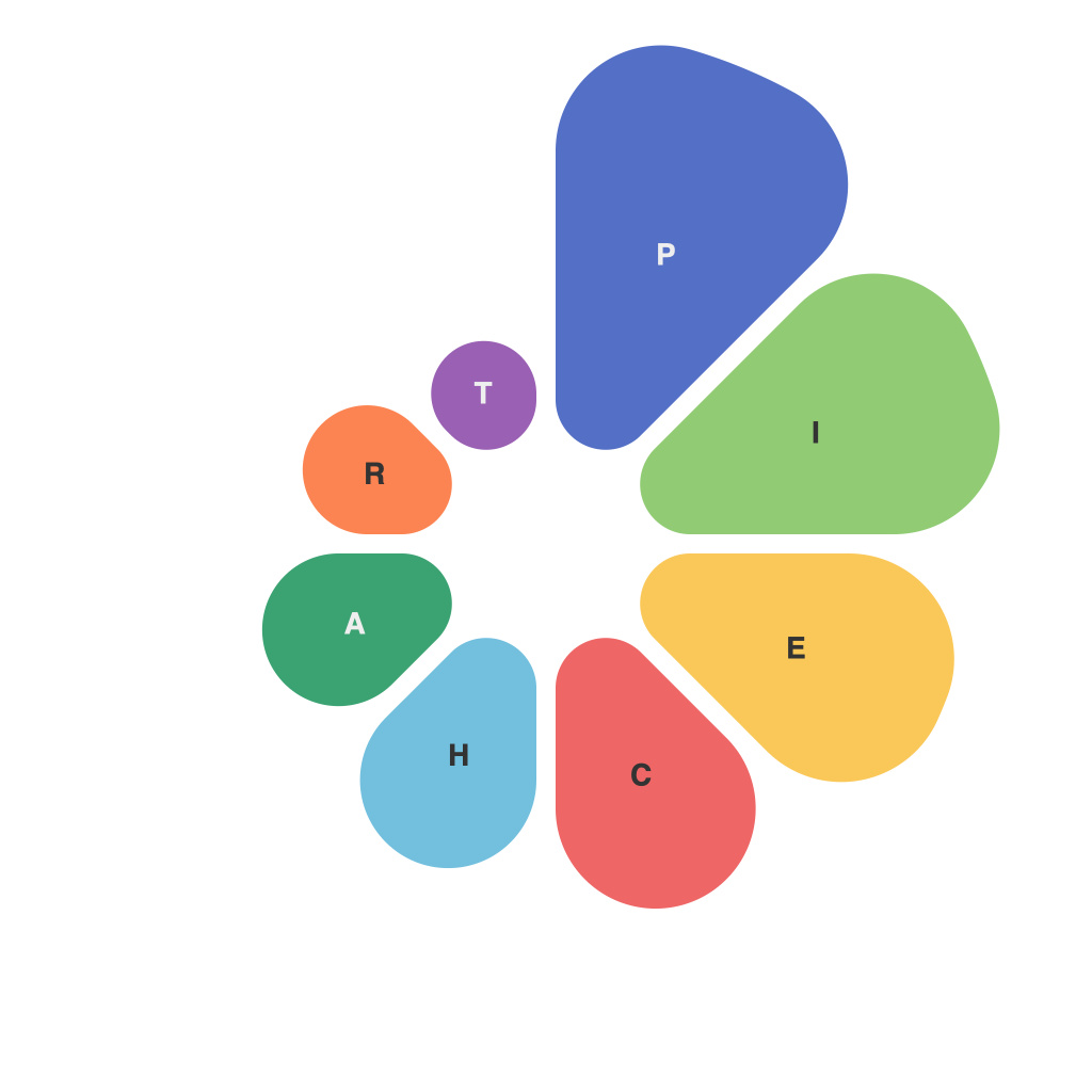
In a world where information is the currency and understanding it the key to progress, data visualisation plays an indispensable role. Among the varied methods of presenting data, pie charts are perhaps the most familiar yet also the most misunderstood. This article delves into the essentials of pie charts, their unspoken language, and the nuances that make or break their effectiveness.
At first glance, a pie chart appears straightforward: a round graph divided into sectors, each representing a fraction of a whole. However, decoding the true essence of these visuals requires a closer look at their design principles and the context in which they are used.
**Understanding the Pie: Composition**
The foundation of a pie chart is the whole—a percentage or quantity that serves as a reference point for understanding individual slices. Each slice represents a part of that whole by its size, conveying relative magnitude at a glance. The way these slices are proportioned can evoke a sense of fairness and balance or create an imbalance that may be misleading.
**Arc Angle: The Silent Communicator**
The angle of the arc in a pie chart slice is its primary means of communication. A larger slice subtending a wider angle signifies a more significant portion. While this method seems intuitive, it can be deceptive. The human brain may mistakenly interpret the length of a pie chart slice to be proportional to its actual size, often leading to a misreading of the data. For instance, a slice that is half the arc length might be perceived as more than half the whole, especially when smaller slices are adjacent to the larger one—a phenomenon known as the “Muller-Lyer illusion.”
**The Placement of Categories: A Design Aspect Often Overlooked**
The order in which items are placed in a pie chart can make a significant difference in interpretation. Placing the highest-value slice first can give the impression that it is a more important category, or its placement might be more related to the presentation style rather than to the actual data. The direction of rotation also matters; a clockwise layout can influence the way the viewer interprets the relative lengths of the slices.
**Comparison Between Pie Charts: When to Look Deeper**
Pie charts are not designed for comparing data sets directly. When there are more than two items being presented within a single pie chart, the comparison becomes increasingly difficult. This is because the eye has to interpret relative sizes in three dimensions—a task that is less intuitive than reading discrete values. Should a direct comparison be necessary, it is often better to use multiple pie charts or consider alternative visualisations, such as bar or line graphs.
**Using Labels and Titles Wisely**
Another factor in the pie chart’s communication effectiveness is the use of labeling. Slices should be labeled clearly with their corresponding data, and the title of the pie chart should succinctly describe the data it represents. However, excessive labeling or overly complex titles can distract from the message being conveyed.
**Choosing the Right Data Representation**
Pie charts are powerful tools, but they need to be used judiciously. They are best employed when comparing whole vs. part relationships, not for ranking data or illustrating trends. For such cases, bar or line graphs are often more appropriate.
**In Conclusion**
Pie charts offer a quick, intuitive visual representation of percentages and proportions, but decoding them correctly requires a nuanced understanding of their unspoken language. Designers and consumers alike must consider arc angles, category placement, and the overall composition to avoid misleading interpretations. Choosing the right time to use a pie chart and carefully consideration of style and formatting can ensure that these visualisations serve their purpose of conveying information accurately and effectively in the complex world of data.

