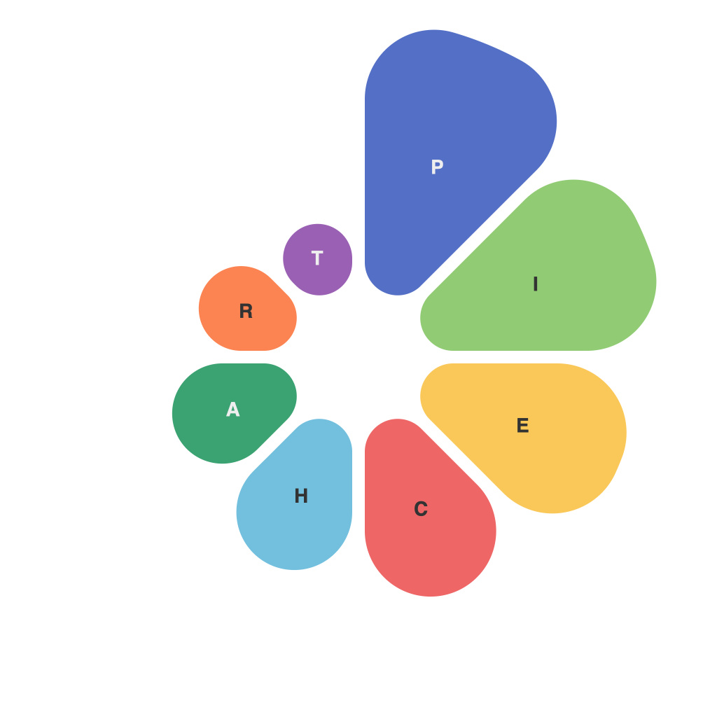
In an era where big data reigns supreme, the need for effective data visualization has never been greater. Data visualization is not just a tool for analysts; it has become an integral part of every business sector, educational establishment, and even daily life. Among various visual representations, pie charts stand out as a universally recognizable format that encapsulates complex information into a straightforward, easy-to-digest format. Despite their popularity, pie charts can either engage or alienate their audience based on how effectively they are crafted. Let’s take a deep dive into the art and science of creating irresistible pie charts.
**The Science of Pie Charts**
Pie charts are a staple in statistical representation, and their appeal lies in their simplicity. They convey a part-to-whole relationship and are easily interpretable by a broad audience. However, to craft a pie chart that truly conveys the intended narrative, one must navigate a series of scientific principles:
1. **Data Relevance**: Pie charts work best when comparing parts of a whole. Therefore, the data being charted must represent meaningful segments of the overall data set.
2. **Accuracy**: It’s vital that the pie chart accurately reflects the proportions of data. No part of the cake should look larger or smaller than it is in reality.
3. **Legibility**: The chart should be sized appropriately to avoid distortion and to ensure that readers can differentiate between the segments. If the pie chart is too small, the audience may struggle to make out the individual slices.
**The Art of Pie Charts**
There’s a level of nuance to pie-chart creation beyond the data and science of the layout. The true art comes in the presentation and the design of these charts:
1. **Color Scheme**: The right color palette can make a pie chart much more engaging. Avoid too many colors and contrasting shades that might clash or cause visual discomfort. A muted, sophisticated color scheme works well.
2. **Segment Names**: Labeling is critical. The names of the segments should be concise, clear, and self-explanatory. Too many words can clutter the chart’s presentation.
3. **Design Aesthetics**: The overall design of the pie chart should complement its content. This means considering things like the chart’s border, background, and any decorative elements that might enhance the viewer’s experience.
4. **Interactivity**: In the digital age, interactive pie charts can be a game-changer. Allowing users to click on segments to see additional data or switch between pie charts can transform a static representation into an engaging experience.
**Common Pitfalls to Avoid**
Despite their enduring popularity, pie charts are not without their drawbacks. Here are some common pitfalls to watch out for:
– **Too Many Segments**: When a pie chart has more than five or six segments, it becomes difficult for the human eye to accurately assess proportions.
– **Don’t Overcomplicate**: Adding too many additional features, like gradients or textures, can distract from the data itself.
– **Circular References**: Pie charts can lead viewers down a confusing path if one segment references another, requiring the viewer to keep too much information in mind.
– **Incorrect Perception**: Because circles are harder to divide accurately, the human brain can often perceive differences between segments that are numerically slight because of the pie chart’s design.
Pie charts, when executed with care, are an invaluable tool in the data visualization arsenal. The art and science involve more than just presenting data—it’s about storytelling and communication. By thoughtfully selecting data, employing a harmonious design, and avoiding common pitfalls, pie charts can be crafted into irresistible narratives, capturing the essence of complex information and delivering it intuitively to their audience.

