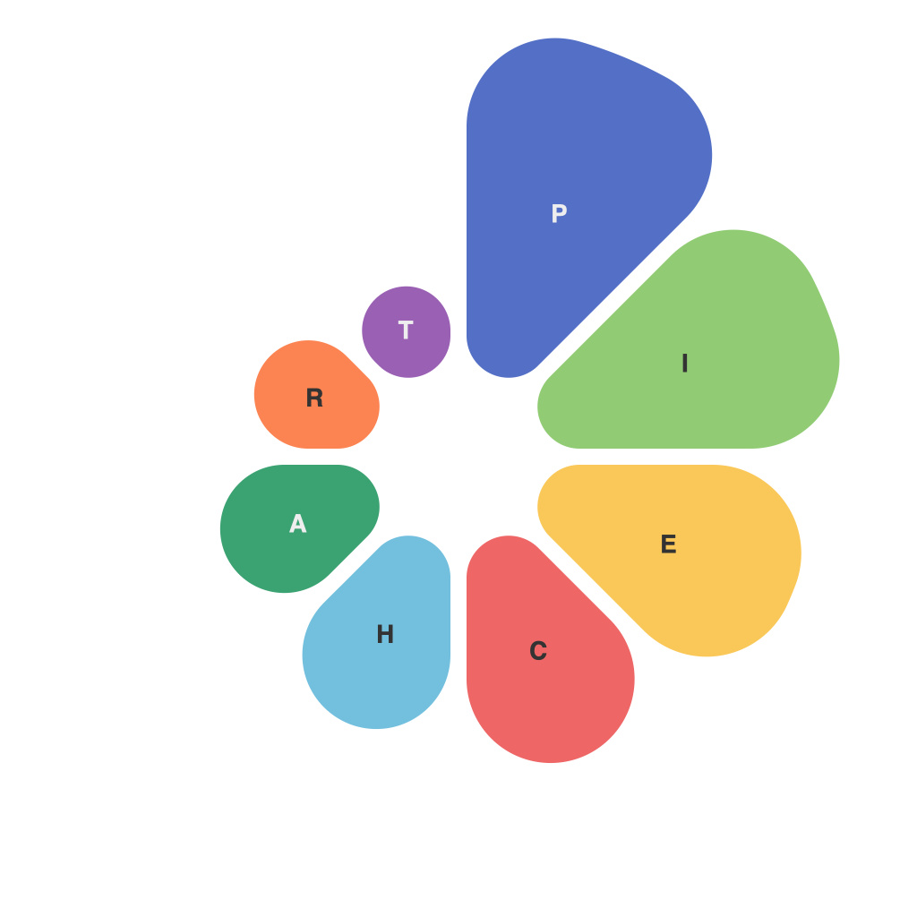
In the realm of data visualization, the pie chart stands out as a foundational element. It is an essential tool for illustrating relationships and comparisons in a concise, visually engaging format. This article endeavors to decode the art and utility of pie charts in effectively communicating information.
### The Aesthetic of Pie Charts
Pie charts are, at their core, a representation of proportions. Each section of the pie corresponds to a part of a whole, making them an excellent choice for illustrating the distribution of a single variable, particularly when the categories involved are limited.
The aesthetic appeal of pie charts is undeniable—they are intuitive and, when used correctly, can convey information at a glance. Yet, their visual allure can sometimes obfuscate the message. A well-designed pie chart should be clear, balanced, and attention-grabbing, while still being easy to understand.
### The Utility of Proportional Communication
One of the primary strengths of pie charts lies in their ability to communicate proportions effectively. They provide a straightforward way to compare sections of data relative to the entire pie. This can be beneficial when discussing market shares, population demographics, or the distribution of costs.
Here are some of the key uses and benefits of pie charts:
1. **Ease of Comparison**: The circular layout of the pie chart naturally separates categories and allows for relatively easy comparison of relative sizes.
2. **Color Coding**: When implemented correctly, color cues can highlight the largest and smallest slices, aiding in the comparison of the most significant data points.
3. **Segmentation**: Through the use of labels, pie charts facilitate the identification of particular data segments, even when there is limited space for text.
### The Art of Proper Design
As with any data visualization, the design of a pie chart is of paramount importance. Here are some design DOs and DON’Ts:
**DO:**
– Use distinct colors for each category.
– Ensure the color scheme is consistent with the overall design of any reports or materials it will be used in.
– Label each section clearly and with a recognizable font.
– Maintain a balance in the overall size of the slices for easy comparison.
**DON’T:**
– Overuse colors that might create confusion or eye strain.
– Label with text that is too small or complicated.
– Have a large number of slices, as it may lead to confusion and clutter.
– Leave out data or create illogical slices to make the data seem more favorable.
### When to Opt for Other Visualizations
Despite the benefits, pie charts are not the best choice in every situation. Here are a few instances where other types of data visualization might be more appropriate:
– When you want to show changes over time (consider a line chart or a stacked bar chart).
– When you need to compare two or more datasets that are interdependent (consider a scatter plot or a bubble chart).
– When the variation in group sizes is significant, as it can create misleading pies (consider a bar chart or a dot plot).
### Conclusion
Pie charts, with their artful balance of simplicity and utility, remain a steadfast tool for data visualization. By understanding how to design and use them effectively, we can enhance the communication of complex information and facilitate informed decision-making. Whether in education, business, or research, pie charts serve a vital role in illustrating data in a compelling, accessible manner.

