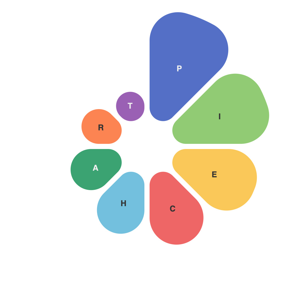
In the intricate tapestry of data analysis and presentation, data visualizations are a cornerstone instrument for conveying complex information succinctly and engagingly. Among these tools is the pie chart, a simple yet often contentious graphical representation that encapsulates the idea of division, proportion, and comparison. Yet, despite its popularity, the pie chart has been vilified by data viz experts, statisticians, and critical thinkers who argue it can create misleading impressions, misrepresent data, and even spawn the “pie chart paradox.” This article seeks to dissect this paradox, exploring the nuances behind pie charts and how they can be effectively, and sometimes not, used in data visualization.
**The Anatomy of a Pie Chart**
A typical pie chart consists of a circle divided into multiple slices, each representing a specific part of a whole and proportionally sized according to the data it represents. This deceptively simple form belies the complexities behind its creation and interpretation.
The allure of pie charts lies in their ability to encode parts and their relationships to a whole in a single display, lending a visual cue that data is being presented in an easy-to-understand, intuitive format. However, the simplicity of pie charts also contributes to their downfall, as seen through the lens of the pie chart paradox.
**The Pie Chart Paradox Unveiled**
The “pie chart paradox,” as coined by Alberto Cairo in his book “The Functional Art,” highlights several intrinsic issues within pie charts:
1. **Cognitive Overload**: Our brains process round shapes and their angles intuitively, which can make pie charts feel natural for presenting information. However, this can lead to cognitive overload, as the human mind is not well-suited to accurately judge angles and compare areas, especially in more complex or dense charts.
2. **Angular Misjudgment**: Human perception is prone to misjudging the size of angles, which is critical in pie charts. When presented with two slices of different sizes close together or a pie chart with a large number of slices, the brain’s ability to accurately discern proportions can become compromised.
3. **Comparison Confusion**: The more slices a pie chart has, the harder it is to make precise comparisons between them. In an attempt to display too much data, pie charts often suffer from “over-charting,” or the presentation of too much information in a single visualization, which defeats the purpose of simplification.
**Navigating the Challenges**
Despite these challenges, pie charts have their uses—when they are applied appropriately. Here are some ways to mitigate the pie chart paradox and harness the chart’s strengths:
– **Simplicity is Key**: Keep the number of slices to a minimum. A pie chart should ideally have no more than seven parts, allowing the eye to easily compare slices and their relative proportions.
– **Labeling and Colorcoding**: Clearly label each pie slice to prevent confusion and use contrasting colors to differentiate between slices for easier differentiation.
– **Direct Proportion**: When making comparisons, use pie charts alongside other types of charts, like bar or line charts, which can be easier to interpret when it comes to exact numeric values.
– **Purposeful Use**: Use pie charts to represent proportions when there is a clear central theme, and the primary goal is to show the relative size of one part compared to the whole.
In the quest to decode data visualizations, the pie chart paradox presents a puzzle for both the designer and the viewer. Recognizing its limitations and knowing how to address them is an essential part of the data visualization process. While pie charts may not be ideal for complex data sets or when precision and quantity are paramount, they still hold a place in the data viz arsenal. They remain a testament to the art and science of conveying information with visual means, and understanding their potential pitfalls and how to navigate them is crucial for anyone looking to navigate the complex world of data presentation.

