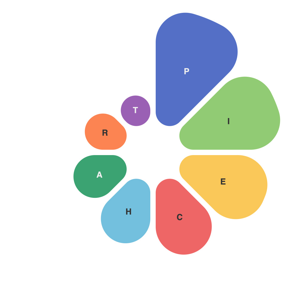
In an era where information overloads are ubiquitous, effective communication of data has become more critical than ever. Pie charts, a fundamental tool in the data visualization repertoire, have emerged as a means to decipher complex data with ease. They offer an intuitive, compact, and captivating way to showcase key insights without overwhelming the audience. This article explores the power of pie charts in visual communication.
At the heart of any pie chart is a circle, divided into segments where each section represents a relative portion of a whole. This visual metaphor makes it simple for viewers to immediately grasp the proportions between different categories in a dataset – no matter whether the data is financial, statistical, demographic, or related to consumer preferences.
Efficient Data Representation
One of the primary benefits of pie charts is their capability to communicate a large amount of information in a visually concise format. They provide the visual impact needed to present the data, which, according to psychologist George Miller, is better captured by the eye instead of the mind when it comes to numerical values. Pie charts simplify the analysis process by allowing us to quickly identify the largest and smallest segments without delving into the specifics of each category.
Accurate Proportional Understanding
The use of angles and sizes in pie charts represents proportions accurately. As a result, they are excellent for illustrating how parts relate to a whole. For instance, when comparing a company’s market share distribution across different regions, the pie chart makes it effortless to see which regions are dominating the market and which are lagging far behind, even if the total market share is extremely diverse.
Comparison Across Categories
Another advantage of pie charts is that they can be a great tool for side-by-side comparisons. By displaying multiple pie charts side by side or overlaying individual segments, one can easily compare different datasets and highlight areas of interest or concern. A side-by-side comparison lets viewers visualize patterns and differences across various categories at a glance.
Color Coding for Clarity
Color can play a crucial role in pie charts for making the visualization even more effective. Colors are used to differentiate the individual categories, helping the eye immediately discern the various segments. Careful use of color palettes can enhance the aesthetic appeal of a pie chart, making it more appealing to viewers and ensuring that the data is communicated in a way that is both informative and engaging.
Limitations and When to Use a Pie Chart
Despite their many virtues, pie charts are not without their drawbacks. One significant limitation is that when there are many categories, a pie chart can become cluttered and hard to read. Moreover, comparing pie charts side by side can lead to the “base rate fallacy” – the tendency to overestimate likelihoods based solely on a small sample of evidence. Hence, pie charts are best used when there are no more than five to seven segments, allowing the viewer to accurately decipher information.
The right time to use pie charts involves several criteria:
– When the data consists of distinct parts that are related to a whole.
– When displaying a comparison of several discrete categories.
– When emphasizing a part-to-whole relationship.
– When color coding and an intuitive design can enhance clarity.
In the vast landscape of data visualization, pie charts offer a simple, intuitive, and effective solution for decoding data with ease. Whether you are presenting sales figures in a boardroom or illustrating statistical trends to a large audience, the power of pie charts lies in their ability to condense complexity into a straightforward, memorable, and impactful visual format. Embracing the art and science of pie charts in data visualization can significantly enhance the efficacy of your communication, fostering a greater understanding of the data among viewers.

