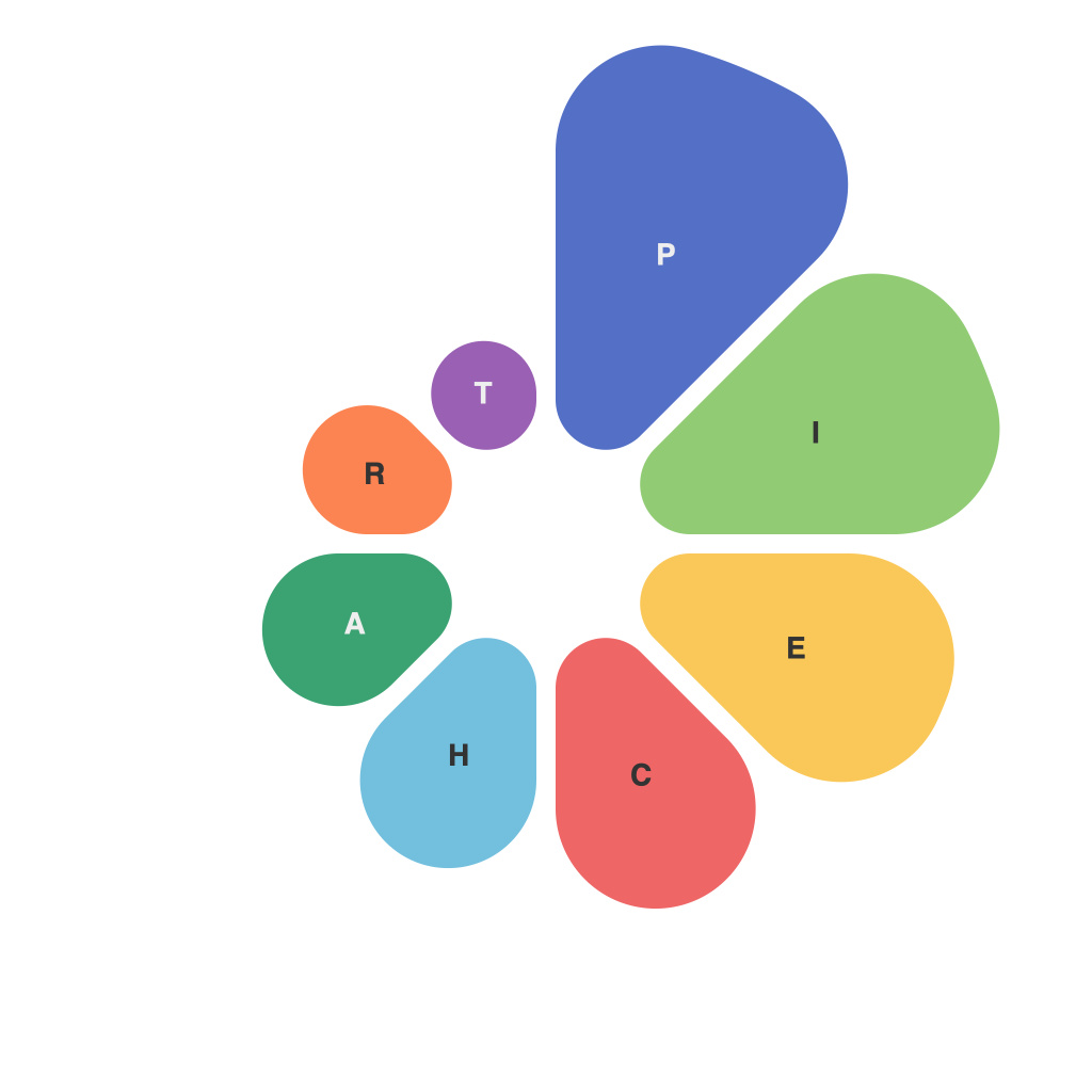
Decoding Data with Pie Charts: A Comprehensive Exploration of Pie Chart Usage and Interpretation
In the vast landscape of data visualization, pie charts stand as a timeless staple for presenting information concisely and appealingly to a wide audience. Their circular format and simple slices effectively communicate parts to the whole, making them a go-to choice for presenting statistical distributions and survey results. However, as with any data visualization technique, the proper use and interpretation of pie charts can make the difference between clear communication and misinterpretation. This comprehensive exploration delves into the essence of pie chart usage and interpretation, offering insights into their strengths and limitations, creative applications, and best practices for effective data storytelling.
**The Concept and Origin of Pie Charts**
The concept of a pie chart is believed to have originated in ancient times, but it was William Playfair, a Scottish engineer and political economist, who famously used them in his works in the 18th century. They were not widely adopted until the 20th century; however, with advancements in computer technology and graphic design, pie charts have found their way into virtually every aspect of modern communication.
**Usage of Pie Charts**
Pie charts are best suited for illustrating proportions, where a whole is divided into sections or slices, each representing a portion of the total amount. Here’s where they are generally used:
1. **Market Share**: Representing how much of the market a particular company or product holds.
2. **Surveys**: Showing the prevalence of opinions or responses in a survey question.
3. **Comparative Analysis**: Analyzing data where percentage comparisons across categories are crucial.
4. **Breakdowns**: Breaking down a large number or category into smaller components.
**Interpretation of Pie Charts**
Interpreting pie charts requires a careful reading of various elements:
1. **Slices**: Larger slices represent larger proportions, but it can also be overwhelming to assess their exact sizes. It’s essential to minimize the number of slices to prevent cognitive overload.
2. **Percentage Labels**: These labels provide precise information over visual cues. They should be easy to read against all slices to avoid confusion.
3. **Center Labels**: They provide a quick reference to how a slice relates to the whole by using fractions (e.g., “30%”).
4. **Labeling and Titles**: Proper titling and labeling slices helps to communicate the subject clearly and enhance the effectiveness of the pie chart.
**Strengths of Pie Charts**
– **Attractive and Easy to Understand**: When used properly, they can illustrate information in an engaging and intuitive way.
– **Quick Overview**: They offer a quick and easy-to-grasp overview of percentage comparisons.
– **Memorability**: They stick in the minds of viewers, often leading to more informed decisions.
**Limitations of Pie Charts**
– **Overwhelm by Many Slices**: As the number of slices increases, it becomes harder for viewers to make clear comparisons.
– **Misinterpreting Slices**: Due to the circular nature, the eye can be tricked into thinking that a slice of less than 10% is more significant than others.
– **No Exact Representation**: They can only provide estimates of percentages and cannot be used to draw conclusions about actual data values.
**Creative Applications of Pie Charts**
– **Interactive Pie Charts**: Using tools like D3.js that allow for interaction, users can delve deeper into the data.
– **3D Pie Charts**: While not a standard practice, 3D charts can be used to highlight particular slices in a multi-color scheme, though readability can suffer.
– **Pie Segments**: Segmenting the pie into pie segments can offer a different perspective when comparing several data points.
**Best Practices**
– **Limit Slices**: Aim for a maximum of 6 slices to maintain accuracy and clarity.
– **Use a Suitable Color Palette**: Colors should contrast each other and not be overwhelming.
– **Add Data Labels for Clarity**: Including the exact data point or percentage next to the slice helps viewers avoid guesswork.
– **Ensure Contrast between Slices**: Make sure that the slices stand out from one another to avoid miscalculations.
**Conclusion**
Pie charts, with their simplicity and elegance, remain a powerful tool in the data visualization arsenal. They have the ability to simplify complex data and give audiences a clear understanding at a glance. However, their efficacy is contingent upon careful consideration of their usage and interpretation. By understanding their strengths and limitations, we can deploy pie charts effectively, enhancing data literacy and making our messaging resonate with audiences across the board.

