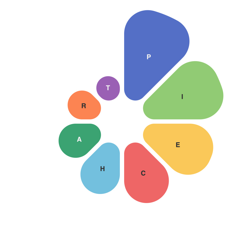
Pie charts, a staple in the world of data visualization, are the culinary art of conveying information through sections of a circle. With a name derived from the circular shape it emulates, this versatile tool has a dual purpose: not only to illustrate proportions or percentages, but also to encapsulate a world of stories, insights, and patterns that the raw data might not reveal in its untouched form. In this article, we delve into decoding data with pie charts, highlighting their design elements and understanding the nuances behind their structure to ensure that their visual allure translates into clear and meaningful insights.
Firstly, let’s consider the basic structure of a pie chart. The circle’s whole reflects the total amount or number represented by the dataset, while individual slices represent segments of this whole. By visualizing data this way, pie charts let you understand the distribution of parts within the whole, making them perfect for comparing categories that add up to a whole or total.
At their best, pie charts serve as intuitive indicators of composition and proportion. However, it’s important to note that when not designed thoughtfully, pie charts can be misinterpreted or misleading, which is why decoding them effectively is essential. Here are some strategies to do so:
### Clarity and Simplicity
A pie chart works best when it’s simple, with a clear message. Overloading it with too many categories can lead to visual clutter. Keep it simple and try to represent only four to five categories at a maximum.
### Color and Pattern
Color isn’t just for aesthetic purposes in pie charts. It plays a critical role in establishing clarity and allowing easy distinction between slices. For optimal visual effect, use a color scheme that aligns with your brand, but more importantly, make sure contrasting colors are used for slices that represent important information.
### Alignment
It is important that the slices are evenly divided, especially when the audience will be comparing the sizes of two or more slices directly—a feature sometimes referred to as a ‘race track’ or donut chart, which gives equal weight to each slice and is easy to compare directly.
### Starting Angle
Slices are sometimes depicted starting from 12 o’clock, with the largest pie slice at 12 o’clock and decreasing successively. However, it’s often more intuitive for a larger slice to begin at the 9 o’clock or 3 o’clock position, depending on the context of the data.
### Labelling
Clear labelling is crucial. Slices should have concise texts identifying them, with labels that reveal not just the category but also important statistics such as the percentage value. Including only essential text prevents the chart from being overshadowed by extraneous information.
### Consider Alternative Visualizations
While pie charts can be powerful, they aren’t always the best tool for the job. If you are trying to compare data over time or show the relationship between different categories, a bar chart, a line chart, or a scatter plot may be more suitable.
### Understand Cultural Cues
Cultural differences also play a role in interpreting pie charts. Slices may need to be ordered in a manner that conveys information naturally to the target audience.
### Interactivity
In cases where the pie chart is part of an interactive visual experience, consider allowing users to manipulate the chart – by zooming in, clicking on a slice, or filtering data – which can lead to a deeper understanding of the information presented.
In conclusion, pie charts are a powerful tool for data visualization when used correctly. They can provide a quick and instinctive understanding of proportions and compositions. However, it’s the skillful application of their elements—clarity, simplicity, color, alignment, starting angle, labelling, and cultural context—that determines the efficacy of a pie chart. By paying attention to these aspects, you can decode the hidden patterns and stories within your data, and translate them into a narrative that makes sense to your audience.

