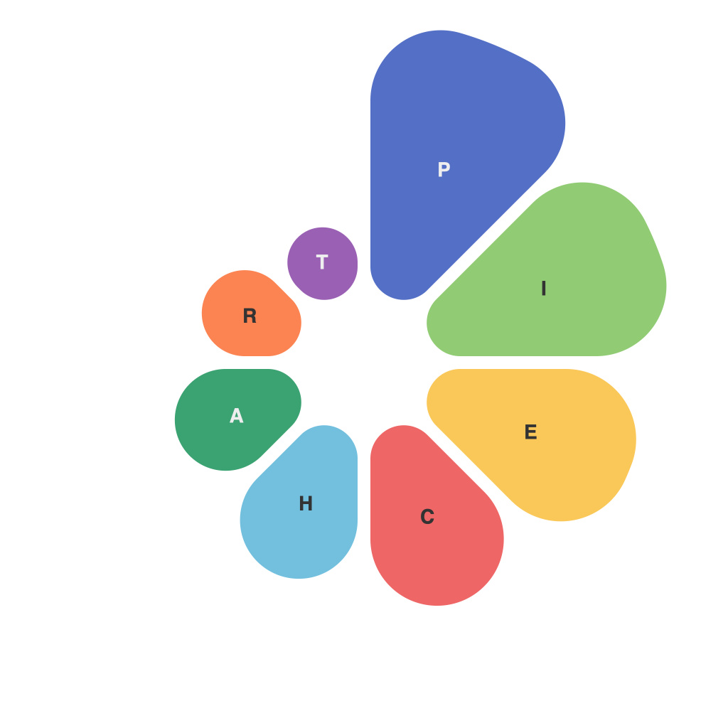
In the world of data visualization, pie charts are often the stars of the show. They provide a quick and intuitive way to understand information, making complex datasets digestible at a glance. This article delves into the art and science of creating effective pie charts, unpacking their purpose, various types, and best practices for their design and use.
### Understanding Pie Charts: The Basics
At its core, a pie chart is a circular graph divided into slices, each representing a proportion of the whole. The first known pie chart was drawn as early as 1801 by Edinburgh mathematician William Playfair, and since then, they have become a staple in the visual representation of data.
### Purpose of Pie Charts: Unveiling the Story in a Slice
Pie charts are used for several reasons:
1. **Comparison**: They easily compare parts to the whole, allowing users to see how pieces of the pie add up to the full circle.
2. **Clarity**: They can present simple distributions in an appealing and eye-catching format.
3. **Pattern Recognition**: Humans are naturally wired to recognize patterns, so pie charts make it easier to spot trends, anomalies, or similarities.
### Types of Pie Charts: Diversify Your Data Representation
While the classic pie chart is perhaps the most common, there are other types to consider, each with its use:
1. **DonutCharts**: A variation on the pie chart that removes the radius around the perimeter to allow for the inclusion of labels on all slices.
2. **Exploded PieCharts**: A donut chart where one or more slices are made larger than the others for emphasis.
3. **3D PieCharts**: Although popular, these are less recommended due to the distortion they introduce to the viewer’s spatial perception.
4. **Clustered and Stacked PieCharts**: These charts cluster slices together or stack them on top of one another to compare different categories.
### The Science of Creating Effective Pie Charts
To craft pie charts that serve their purpose adequately:
1. **Limit the Amount of Data**: Too many slices can make a pie chart difficult to read. Aim for no more than 6 to 10 slices.
2. **Ensure Legibility**: Choose colors that provide high contrast and avoid too many hues, as color memory diminishes with more than 6 different shades.
3. **Data Precision**: Use precise numerical labels to highlight the size of each slice but avoid including too much decimal places, which can be distracting.
4. **Align with Audience**: Tailor the visual representation to the audience. For audiences that are unfamiliar with pie charts, a more basic version is better.
### Best Practices for Pie Charts
1. **Keep Them Simple**: Avoid including unnecessary design elements that distract from the data. Keep the visual clean and clutter-free.
2. **Label Clearly**: Make sure bothSlice Names and percentage labels are clearly readable and positioned in a way that doesn’t obstruct other visual elements.
3. **Size Proportions Correctly**: If using a traditional pie chart, ensure that the slices are proportionally correct—neither should be too small or too large to be seen clearly.
4. **Avoid Misleading Charts**: Be cautious of using percentages without context. For instance, don’t let viewers assume 75% is larger than 25% just because the shape is more prominent.
### Conclusion
Pie charts are a versatile tool in the data visualization arsenal. By mastering their art and science, data analysts, designers, and presenters alike can communicate data in an engaging, informative, and easily digestible manner. While pie charts may sometimes receive criticism for not being the most accurate way to represent data visually, their strength lies in their ability to facilitate a quick grasp of the fundamental distribution and relationship between parts and the whole. With careful design and thoughtful application, pie charts can be powerful allies in the quest to decode information at a glance.

