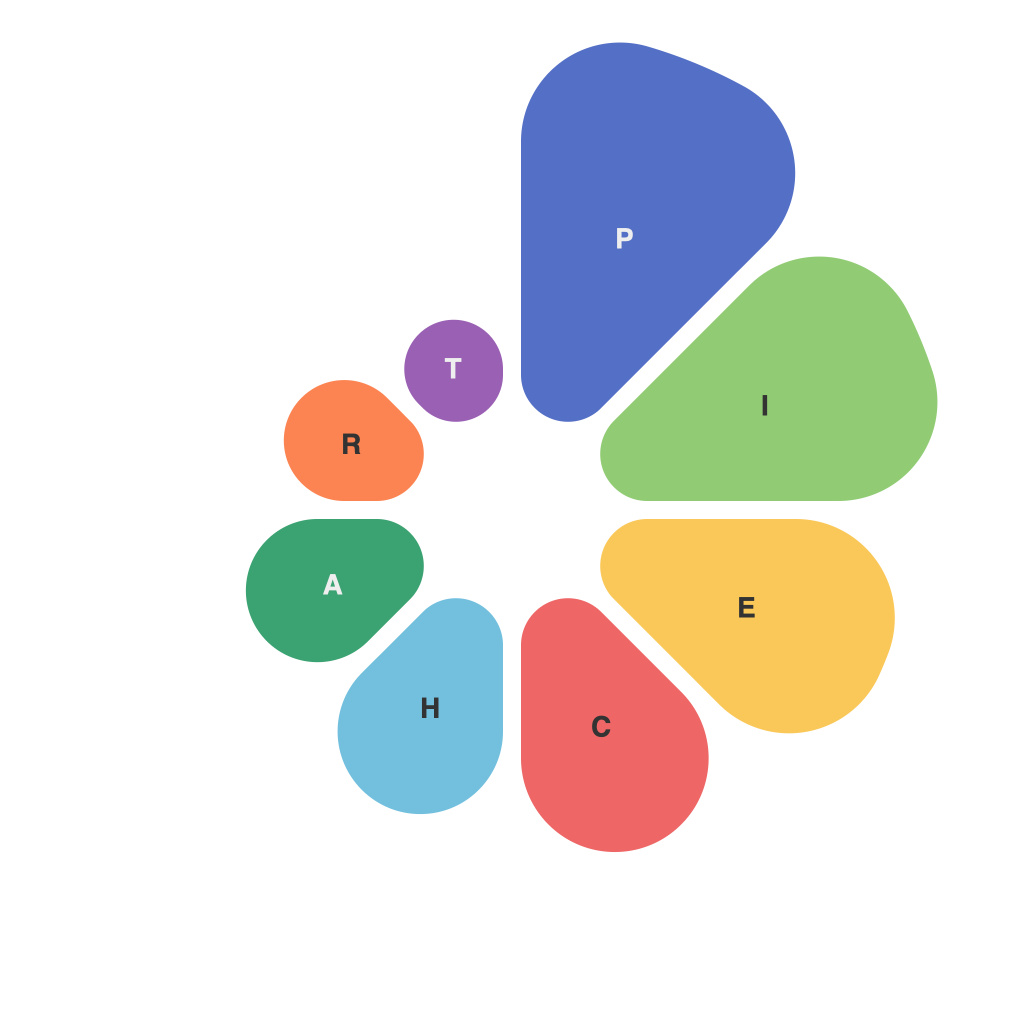
In our rapidly digitalizing world, the capacity to digest and interpret information at a glance has never been more critical. With the sheer volume of data available, traditional methods of reporting, like lengthy texts or complex spreadsheets, are losing their efficacy. Enter the infographic and the pie chart—工具 of the modern data analyst, graphic designer, and informed consumer alike. These visual tools harness the visual power of proportions to make complex information not just understandable, but compelling and engaging. Let’s decode the data behind these powerful graphic devices.
—
**The Infographic – Data Artistry at Its Zenith**
The infographic is a genre of graphic communication that utilizes visual elements to convey a story or the relationships between various data points. Its hallmark is the succinct presentation of vital information, using a mix of symbols, icons, and simple, clean visuals. They tell us more than a single chart or picture ever could, and in the process, simplify intricate concepts.
An effective infographic will balance the elements of design and data. When crafting an infographic, consider the following:
– **Clarity and Simplification**: Every line, shape, and color should contribute to a single, clear message. Avoid clutter and opt for simplicity in design.
– **Narrative**: An effective infographic follows a logical sequence, leading the viewer through the story the data is intended to tell.
– **Focus**: A good infographic stays centered on one idea; attempting to convey multiple unrelated concepts can dilute its impact.
– **Color Theory**: Use colors selectively. Certain colors evoke emotions and convey different meanings, so pair them to draw focus to specific data points.
Visual storytelling is an intricate balancing act in the hands of the infographic designer, but when used properly, it can transform a jumble of data into a compelling narrative.
—
**Pie Charts – A Slice of Proportionate Information**
While the infographic is a story, the pie chart is a simple proportion. Often misused in presentations and reports, the pie chart is a circular statistical graphic segmenting data into differently-sized slices each representing a proportion of the whole. It’s most commonly used to illustrate quantitative comparison.
When designing a pie chart, keep these points in mind:
– **Limit Your Pie**: Avoid overcrowding a pie chart with too many slices. The more slices you have, the harder it is to distinguish them and interpret the data.
– **Use a Larger than Life Comparison**: Charts should not be so small they become unreadable.
– **Be Mindful of Color**: This is another area where color is key. Use different shades of a single color to denote different slices, or mix in one color with subtle variations to ensure differentiation.
– **Look at Alternatives**: If a pie chart doesn’t seem to convey the data as effectively as you hoped, consider alternatives like doughnut charts or other, often more informative, visual methods such as the bar chart.
**Behind the Scenes: The Science of Visualization**
What enables infographics and pie charts to distill volumes of data into digestible visuals is the psychology behind visualization. Our brains process images faster than text, and visuals can communicate emotional messages with more success than words alone. They help us associate concepts with recognizable symbols and convey complexity while making difficult concepts easier to comprehend.
In conclusion, decoding the data means understanding that not all data needs to be presented in its raw form. Infographics and pie charts offer us a palette of visual artistry and design to convert information into knowledge that resonates with our visual senses. By leveraging the power of proportions and visual storytelling, we can unlock the true potential of data and spark informed decisions across every walk of life.

