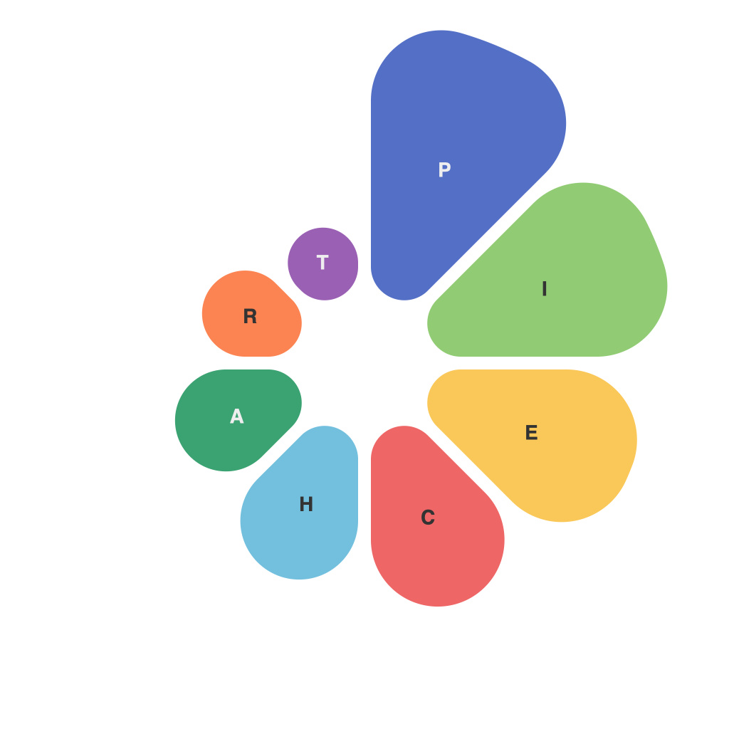
In the rapidly evolving landscape of data analysis, visual representation stands as a keystone for distilling intricate datasets into comprehensible insights. Amongst the plethora of visualization tools at a data analyst’s disposal, the pie chart has remained a steadfast companion, often wielding an air of simplicity beneath its rounded profile. Yet, as we delve into the intricacies of its creation and interpretation, the divide that separates a static, accurate depiction and a misleading representation becomes clear. This article deciphers the divide, elucidating how pie charts are not just shapes of data, but pivotal instruments within the data analyst’s toolkit.
### The Basics of the Pie Chart: Cutting Through the Circle
The humble pie chart was born from the need for simplicity; a round figure divided into proportional slices, each section representing a part of the whole. For ease, pie charts are often divided into three to seven slices, making it possible for human viewers to discern values without extensive cognitive effort. The whole of the chart is set to 360 degrees, where each slice’s angle corresponds to its proportion of the total value, often quantified by simple fractions or percents.
### Ensuring Balance: The Weight of Accuracy
An accurate and informative pie chart is not just about visually conveying data; it’s about the weight that is accurately distributed among the slices. To maintain balance, the following principles should govern pie chart representation:
– **Consistency in Slice Proportions:** The areas (and, by extension, the angles or perimetric lengths) of pie slices should accurately reflect the proportion of each category to the whole.
– **Equal Angle Slices:** If one slice is significantly larger than the rest, it risks overshadowing smaller slices, creating the perception of greater importance than exists in reality.
### Choosing the Right Pie: When Simplicity is Not Enough
Pie charts are not a one-size-fits-all tool. While they excel in visually communicating whole-part relationships, they can mislead when misuse comes into play. Consider these scenarios:
– **Lack of Context:** A pie chart of financial income distribution, for example, can lose meaning if the total income (the whole) is significantly higher than other periods, giving the wrong impression about individual category magnitudes.
– **Too Many Categories:** When there are too many slices, the pie chart can become visually cluttered and less readable. This often leads to the need for “Donuts,” or pie charts with a hollow center, to squeeze in extra slices, further muddling readability.
– **Use of Shades and Colors:** It’s essential that color or shading is used to distinguish categories consistently and logically. Misuse of these tools can lead to misinterpretation of the chart.
### The Divide: Where Misleading Meets Misunderstanding
Deciphering the divide in pie chart representation isn’t merely about the visual. The pitfalls that lead to misleading charts are often subtle, but they can be significant:
– **Misleading Labels:** Pie charts should label slices or include a legend to prevent ambiguity about what each part represents.
– **Omitted Data:** Omitting data for the sake of aesthetics, such as selectively choosing only positive or only negative values, distorts the actual composition of the dataset.
– **Misrepresented Total:** Pie charts should aim to present the whole or all of the data represented in the categories. Misrepresenting the total, either by rounding or arbitrarily selecting an amount, can lead to skewed understanding.
### Piecing Together Clarity: Recommendations for Effective Usage
To avoid plummeting into the misleading side of the divide, here are some recommendations:
– **Minimize the Number of Categories:** Keep pie charts simple by limiting the number of slices to a manageable amount for human cognition (5 to 7 categories, if possible).
– **Prefer Circular Design:** Present data as a circle to reflect total 100% accurately, but also be aware of the perception bias that tends to increase as the number of slices increases.
– **Use the Legend or Labels:** Always clearly label each slice or provide a legend to ensure clarity and understanding.
– **Compare with Other Visualizations:** Pair pie charts with bar graphs or line charts to present different aspects of the data that the pie chart may not be able to fully convey.
– **Educate Your Audience:** Ensure that viewers understand the purpose of the pie chart, the data it represents, and the limitations of pie chart representation.
While the pie chart, like the slice itself, remains a simple construct, its power lies in its meticulous application. To decode the divide, data analysts must be both the creators and the guardians of information, ensuring that each pie chart they craft is not just another slice of data, but a clear and meaningful visualization of the story the numbers have to tell.

